Supabase UI
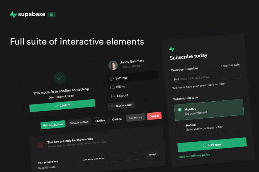
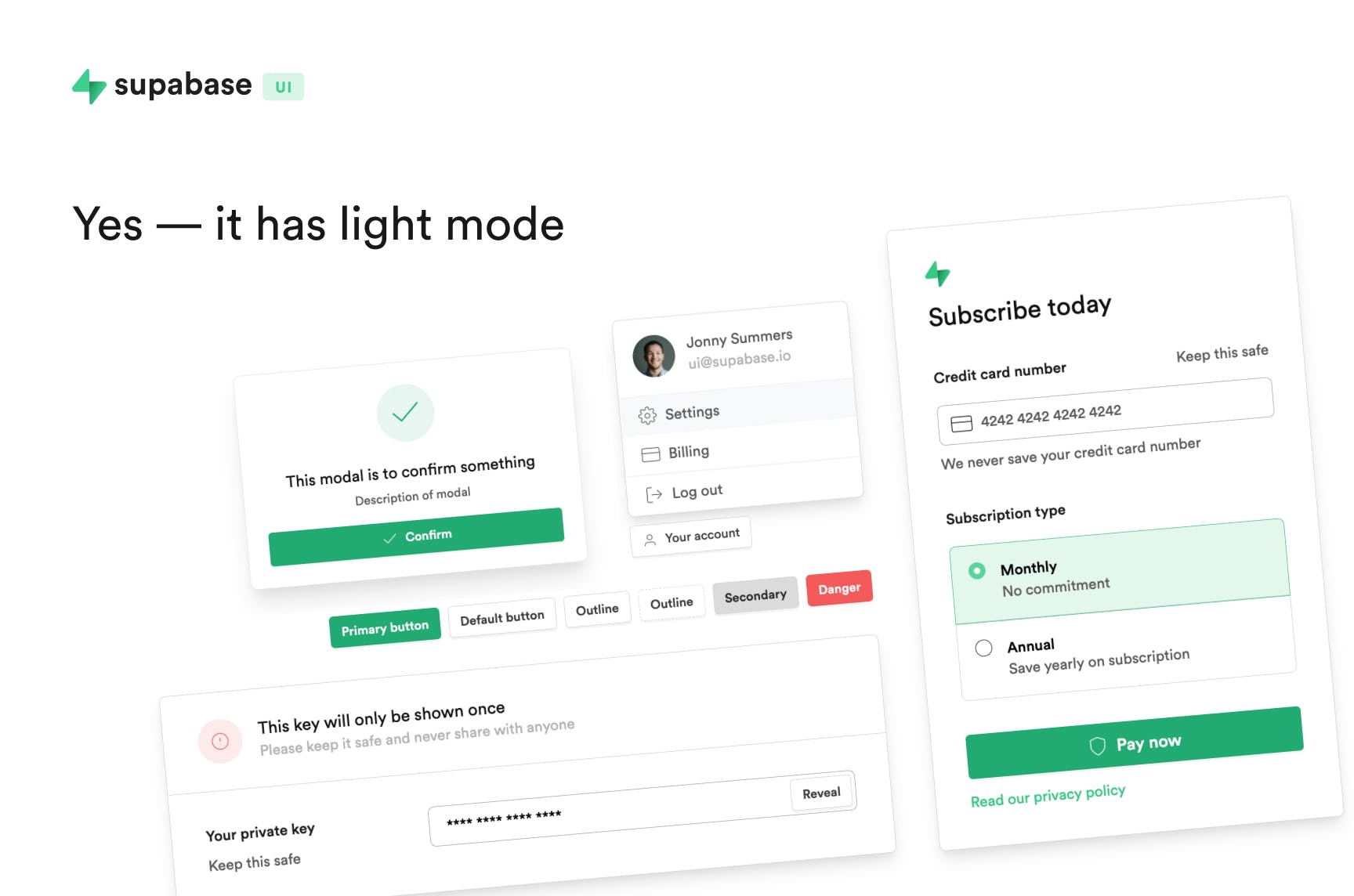
Supabase UI is a React UI library.
?
Supabase UI is still a work-in-progress until a major release is published.
Install Supabase UI
npm install @supabase/ui
Using Supabase UI
Example of importing a component
import { Button } from '@supabase/ui'

//...

return <Button>I am a Supabase UI button</Button>
It is probably advisable to use Normalize with Supabase UI for the timebeing.
Using Icons
We use Feather icon library in Supabase UI
You can use any Icon from the library as a component by prepending Icon to any Icon name, like, <IconMail>
import { IconMail } from '@supabase/ui'

//...

return <IconMail size="small" />
Using Supabase UI Auth
You can use our Auth widget straight out the box with Supabase auth including social logins.
The Auth component also includes a context component which detects whether a user is logged in or not.
Make sure to also install @supabase/supabase-js
npm install @supabase/supabase-js
You can then easily import Auth from the ui library and pass the createClient to the Auth component.
import { Auth, Typography, Button } from "@supabase/ui";
import { createClient } from "@supabase/supabase-js";

const { Text } = Typography

// Create a single supabase client for interacting with your database
const supabase = createClient(
  "https://xyzcompany.supabase.co",
  "public-anon-key"
);

const Container = (props) => {
  const { user } = Auth.useUser();
  if (user)
    return (
      <>
        <Text>Signed in: {user.email}</Text>
        <Button block onClick={() => props.supabaseClient.auth.signOut()}>
          Sign out
        </Button>
      </>
    );
  return props.children;
};

export default function Home() {
  return (
    <Auth.UserContextProvider supabaseClient={supabase}>
      <Container supabaseClient={supabase}>
        <Auth providers={['facebook', 'github']} supabaseClient={supabase}/>
      </Container>
    </Auth.UserContextProvider>
  );
};
Roadmap
Some of these are a work in progress – we invite anyone to submit a feature request if there is something you would like to see.
General
- Button
- Typography
- Icon
- Image (work in progress)
Data Input
- Input
- InputNumber
- Select (custom select wip)
- Checkbox
- Radio
- Toggle
- Upload
- Slider
- Date picker
- Time picker
- Form
Layout
– [ ] Layout
– [ ] Grid (Flex)
- Divider
- Space (Flex)
Display
- Card
- Avatar
- Accordion
- Alert
- Badge
- Menu
- Tooltips
- Tables
- Code block
Navigation
- Tabs
- Breadcrumb
- Dropdown
- Menu
- Page Header
- Sidebar
- Flyout menu
- Steps
Overlay
- Modal
- Context Menu
- Drawer / SidePanel
- Toast messages / Notification
- Progress
- Feeds / Timeline
Utility
- Loading
- Transition (work in progress)
Misc
- Storybook docs
- Theming (in progress)
- Supabase Auth Elements
- Documentation website
We would be keen to hear any feedback on this project.
Feel free to submit a question or idea here
