unop-react-dropdown
Unopinionated dropdown component for react.
Motivation
I found myself reusing this dropdown logic between different projects.
Features
- Completely unopinionated (does not enforce any styling whatsoever)
- Lifecycle functions that allow things like animations before the dropdown closes
- Since it's unopinionated, you can turn any element to a dropdown trigger and any element to a drop down menu.
- Includes basic functionality for opening, closing and setting delay before close (for things like a close animation to happen)
Live Demo
A visual storybook to demonstrate the various component prop behaviour can be found below.
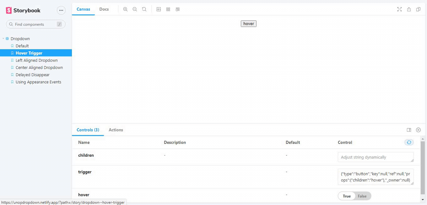
The hover prop demo
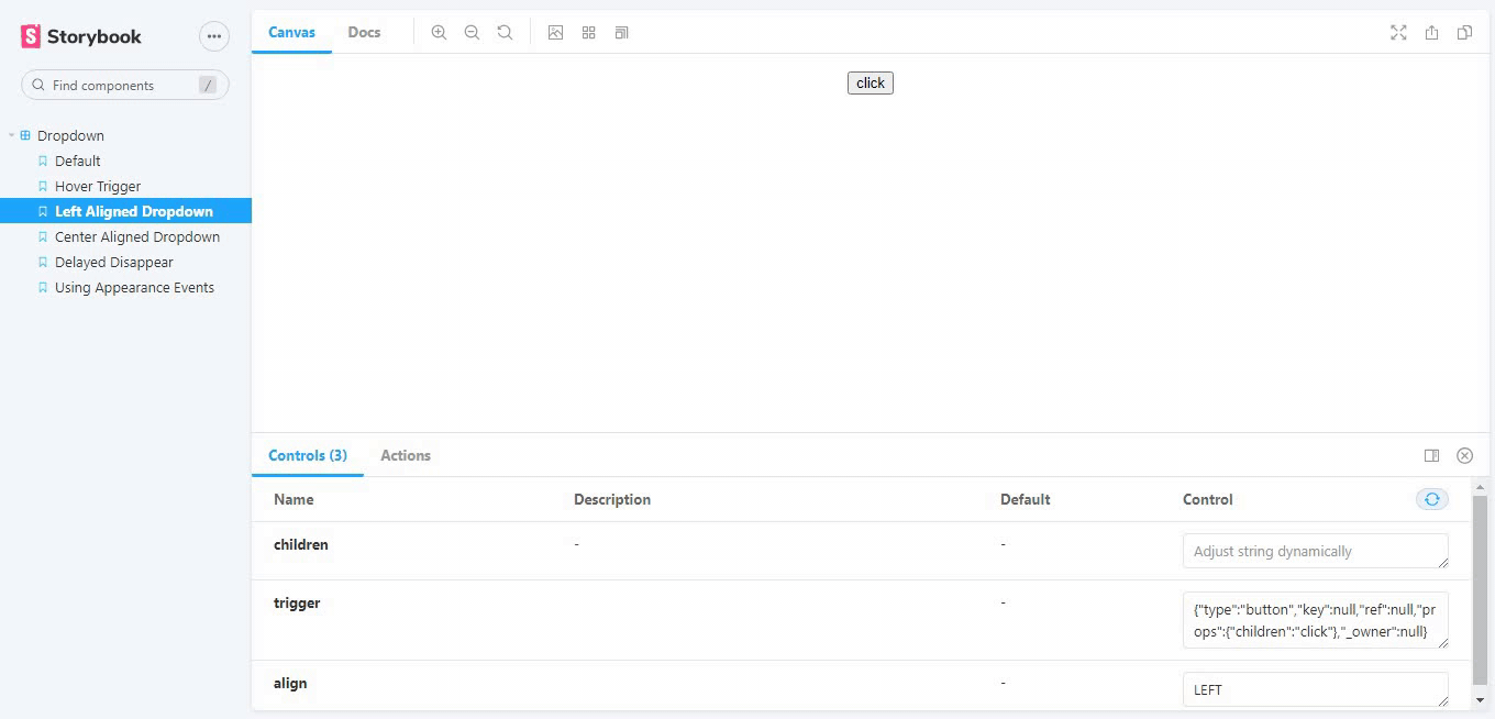
The align prop demo
The other component props, and their options can be found here
Code Sandbox Demo
The component was implemented to create an editable demo dropdown for reference in code sandbox
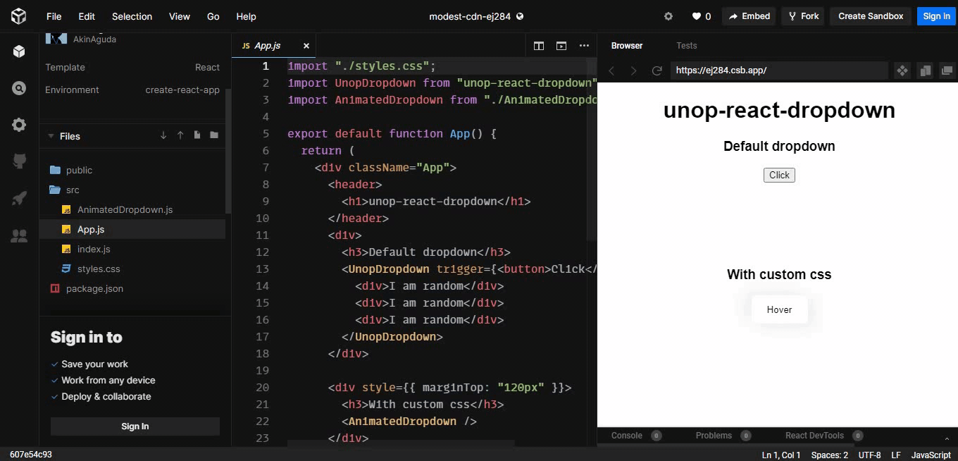
Dropdown in code sandbox
Full list of component props, and their options can be found here
Installation
Unop-react-drop down is available as an npm package
npm install unop-react-dropdown
Usage
import UnopDropdown from "unop-react-dropdown";
and use as:
<UnopDropdown trigger={<button>Click</button>}>
  <ul>
    <li>List item 1</li>
    <li>List item 2</li>
  </ul>
</UnopDropdown>
trigger is the minimum required prop
To implement the other props, they can be passed as such:
<UnopDropdown
      onAppear={handler}
      onDisappearStart={handler}
      trigger={<button className="AnimatedDropdownButton">Hover</button>}
      delay={300}
      align="CENTER"
      hover
    >
        <div>I am random</div>
        <div>I am random</div>
        <div>I am random</div>
    </UnopDropdown>
Check out the code sandbox implementation for any clarification.
Full list of component props, and their options can be found here
Help and Contributions
How to help/contribute
- fix issues, pull request are very welcome
- write, improve docs
- write tests
- suggest features and improvements
API
Component props
| Prop | Type | Default | Description |
|---|---|---|---|
| trigger | Jsx.Element | [] | This will be passed an onClick to handle the toggling when it is rendered. This should prefarably be a button |
| align | 'RIGHT' or 'LEFT' or 'CENTER' | 'LEFT' | When 'RIGHT', the dropdown will be rendered below the trigger, aligned to the right. When 'CENTER', the dropdown will be aligned to the center |
| onAppear | function | null | This will be called when the dropdown is visible |
| onDisappear | function | null | This will be called when the dropdown is invisible |
| onDisappearStart | function | null | This will be called when the timeout to diappear(become invisible) starts |
| delay | number | 0 | This is the delay in milliseconds before the dropdown goes invisible |
| hover | boolean | false | When true, the dropdown will become visible on hover |