react-portal-hint
This library is in the alpha phase. Many things are subject to change.
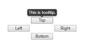
The intuitive, efficient, configurable Tooltip/Popover which exploits React Portals. Parallel fading is enabled.
TODO
- [x] Implement default style
- [x] Implement port for user-defined style
- [x] Support place options (top, button, left, right)
- [x] Make portal root element configurable
- [x] Follow target or hint content size or position (Use
ResizeObserver) - [x] Support more events
- [x] Support more place options (combinations)
- [x] Implement
transformobservation (UsesetInterval) - [x] Resolve margin problem
- [x] Resolve CSS Flexbox & Grid problem
- [x] Examples (Flexbox, CSS grid)
- [x] Enable ts strict options
- [ ] Do TODO in code
- [ ] Accepts forwardRef
- [ ] Accepts multiple children
- [ ] content validation
- [ ] Example with custom stylesheet
- [ ] Accepts Refs as props (exotic)
- [ ] Configure test summary for CI
- [ ] Well-documented documents
- [ ] Improve performance
- [ ] Multi-browser support
How to use
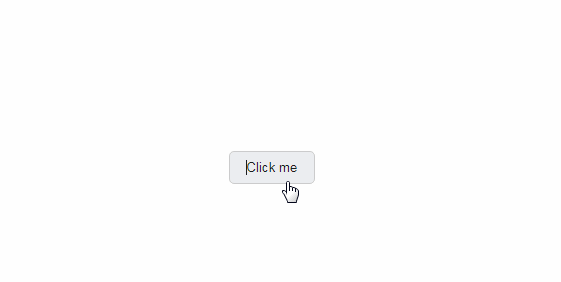
Use this as tooltip with default style
import Hint from "react-portal-hint";
import "react-portal-hint/default.css";

<Hint content="Hello!">
  <button>Something happens...</button>
</Hint>;
Props
| PropertyName | Type | Default |
|---|---|---|
| content | JSX.Element ǀ string ǀ ((rect: ClientRect) => JSX.Element ǀ string) |
N/A |
| place | (see below) | "top" |
type ActualPlace = "top" | "bottom" | "left" | "right";
type Place = ActualPlace | "column" | "row" | "start" | "end";
declare place: Place | ActualPlace[]; // TODO: explanation