react-color-palette
2KB color picker component for React.

Installation
npm
npm install react-color-palette
yarn
yarn add react-color-palette
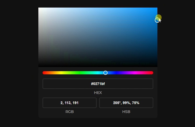
Usage
import ColorPicker, { useColor } from "react-color-palette";

export const App = () => {
  const [color, setColor] = useColor("hex", "#121212");

  return <ColorPicker width={456} height={228} color={color} onChange={setColor} hideHSB dark />;
};
Overriding styles
If the default colors don't fit your project, you can always change them.
Example for the Light theme
.rcp-light {
  --rcp-background: #ffffff;
  --rcp-input-text: #111111;
  --rcp-input-border: rgba(0, 0, 0, 0.1);
  --rcp-input-label: #717171;
}
Example for the Dark theme
.rcp-dark {
  --rcp-background: #181818;
  --rcp-input-text: #f3f3f3;
  --rcp-input-border: rgba(255, 255, 255, 0.1);
  --rcp-input-label: #999999;
}
API
'Color' type
Color
| Field |
Type |
| hex |
string |
| rgb |
ColorRGB |
| hsb |
ColorHSB |
ColorRGB
| Field |
Type |
| r |
number |
| g |
number |
| b |
number |
ColorHSB
| Field |
Type |
| h |
number |
| s |
number |
| b |
number |
ColorPicker Props
| Name |
Type |
Default |
Description |
| width |
number |
|
The width of the color picker. |
| height |
number |
width |
The height of the color picker. |
| color |
[Color][1] |
|
The current [Color][1]. |
| onChange |
Function |
|
The function that accepts the updated [Color][1] as a single argument. |
| hideHEX |
bool |
false |
Hide HEX input. |
| hideRGB |
bool |
false |
Hide RGB input. |
| hideHSB |
bool |
false |
Hide HSB input. |
| dark |
bool |
false |
Color theme. |
useColor Arguments
| Name |
Type |
Default |
Description |
| format |
"hex" | "rgb" | "hsb" |
|
The color format. |
| initialColor |
string | ColorRGB | ColorHSB |
|
The initial color in the selected color format. |
toColor Arguments
| Name |
Type |
Default |
Description |
| format |
"hex" | "rgb" | "hsb" |
|
The color format. |
| color |
string | ColorRGB | ColorHSB |
|
The color in the selected color format. |
GitHub