Simple Hue Picker

A tiny library to show a Hue picker for user!
- Small. 1.25 Kb (minified and gzipped). No deps. Controlled by Size Limit.
- Framework agnostic. Works with TypeScript and any framework: React, Vue, Preact, Solid and Svelte!

Install
npm install simple-hue-picker
Usage
Since it’s a Web Component and not a framework component, it requires some framework-specific treatment. But don’t fret, no hacks.
The first common step is to import the module. Do this in your main.ts file or in your wrapper (if you need one):
import 'simple-hue-picker';
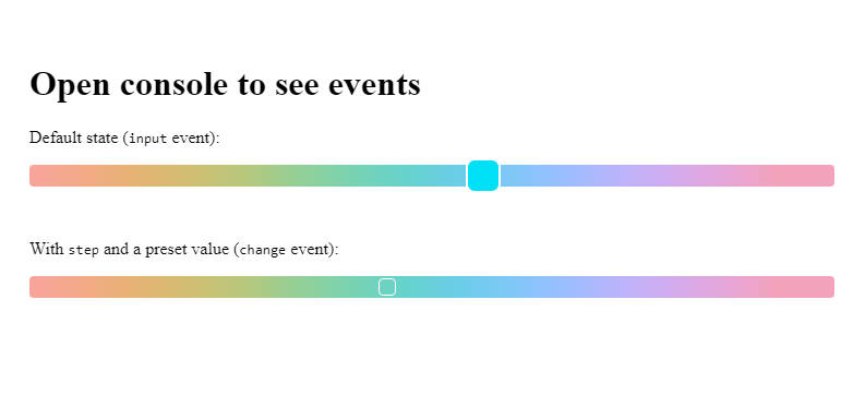
As soon as you do this, you’ll have a new globally-available component called <hue-picker />. Under the hood the whole component is just an <input type="range" /> and an SVG that gives you the background.
It accepts all the same props as a usual <input />. The selected value is stored in, as usual, value.
The lib exposes 2 events: change and input, both fire a CustomEvent<number>. Be aware of the difference between those two: change only fires when the value is commited (the mouse is released), while input is realtime.
This is what a typical even handler would look like:
<hue-picker onInput={(e) => setValue(e.detail)} />
Usage with React
React is the least Web Components friendly, because of its Synthetic events. But have no fear: we ship a special React component for you, that does all the dirty work for you!
import { HuePicker } from "simple-hue-picker/react";

function App() {
  const [selected, setSelected] = useState(120);

  return <HuePicker step={10} value={selected} onInput={e => setSelected(e.detail)} />;
};
Usage with Vue
Vue is Web Components friendly, so usage is pretty simple:
<script setup lang="ts">
import type { HueChangeEvent } from "simple-hue-picker/react";
import { ref } from 'vue'

const selectedHue = ref(120)
</script>

<template>
  <div>
    {{selectedHue}}
  </div>
  <hue-picker :value="selectedHue" @input="(e: HueChangeEvent) => selectedHue = e.detail">
  </hue-picker>
</template>
Usage with Preact
Preact is Web Components friendly, so usage is extremely simple:
export function App() {
  const [selected, setSelected] = useState(150);
  return <hue-picker value={selected} onInput={e => setSelected(e.detail)}></hue-picker>
}
Usage with Solid
Solid is Web Components friendly, so usage is simple, but you need to explicitly give the compiler a hint, that value is an attribute:
function App() {
  const [selected, setSelected] = createSignal(120);

  return (
    <hue-picker
      step={10}
      // Notice the attr:
      attr:value={selected()}
      onInput={(e) => setSelected(e.detail)}
    ></hue-picker>
  );
}
Usage with Svelte
Svelte is Web Components friendly, but as of my knowledge it doesn’t provide any way for a library author to define types for Web Components. Therefore, it’s a bit of a manual work and doesn’t work with two-way data binding:
<script lang="ts">
  import type { HueChangeEvent } from "simple-hue-picker";

  let value = 120;
  const onInput = (e: HueChangeEvent) => (value = e.detail);
</script>

<hue-picker {value} step="10" on:input={onChange} />
Usage with SSR
This library is powered by Web Components. If you try to initialize it in Node environment, you’ll get something like “HTMLElement is not defined”. Since this component doesn’t provide any critical functionality, feel free to use tools that your meta-framework provide you with that allow you to bypass the SSR step for this component. For example, for Next.js it would be something like this:
import dynamic from "next/dynamic";

const HuePicker = dynamic(() => import("simple-hue-picker/react"), {
  ssr: false,
});

function App() {
  const [selected, setSelected] = useState(120);

  return <HuePicker step={10} value={selected} onInput={e => setSelected(e.detail)} />;
};
Usage with forms
When you use an input inside a Web Component, it doesn’t propagate its value in FormData when you submit a form. We solve this by rendering an <input type="hidden" /> with the provided name, and sync its value with the hue-picker.
TLDR: all is covered, use name as usual ?