react-gradient-timepicker
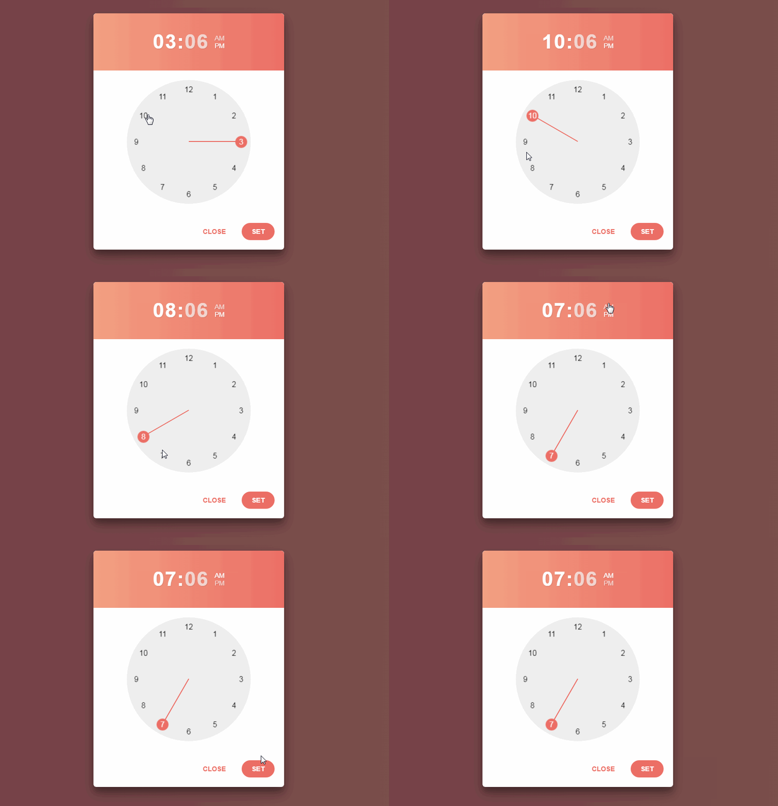
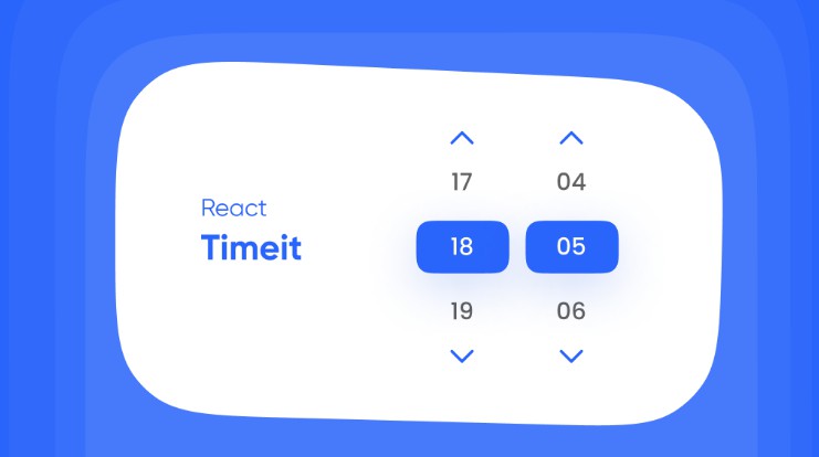
A beautiful gradients timepicker component built in and for awesome React.
Installation
npm install react-gradient-timepicker --save
How to use?
import TimePicker from 'react-gradient-timepicker'; // or
var TimePicker = require('react-gradient-timepicker');
<TimePicker
  time="01:00"
  theme="Bourbon"
  className="timepicker"
  placeholder="Start Time"
  onSet={(val) => {
    alert('val:' + val.format12);
  }}
/>
PropTypes
| prop | type | description | optional |
|---|---|---|---|
| #time | string | 24 hours format time to initial time | Yes. Takes current time if not provided |
| theme | string | Gradient name from www.uigradients.com. header, buttons, hand colors will take theme color. If you want to change buttons and hand color, provide color1 prop. Note: Header color cant be changed if theme is provided | Yes. If not provided it takes color1. if color1 is not provided it takes default color ie #F26B83. |
| color1 | string | color1 is primary color ie. header, buttons, hand will take this color. If you want to header color, provide headerColor prop | Yes. Takes default color for header, buttons, hand ie. #F26B83 |
| headerColor | string | Header color for timepicker. Does not work if theme prop is provided. | Yes. If not provided it takes color1. if color1 is not provided it takes default color ie #F26B83. |
| placeholder | string | Placeholder string for timepicker input | No |
| className | string | Class name for timepicker input | Yes |
| onSet | function | The funciton to call when Set button is clicked | No |
onSet PropType
onSet function is called everytime SET button is clicked with parameter
{
    format12: "01:00 AM" // 12 hour format,
    format24: "13:00" // 24 hour format
}
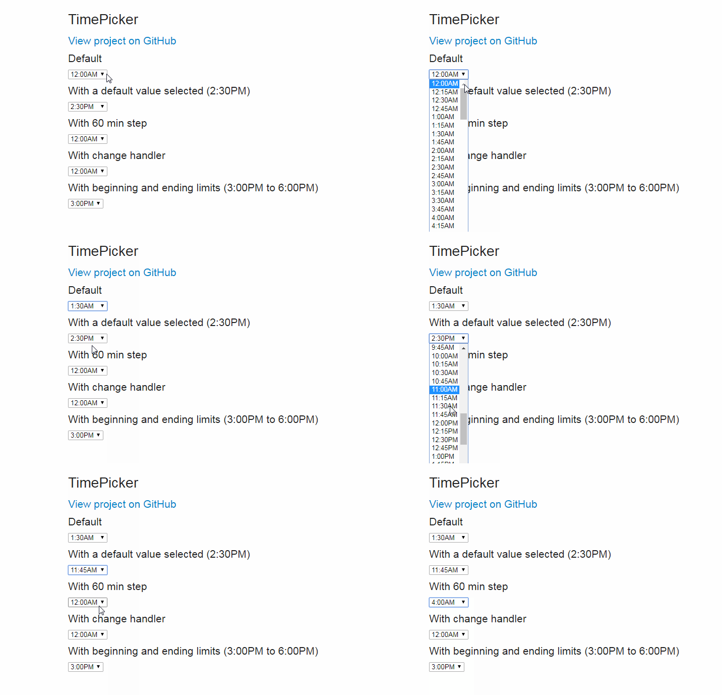
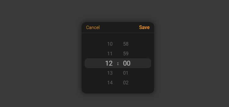
Screenshots


