React Calendar Heatmap
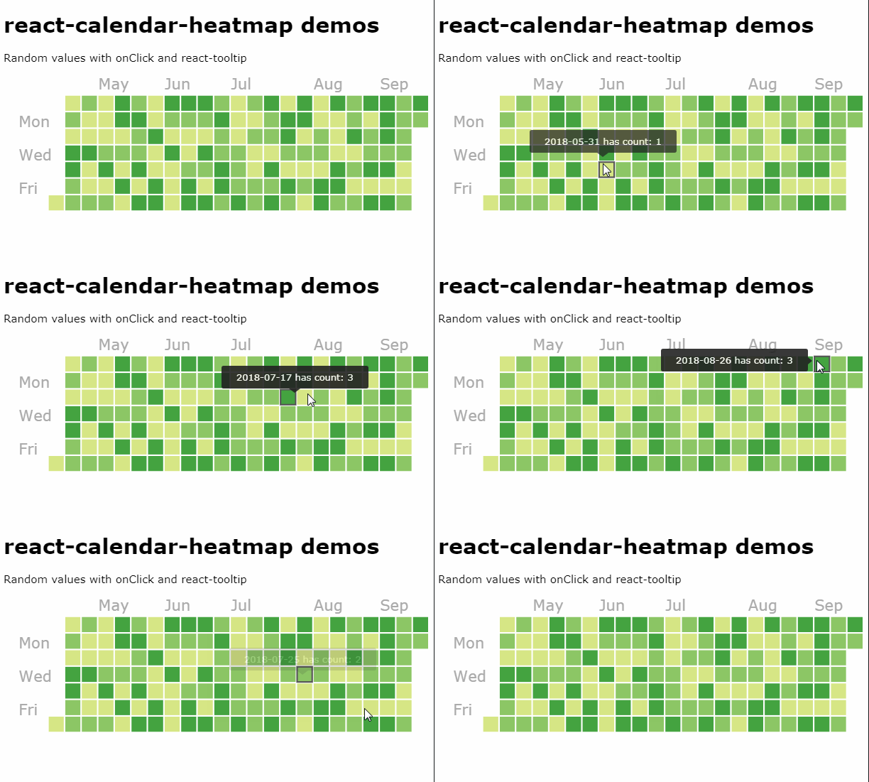
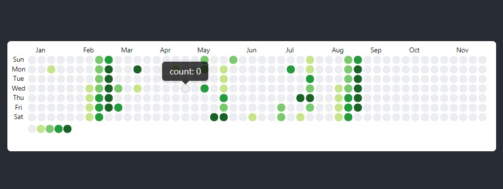
A calendar heatmap component built on SVG, inspired by github's commit calendar graph. The component expands to size of container and is super configurable.
Setup
Install the npm module with yarn or npm:
yarn add react-calendar-heatmap
Usage
Import the component:
import CalendarHeatmap from 'react-calendar-heatmap';
Import styles. You can directly import from the module, which requires a CSS loader:
import 'react-calendar-heatmap/dist/styles.css';
A CSS loader is included by default in create-react-app. If you don't have a CSS loader, you can simply copy the stylesheet into a file in your project and import it instead.
To show a basic heatmap from January 1st to April 1st:
<CalendarHeatmap
  startDate={new Date('2016-01-01')}
  endDate={new Date('2016-04-01')}
  values={[
    { date: '2016-01-01' },
    { date: '2016-01-22' },
    { date: '2016-01-30' },
    // ...and so on
  ]}
/>
Props
| Name | Type | Description |
|---|---|---|
values |
Required, Array of Object | Required array of objects which each have a date property, which can be a Date object, parseable string, or millisecond timestamp. Example: [{ data: '2016-01-01', count: 6 }] |
startDate |
String, Number, or Date | Start of date range. |
endDate |
String, Number, or Date | End of date range - a Date object, parseable string, or millisecond timestamp. |
showMonthLabels |
Boolean | Toggle for removing month labels. |
showWeekdayLabels |
Boolean | Toggle for removing weekday labels. |
showOutOfRangeDays |
Boolean | Toggle display of extra days in week that are past endDate and before beginning of range. |
horizontal |
Boolean | Whether to orient horizontally or vertically. Can be used in combination with numDays/endDate to show just the current month. |
gutterSize |
Number | Size of gutters relative to squares. |
onClick |
Function | Callback to invoke when a square is clicked, e.g. (value) => alert(value) |
onMouseOver |
Function | Callback to invoke when mouse pointer is over a square, e.g. (event, value) => console.log(event, value) |
onMouseLeave |
Function | Callback to invoke when mouse pointer leaves a square, e.g. (event, value) => console.log(event, value) |
titleForValue |
Function | Function to determine each square's title attribute, for generating 3rd party hover tooltips (may also need to configure tooltipDataAttrs). Example: (value) =>Date is ${value.date}` |
tooltipDataAttrs |
Object or Function | Set data attributes for all squares, for generating 3rd party hover tooltips. Either an object like { 'data-tooltip': 'tooltip' } or a function like (value) => { return { 'data-tooltip': 'Tooltip: ' + value } } |
classForValue |
Function | Callback for determining CSS class to apply to each value, e.g. (value) => (value.count > 0 ? 'blue' : 'white'). |
monthLabels |
Array of String | An array with 12 strings representing the text from January to December, e.g. ['01', '02', ..., '12'] |
weekdayLabels |
Array of String | An array with 7 strings representing the text from Sunday to Saturday |
transformDayElement |
Function | A function to further transform generated svg element for a single day. Can be used to attach event handlers, add tooltips and more. Example: (element, value, index) => React.cloneElement(element, { title: value.date }). |
Configuring colors
To use the color scale shown in the live demo based on the github contribution graph, you can set the classForValue prop, a function that determines which CSS class to apply to each value:
<CalendarHeatmap
  values={[
    { date: '2016-01-01', count: 1 },
    { date: '2016-01-03', count: 4 },
    { date: '2016-01-06', count: 2 },
    // ...and so on
  ]}
  classForValue={(value) => {
    if (!value) {
      return 'color-empty';
    }
    return `color-scale-${value.count}`;
  }}
/>
Then you use CSS to set colors for each class:
.react-calendar-heatmap .color-scale-1 { fill: #d6e685; }
.react-calendar-heatmap .color-scale-2 { fill: #8cc665; }
.react-calendar-heatmap .color-scale-3 { fill: #44a340; }
.react-calendar-heatmap .color-scale-4 { fill: #1e6823; }
