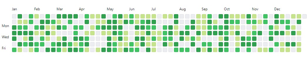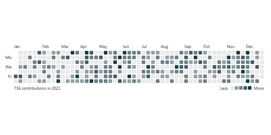
HeatMap
A lightweight calendar heatmap react component built on SVG, customizable version of GitHub's contribution graph.
Install
# Not dependent on uiw.
npm install @uiw/react-heat-map --save
Basic Usage
Basic usage example, Please pay warning to the time setting.
⚠️ Example: 2016-01-112016/01/11, Support Safari
import ReactDOM from 'react-dom';
import HeatMap from '@uiw/react-heat-map';

const value = [
  { date: '2016/01/11', count: 2 },
  { date: '2016/01/12', count: 20 },
  { date: '2016/01/13', count: 10 },
  ...[...Array(17)].map((_, idx) => ({ date: `2016/02/${idx + 10}`, count: idx, content: '' })),
  { date: '2016/04/11', count: 2 },
  { date: '2016/05/01', count: 5 },
  { date: '2016/05/02', count: 5 },
  { date: '2016/05/04', count: 11 },
];

const Demo = () => {
  return (
    <div>
      <HeatMap value={value} startDate={new Date('2016/01/01')} />
    </div>
  )
};
ReactDOM.render(<Demo />, _mount_);
Set Color
Set the theme color style.
import ReactDOM from 'react-dom';
import HeatMap from '@uiw/react-heat-map';

const value = [
  { date: '2016/01/11', count:2 },
  { date: '2016/04/12', count:2 },
  { date: '2016/05/01', count:5 },
  { date: '2016/05/02', count:5 },
  { date: '2016/05/03', count:1 },
  { date: '2016/05/04', count:11 },
  { date: '2016/05/08', count:32 },
];

const Demo = () => {
  return (
    <HeatMap
      value={value}
      width={600}
      style={{ color: '#ad001d' }}
      startDate={new Date('2016/01/01')}
      panelColors={{
        0: '#f4decd',
        2: '#e4b293',
        4: '#d48462',
        10: '#c2533a',
        20: '#ad001d',
        30: '#000',
      }}
    />
  )
};
ReactDOM.render(<Demo />, _mount_);
Set Rect Style
Set the radius of the rect.
import ReactDOM from 'react-dom';
import HeatMap from '@uiw/react-heat-map';

const value = [
  { date: '2016/01/11', count:2 },
  ...[...Array(17)].map((_, idx) => ({ date: `2016/01/${idx + 10}`, count: idx })),
  ...[...Array(17)].map((_, idx) => ({ date: `2016/02/${idx + 10}`, count: idx })),
  { date: '2016/04/12', count:2 },
  { date: '2016/05/01', count:5 },
  { date: '2016/05/02', count:5 },
  { date: '2016/05/03', count:1 },
  { date: '2016/05/04', count:11 },
  { date: '2016/05/08', count:32 },
];

const Demo = () => {
  const [range, setRange] = useState(5)
  return (
    <div>
      <input type="range" min="0" max="5" step="0.1" value={range} onChange={(e) => setRange(e.target.value)} /> {range}
      <HeatMap
        value={value}
        width={600}
        startDate={new Date('2016/01/01')}
        legendRender={(props) => <rect {...props} y={props.y + 10} rx={range} />}
        rectProps={{
          rx: range
        }}
      />
    </div>
  )
};
ReactDOM.render(<Demo />, _mount_);
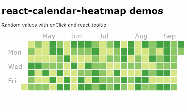
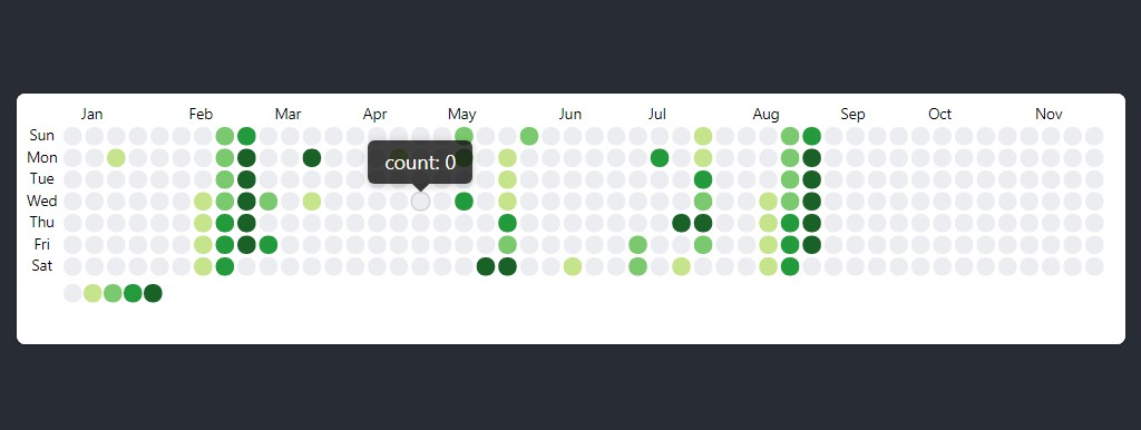
Tooltip
A simple text popup tip.
import ReactDOM from 'react-dom';
import Tooltip from '@uiw/react-tooltip';
import HeatMap from '@uiw/react-heat-map';

const value = [
  { date: '2016/01/11', count:2 },
  ...[...Array(17)].map((_, idx) => ({ date: `2016/01/${idx + 10}`, count: idx, })),
  ...[...Array(17)].map((_, idx) => ({ date: `2016/02/${idx + 10}`, count: idx, })),
  { date: '2016/04/12', count:2 },
  { date: '2016/05/01', count:5 },
  { date: '2016/05/02', count:5 },
  { date: '2016/05/03', count:1 },
  { date: '2016/05/04', count:11 },
  { date: '2016/05/08', count:32 },
];

const Demo = () => {
  return (
    <HeatMap
      value={value}
      width={600}
      startDate={new Date('2016/01/01')}
      rectRender={(props, data) => {
        // if (!data.count) return <rect {...props} />;
        return (
          <Tooltip key={props.key} placement="top" content={`count: ${data.count || 0}`}>
            <rect {...props} />
          </Tooltip>
        );
      }}
    />
  )
};
ReactDOM.render(<Demo />, _mount_);
Show/Hide Legend
import ReactDOM from 'react-dom';
import HeatMap from '@uiw/react-heat-map';

const value = [
  { date: '2016/01/11', count:2 },
  ...[...Array(17)].map((_, idx) => ({ date: `2016/01/${idx + 10}`, count: idx })),
  ...[...Array(17)].map((_, idx) => ({ date: `2016/02/${idx + 10}`, count: idx })),
  { date: '2016/04/12', count:2 },
  { date: '2016/05/01', count:5 },
  { date: '2016/05/02', count:5 },
  { date: '2016/05/03', count:1 },
  { date: '2016/05/04', count:11 },
  { date: '2016/05/08', count:32 },
];

const Demo = () => {
  const [size, setSize] = useState(0)
  return (
    <div>
      <label style={{ userSelect: 'none' }}>
        <input
          type="checkbox"
          checked={size === 0}
          onChange={(e) => setSize(e.target.checked ? 0 : 12)}
        />
        {size === 0 ? ' Hide' : ' Show'} Legend
      </label>
      <HeatMap
        width={600}
        value={value}
        legendCellSize={size}
        startDate={new Date('2016/01/01')}
      />
    </div>
  )
};
ReactDOM.render(<Demo />, _mount_);
Selected Rect
import ReactDOM from 'react-dom';
import HeatMap from '@uiw/react-heat-map';

const value = [
  { date: '2016/01/11', count:2 },
  ...[...Array(17)].map((_, idx) => ({ date: `2016/01/${idx + 10}`, count: idx })),
  ...[...Array(17)].map((_, idx) => ({ date: `2016/02/${idx + 10}`, count: idx })),
  { date: '2016/04/12', count:2 },
  { date: '2016/05/01', count:5 },
  { date: '2016/05/02', count:5 },
  { date: '2016/05/03', count:1 },
  { date: '2016/05/04', count:11 },
  { date: '2016/05/08', count:32 },
];

const Demo = () => {
  const [selected, setSelected] = useState('')
  return (
    <div>
      <HeatMap
        width={600}
        value={value}
        startDate={new Date('2016/01/01')}
        rectRender={(props, data) => {
          if (selected !== '') {
            props.opacity = data.date === selected ? 1 : 0.45
          }
          return (
            <rect {...props} onClick={() => {
              setSelected(data.date === selected ? '' : data.date);
            }} />
          );
        }}
      />
    </div>
  )
};
ReactDOM.render(<Demo />, _mount_);
Props
| Property | Description | Type | Default |
|---|---|---|---|
| value | Data to be displayed, required | Array | [] |
| rectSize | Grid size | number | 11 |
| legendCellSize | Size of the legend cells, in pixel. Value equal to 0 hide legend. |
number | 11 |
| startDate | Start date | Date | new Date() |
| endDate | End date | Date | - |
| space | Interval between grid sizes | number | 2 |
| rectProps | Grid node attribute settings | React.SVGProps<SVGRectElement> |
2 |
| weekLables | Week display | string[] | ['Sun', 'Mon', 'Tue', 'Wed', 'Thu', 'Fri', 'Sat'] |
| monthLables | Month display | string[] | ['Jan', 'Feb', 'Mar', 'Apr', 'May', 'Jun', 'Jul', 'Aug', 'Sep', 'Oct', 'Nov', 'Dec'] |
| panelColors | Backgroud color of active colors | Record<number, string> |
{ 0: '#EBEDF0', 8: '#7BC96F', 4: '#C6E48B', 12: '#239A3B', 32: '#196127' } |
| rectRender | Single day block re-render |
<E = SVGRectElement>(data: E & { key: number }, valueItem: HeatMapValue & { date: string, column: number, row: number, index: number }) => React.ReactElement |
- |
| legendRender | Single legend block re-render |
(props: React.SVGProps<SVGRectElement>) => React.ReactNode |
- |
Development
development
Runs the project in development mode.
# Step 1, run first, listen to the component compile and output the .js file
# listen for compilation output type .d.ts file
npm run watch
# Step 2, development mode, listen to compile preview website instance
npm run start
production
Builds the app for production to the build folder.
npm run build
The build is minified and the filenames include the hashes.
Your app is ready to be deployed!