react-colorpickr
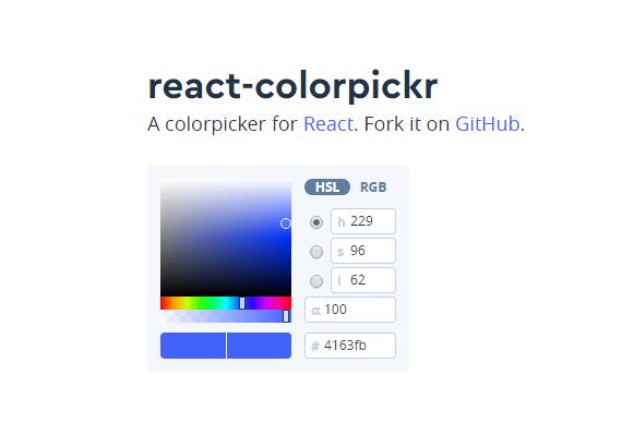
A colorpicker for React.
Install
npm install @mapbox/react-colorpickr
You'll also want to include a copy of colorpickr.css in your code.
<link href='react-colorpickr.css' rel='stylesheet' />
Usage
import React from 'react'
import ColorPicker from '@mapbox/react-colorpickr'

export default class Example extends React.PureComponent {
  onChange = color => {
    console.log(color);
  };

  render() {
    return (
      <ColorPicker onChange={this.onChange} />
    )
  }
}
Required properties
onChange
Value should be a function and is called whenever a color is updated from
the colorpicker. Returns a color object.
Optional properties
theme
By default, react-colorpickr depends on Assembly and the CSS located in dist/colorpickr.css. You can however, override it thanks to react-themeable which react-colorpickr uses internally. See the properties used and the class name values in theme.js.
initialValue
Accepts any valid css color. If this isn't provided, a default color is used.
mode
Defaults to hsl. Initializes which color model tab is active.
Possible options: hsl, rgb.
channel
Defaults to h. Initializes which color channel is active.
Possible options: h, s, l, r, g, b.
reset
If reset is provided as a property with a value of true a reset button is
added that when pressed, reverts back to the original color when the
colorpicker is initialized on the page. Defaults to true.
mounted
To use internal methods from react-colorpickr, mounted provides access to the components instance. This is helpful for calling methods like overrideValue that can manually set a new color.
instance = null;

setInstance = picker => {
  this.instance = picker;
};

override = () => {
  this.instance.overrideValue('red');
};

render() {
  <div>
    <ColorPickr mounted={this.setInstance} onChange={console.log} />
    <button onClick={this.override}>Override</button>
  </div>
}


