react-photoswipe-gallery
React component wrapper around PhotoSwipe.
Basic Usage
import 'photoswipe/dist/photoswipe.css'
import 'photoswipe/dist/default-skin/default-skin.css'

import { Gallery, Item } from 'react-photoswipe-gallery'

const MyGallery = () => (
  <Gallery>
    <Item
      original="https://placekitten.com/1024/768?image=1"
      thumbnail="https://placekitten.com/80/60?image=1"
      width="1024"
      height="768"
    >
      {({ ref, open }) => (
        <img ref={ref} onClick={open} src="https://placekitten.com/80/60?image=1" />
      )}
    </Item>
    <Item
      original="https://placekitten.com/1024/768?image=2"
      thumbnail="https://placekitten.com/80/60?image=2"
      width="1024"
      height="768"
    >
      {({ ref, open }) => (
        <img ref={ref} onClick={open} src="https://placekitten.com/80/60?image=2" />
      )}
    </Item>
  </Gallery>
)
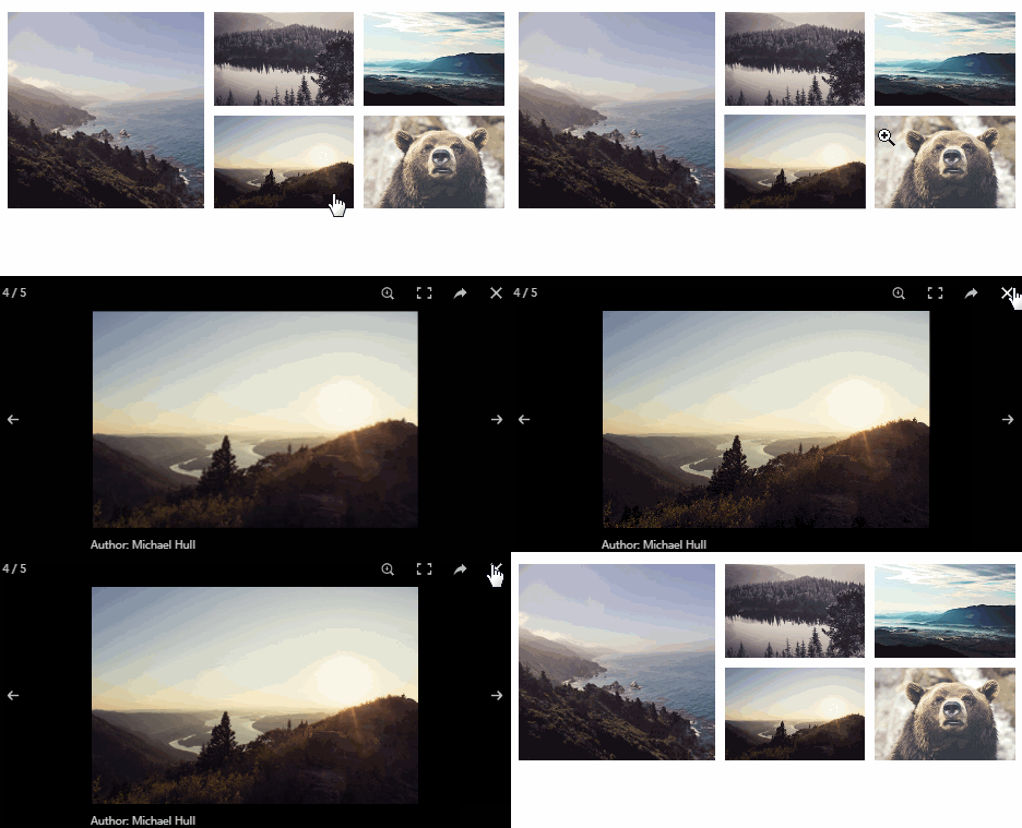
<Gallery /> component ships with default PhotoSwipeUI and Layout. Such a setup is suitable for most cases. If you want more control, jump to advanced usage example.
Installation
yarn add photoswipe react-photoswipe-gallery
or
npm install photoswipe react-photoswipe-gallery --save
Advanced Usage
If you want to customize PhotoSwipe layout or use your PhotoSwipe UI, you should take <CustomGallery /> component.
We also provide configurable <DefaultLayout />. It's suitable for most cases, and provide props for configuring all captions and removing unneeded UI elements.
Also, if you have more than one gallery instance in your view, we recommend reusing <Layout /> between several <CustomGallery />.
import PhotoswipeUIDefault from 'photoswipe/dist/photoswipe-ui-default'
import { CustomGallery, Item, DefaultLayout } from 'react-photoswipe-gallery'

const MyGallery = () => {
  const layoutRef = useRef()

  return (
    <CustomGallery layoutRef={layoutRef} ui={PhotoswipeUIDefault}>
      {/*...*/}
    </CustomGallery>

    <CustomGallery layoutRef={layoutRef} ui={PhotoswipeUIDefault}>
      {/*...*/}
    </CustomGallery>

    <DefaultLayout
      shareButton={false}
      fullscreenButton={false}
      zoomButton={false}
      ref={layoutRef}
    />
  )
}
Hash Navigation
You should pass a unique id prop to <Gallery /> or <CustomGallery /> component, to enable hash navigation.
Optionally, you can also pass the id to <Item /> component. Otherwise, the index will be used.
const MyGallery = () => {
  <Gallery id="my-gallery">
    <Item
      id="first-pic"
      {/*...*/}
    />
    <Item
      id="second-pic"
      {/*...*/}
    />
  </Gallery>
}
Props
Gallery
You can pass any of
DefaultLayoutprops toGallery.
| Prop | Type | Required | Description |
|---|---|---|---|
id |
Number or String | ✓ (for hash navigation) | Item ID, for hash navigation |
options |
Object | PhotoSwipe options | |
onOpen |
Function | Triggers after PhotoSwipe.init() call. Use it for accessing PhotoSwipe API. It will receive PhotoSwipe instance as the first argument: (photoswipe: PhotoSwipe) => void |
Item
Should be children of the
Gallery.
| Prop | Type | Required | Description |
|---|---|---|---|
children |
Function | ✓ | Render prop for exposing Gallery API |
original |
String | Url of original image | |
thumbnail |
String | Url of thumbnail | |
width |
Number or String | Width of original image | |
height |
Number or String | Height of original image | |
title |
String | Title for Default UI | |
html |
String | Html content, if you need to use it as modal | |
id |
Number or String | Item ID, for hash navigation |
Note about Item's children render prop.
Item accepts only function as children.
type RenderItem = (props: {
  /**
   * Required `ref` object to any html node of item
   *
   * Can be omitted if there is only one item in the gallery
   */
  ref: React.MutableRefObject;

  /**
   * Function that opens the gallery at the current item's index
   */
  open: () => void;
}) => JSX.Element

<Item>
  {({ ref, open }) => (
    <img ref={ref} onClick={open} />
  ) as RenderItem}
</Item>

<Item>
  {({ ref, open }) => (
    <span ref={ref}>Open gallery</span>
  ) as RenderItem}
</Item>
CustomGallery
| Prop | Type | Required | Description |
|---|---|---|---|
layoutRef |
React.MutableRefObject<HTMLElement> |
✓ | Ref to your layout element |
ui |
PhotoSwipeUI | ✓ | PhotoSwipe UI class |
id |
Number or String | ✓ (for hash navigation) | Item ID, for hash navigation |
options |
Object | PhotoSwipe options | |
onOpen |
Function | Triggers after PhotoSwipe.init() call. Use it for accessing PhotoSwipe API. It will receive PhotoSwipe instance as the first argument: (photoswipe: PhotoSwipe) => void |
DefaultLayout
All props are optional.
| Prop | Type | Default | Description |
|---|---|---|---|
closeButtonCaption |
Object | 'Close (Esc)' | .pswp__button--close caption |
shareButtonCaption |
Object | 'Share' | .pswp__button--share caption |
toggleFullscreenButtonCaption |
Object | 'Toggle fullscreen' | .pswp__button--fs caption |
zoomButtonCaption |
Object | 'Zoom in/out' | .pswp__button--zoom caption |
prevButtonCaption |
Object | 'Previous (arrow left)' | .pswp__button--arrow--left caption |
nextButtonCaption |
Object | 'Next (arrow right)' | .pswp__button--arrow--right caption |
shareButton |
Boolean | true |
Show .pswp__button--share |
fullscreenButton |
Boolean | true |
Show .pswp__button--fs |
zoomButton |
Boolean | true |
Show .pswp__button--zoom |
Hooks
useGallery
The useGallery hook returns an object with some useful methods.
| Property | Type | Description |
|---|---|---|
open |
(index: number) => void | This function allows programmatically open Photoswipe UI at index |
Requirements
- [email protected]+
- Map polyfill for older browsers
Development
yarn install
yarn pnpify --sdk
then
yarn storybook
or
yarn start


