use-dark-mode
A custom React Hook to help you implement a "dark mode" component for your application.

useDarkMode works in one of two ways:
-
By toggling a CSS class on whatever element you specify (defaults to
document.body).
You then setup your CSS to display different views based on the presence of the selector. For example, the following CSS is used in the demo app to ease the background color in/out of dark mode.body { background-color: #fff; color: #333; transition: background-color 0.3s ease; } body.dark-mode { background-color: #1a1919; color: #999; } -
If you don't use global classes, you can specify an
onChangehandler and take care of the implementation of switching to dark mode yourself.
Requirement ⚠️
To use use-dark-mode, you must use [email protected]. React Hooks is currently at
RFC stage.
Installation
$ npm i use-dark-mode
Usage
const darkMode = useDarkMode(initialState, optionalConfigObject);
Config
You pass useDarkMode an initialState (a boolean specifying whether it should be in dark mode
by default) and an optional configuration object. The configuration object contains the following.
| Key | Description |
|---|---|
className |
The class to apply. Default = dark-mode. |
element |
The element to apply the class name. Default = document.body. |
onChange |
A function that will be called when the dark mode value changes and it is safe to access the DOM (i.e. it is called from within a useEffect). If you specify onChange then className and element are ignored (i.e. no classes are automatically placed on the DOM). You have full control! |
Return object
A darkMode object is returned with the following properties.
| Key | Description |
|---|---|
value |
A boolean containing the current state of dark mode. |
enable() |
A function that allows you to set dark mode to true. |
disable() |
A function that allows you to set dark mode to false. |
toggle() |
A function that allows you to toggle dark mode. |
Example
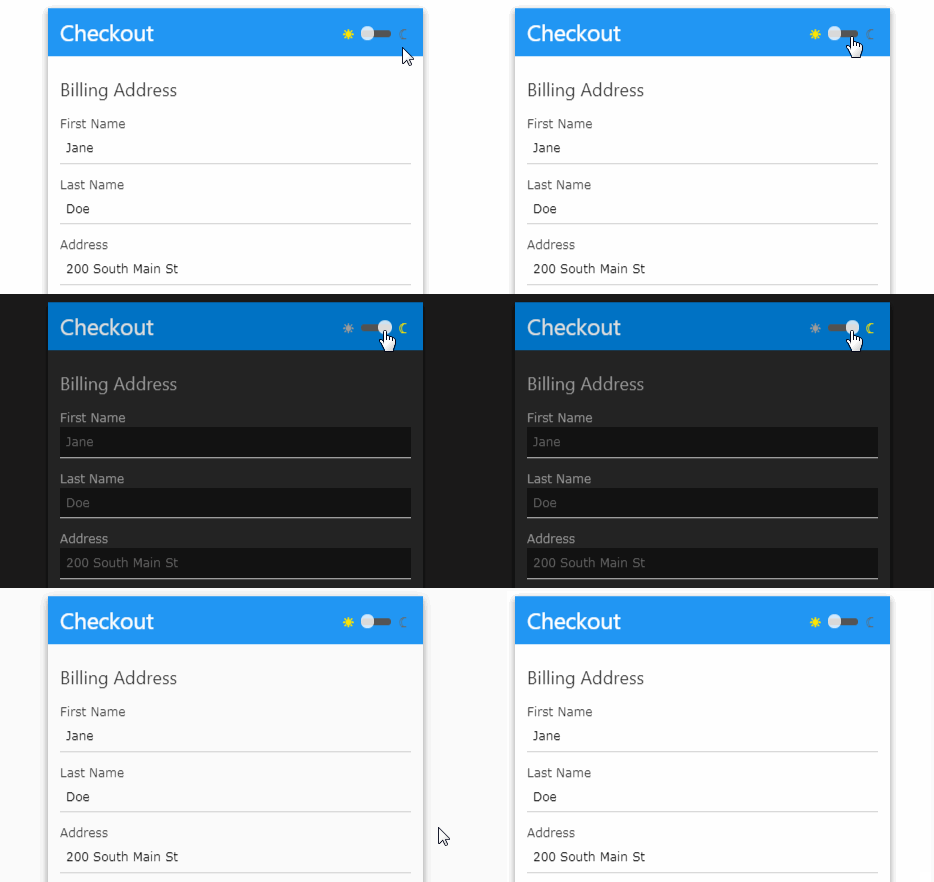
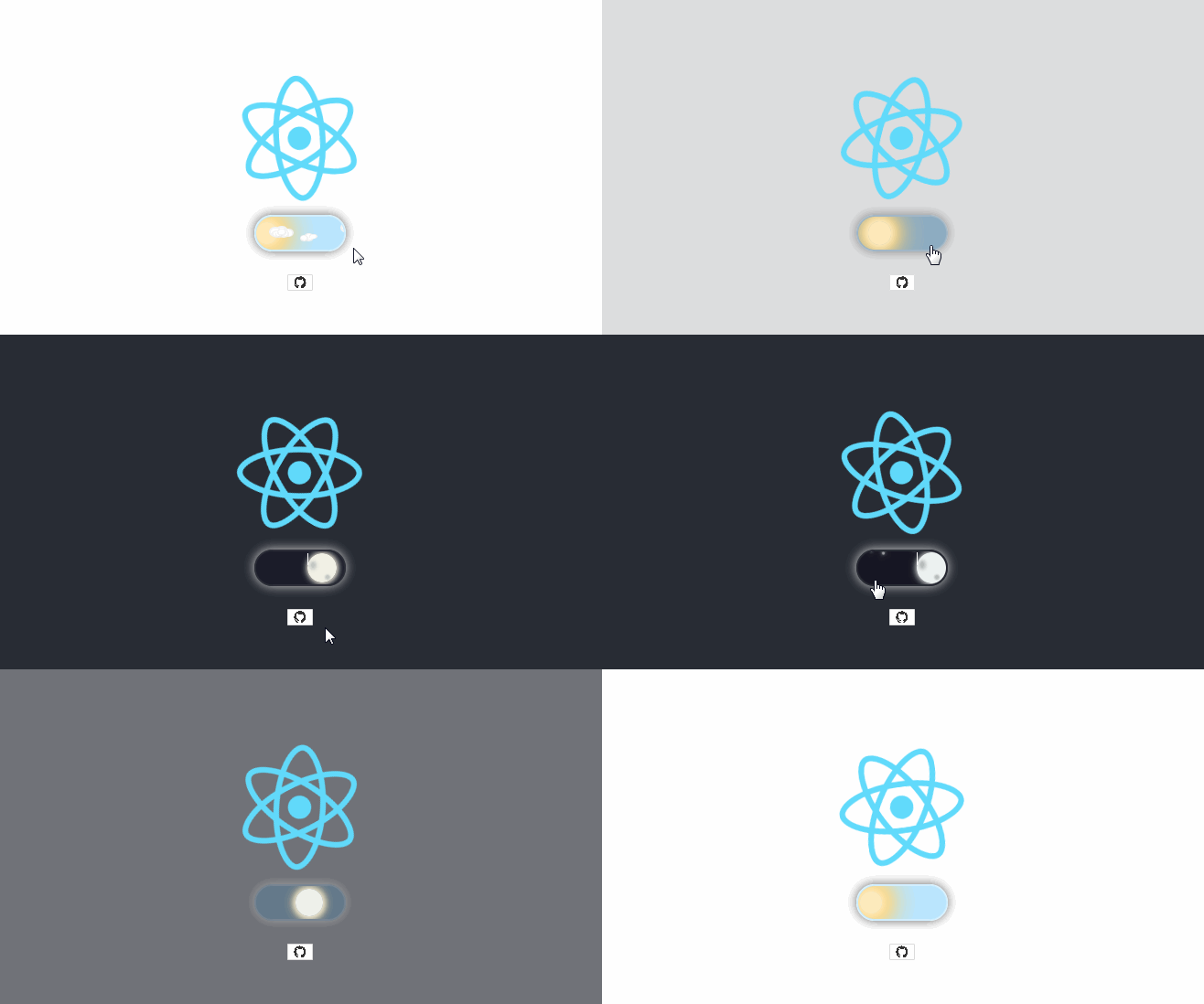
Here is a simple component that uses useDarkMode to provide a dark mode toggle control.
If dark mode is selected, the CSS class dark-mode is applied to document.body and is removed
when de-selected.
import React from 'react';

import Toggle from './Toggle';
import useDarkMode from 'use-dark-mode';

const DarkModeToggle = () => {
  const darkMode = useDarkMode(false);

  return (
    <div>
      <button type="button" onClick={darkMode.disable}>
        ☀
      </button>
      <Toggle checked={darkMode.value} onChange={darkMode.toggle} />
      <button type="button" onClick={darkMode.enable}>
        ☾
      </button>
    </div>
  );
};

export default DarkModeToggle;
