@graphland/react-video-player
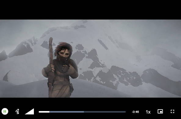
A customizable React component serving as a wrapper for the popular Video.js library. This component provides a sleek and responsive video player with theme options.
Installation
npm install @graphland/react-video-player
Usage
import React from "react";
import { VideoPlayer, VideoPlayerProps } from "@graphland/react-video-player";

const App: React.FC = () => {
  const videoSources = [
    {
      src: "https://media.w3.org/2010/05/sintel/trailer_hd.mp4",
      type: "video/mp4",
    },
    // Add more video sources as needed
  ];

  const videoProps: VideoPlayerProps = {
    theme: "city", // 'city', 'fantasy', 'forest', 'sea'
    height: 720,
    width: 1280,
    autoPlay: false,
    loop: false,
    sources: videoSources,
    controlBar: {
      skipButtons: {
        forward: 5,
        backward: 5,
      },
    },
    playbackRates: [0.5, 1, 1.5, 2],
    disablePictureInPicture: false,
    onReady: () => {
      console.log("Video player is ready!");
    },
  };

  return <VideoPlayer {...videoProps} />;
};

export default App;
Props
theme(optional): Choose from ‘city’, ‘fantasy’, ‘forest’, ‘sea’ for different player themes.height(optional): Height of the video player in pixels.width(optional): Width of the video player in pixels.autoPlay(optional): Automatically start playing the video when the component mounts.loop(optional): Enable looping of the video.sources(required): An array of video sources with{ src: string, type: string }format.poster(optional): URL for the video poster image.controlBar(optional): Additional configuration for the video control bar, including skip buttons.playbackRates(optional): Array of playback rates available to the user.disablePictureInPicture(optional): Disable the Picture-in-Picture mode.onReady(optional): Callback function called when the video player is ready.