The Ultimate React Multilevel Menu
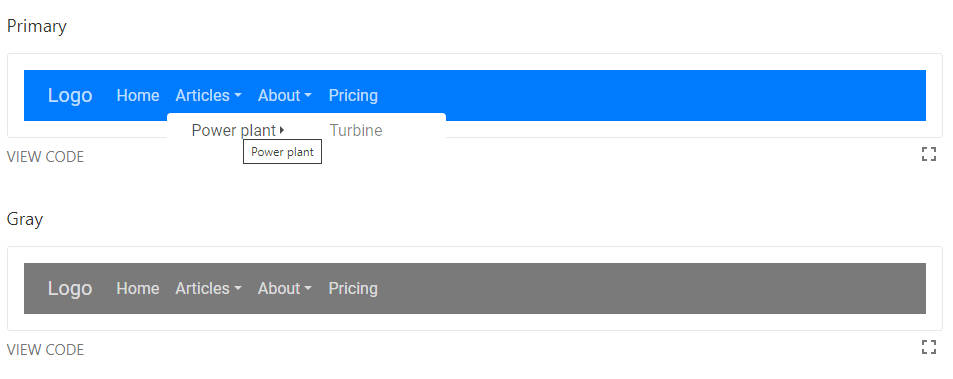
URMM is a responsive menu react component. It’s designed to be customizable and user-friendly.
- User-friendly simple and eligent
- Customizable to be suited to your needs
- RTL-Support to support different languages
- Mutli-level to go as deep as you want
Pros
- URMM is fully customizable thanks to different props
- URMM supports multi-level menus
- URMM is easy to implement
Demo.
Documentation is here.
Install
npm install --save ultimate-react-multilevel-menu
or
yarn add ultimate-react-multilevel-menu
Minimum Working Set Up
import {
  Nav,
  Collapse,
  Item,
  Items,
  Logo
} from 'ultimate-react-multilevel-menu'

;<Nav className={'navbar-light bg-white'}>
  <Logo href="/">Logo</Logo>
  <Collapse>
    <Item href={'#home'}>Home</Item>
    <Items href={'#articles'} title="Articles">
      <Items href={'#power-plant'} title="Power plant">
        <Item href={'#turbine'}>Turbine</Item>
      </Items>
    </Items>
    <Items href={'#about'} title="About">
      <Item href={'#introduction'}>Introduction</Item>
    </Items>
    <Item href={'#pricing'}>Pricing</Item>
  </Collapse>
</Nav>
Componnents
Nav
Nav component is container of all other components and you can change the color scheme by using the predefined css classes or your custom css classes
Props
| Name | Type | Default | Description |
|---|---|---|---|
| dir | “rtl” | “ltr” | “ltr” | Menu direction |
| className | “string” | “” | CSS class for nav tag |
Collapse
Collapse component is container of Item and Items components and it’s responsible to make the menu responsive and elegant on small screens
Props
| Name | Type | Default | Description |
|---|
Logo
Logo component is container of your logo which can be an image or a simple text
Props
| Name | Type | Default | Description |
|---|---|---|---|
| href | “string” | “” | Logo url link |
| as | React.ElementType | a | The component that link render as |
| className | “string” | “” | CSS class for container div tag |
Item
Item component is a single link
Props
| Name | Type | Default | Description |
|---|---|---|---|
| href | “string” | “” | Item url link |
| as | React.ElementType | a | The component that link render as |
| className | “string” | “” | CSS class for container li tag |
Items
Items component is a link and a container for other Item or Items components
Props
| Name | Type | Default | Description |
|---|---|---|---|
| href | “string” | “” | Url link for it self |
| as | React.ElementType | a | The component that link render as |
| className | “string” | “” | CSS class for container ul tag |
Contact Me
Email : [email protected]
