React-Date-Picker
A date picker for your React app.
- Pick days, months, years, or even decades
- Supports virtually any language
- No moment.js needed
Important message for React-Date-Picker ≤5 users
Sadly, the authors of original React-Date-Picker ≤5 have abandoned the package. Because it lacked compatibility with React 16, the package would quickly become dead.
In version 6 I aim to provide a solution that will suit everyone's needs. To make that happen, I need time and your help. Please don't hesitate to file an issues with bugs, suggestions, or simply telling me more about how you use react-date-picker. Your help will be invaluable!
Upgrade guide for React-Date-Picker ≤5 users is there to help you with the upgrade.
tl;dr
- Install by executing
npm install react-date-pickeroryarn add react-date-picker. - Import by adding
import DatePicker from 'react-date-picker'. - Use by adding
<DatePicker />. UseonChangeprop for getting new values.
Looking for a time picker or a datetime picker?
React-Date-Picker will play nicely with React-Time-Picker and React-DateTime-Picker. Check them out!
Getting started
Compatibility
Your project needs to use React 16 or later. If you use older version of React, please refer to the table below to find suitable React-Date-Picker version.
| React version | Newest supported React-Date-Picker |
|---|---|
| >16.0 | latest |
| >15.0 | 6.7.0 |
React-Calendar, on which React-Date-Picker relies heavily, uses modern web technologies. That's why it's so fast, lightweight and easy to style. This, however, comes at a cost of supporting only modern browsers.
Legacy browsers
If you need to support legacy browsers like Internet Explorer 10, you will need to use Intl.js or another Intl polyfill along with React-Date-Picker.
Installation
Add React-Date-Picker to your project by executing npm install react-date-picker or yarn add react-date-picker.
Usage
Here's an example of basic usage:
import React, { Component } from 'react';
import DatePicker from 'react-date-picker';

class MyApp extends Component {
  state = {
    date: new Date(),
  }

  onChange = date => this.setState({ date })

  render() {
    return (
      <div>
        <DatePicker
          onChange={this.onChange}
          value={this.state.date}
        />
      </div>
    );
  }
}
Custom styling
If you don't want to use default React-Date-Picker styling to build upon it, you can import React-Date-Picker by using import DatePicker from 'react-date-picker/dist/entry.nostyle'; instead.
User guide
DatePicker
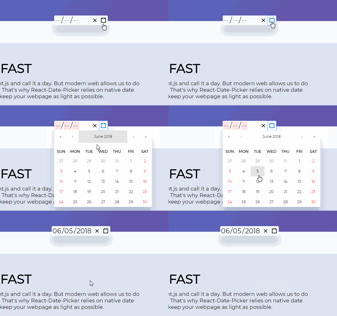
Displays an input field complete with custom inputs, native input, and a calendar.
Props
| Prop name | Description | Example values |
|---|---|---|
| calendarClassName | Defines class name(s) that will be added along with "react-calendar" to the main React-Calendar <div> element. |
|
| calendarIcon | Defines the content of the calendar button. |
|
| className | Defines class name(s) that will be added along with "react-date-picker" to the main React-Date-Picker <div> element. |
|
| clearIcon | Defines the content of the clear button. |
|
| disabled | Defines whether the date picker should be disabled. Defaults to false. | true |
| isOpen | Defines whether the calendar should be opened. Defaults to false. | true |
| locale | Defines which locale should be used by the date picker and the calendar. Can be any IETF language tag. Defaults to user's browser settings. | "hu-HU" |
| maxDate | Defines maximum date that the user can select. Periods partially overlapped by maxDate will also be selectable, although React-Date-Picker will ensure that no later date is selected. | Date: new Date() |
| maxDetail | Defines the most detailed calendar view that the user shall see. View defined here also becomes the one on which clicking an item in the calendar will select a date and pass it to onChange. Can be "month", "year", "decade" or "century". Defaults to "month". | "month" |
| minDate | Defines minimum date that the user can select. Periods partially overlapped by minDate will also be selectable, although React-Date-Picker will ensure that no earlier date is selected. | Date: new Date() |
| minDetail | Defines the least detailed calendar view that the user shall see. Can be "month", "year", "decade" or "century". Defaults to "century". | "century" |
| name | Defines input name. Defaults to "date". | "myCustomName" |
| onChange | Function called when the user clicks an item on the most detailed view available. | (value) => alert('New date is: ', value) |
| returnValue | Defines which dates shall be passed by the calendar to the onChange function and onClick{Period} functions. Can be "start", "end" or "range". The latter will cause an array with start and end values to be passed. Defaults to "start". | "range" |
| required | Defines whether date input should be required. Defaults to false. | true |
| showLeadingZeros | Defines whether leading zeros should be rendered in date inputs. Defaults to false. | true |
| value | Defines the value of the input. |
|
Calendar
DatePicker component passes all props to React-Calendar, with the exception of className (you can use calendarClassName for that instead). There are tons of customizations you can do! For more information, see Calendar component props.
