react-kiwi-dropdown
A minimal, easy-to-use and highly adjustable dropdown component made with ReactJS.
Why?
Styling <select> and <option> elements is a hassle when creating a custom dropdown.
Many UI component libraries have great dropdown components but these are often heavily styled and not easy to overwrite. react-kiwi-dropdown is an easy to use dropdown component which makes overwriting default styles a breeze.
Usage
import React, { useState } from 'react'
import Dropdown from 'react-kiwi-dropdown'
const [selectedOption, setSelectedOption] = useState('')
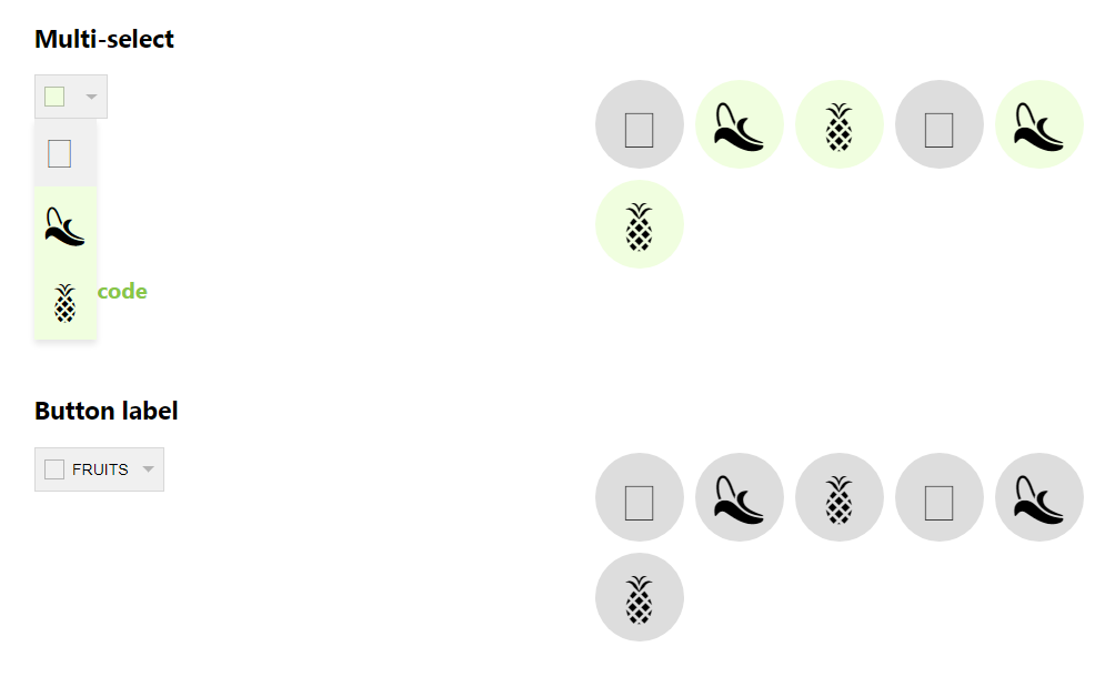
const options = [
{ value: 'kiwi', content: '?' },
{ value: 'banana', content: '?' },
{ value: 'pineapple', content: '?' }
]
const onChange = option => {
if (option.value === selectedOption) {
setSelectedOption('')
} else {
setSelectedOption(option.value)
}
}
return (
<Dropdown
options={options}
onChange={onChange}
buttonIndicator
resetValue={''}
selectedOption={selectedOption}
/>
)
Props
There's only two required props, options and onChange.
| Name | Type | Description |
|---|---|---|
| options | array | An array containing option objects |
| selectedOption | string / array of strings | The currently selected value/values |
| resetValue | any | Used to reset select with button indicator |
| onChange | function | The dropdown will call this function on change and return the selected option object |
| buttonLabel | string | Button label |
| buttonIndicator | boolean | Show button indicator |
| buttonIndicatorContent | any | Custom content inside button indicator |
| buttonArrow | 'single' or 'double' | Arrow style, single or double |
| selectedOptionIcon | any | Custom icon for selected option |
Option object
| Name | Type | Description | Required |
|---|---|---|---|
| value | string | Option value | required |
| content | any | Content to display | required |
| icon | any | Any component |
Button indicator
The button indicator indicates if a value is selected and alo deselect all values if it's clicked while the dropdown is closed.
Button indicator requires the prop resetValue. This value will be sent back when it deselects all values.
Styling
The dropdown can easily be styled by extending the component with styled-components styled() function.
Use predefined classNames to add style to specific components.
| className | Description | Selected className |
|---|---|---|
| .KIWI-button | Button to toggle options | |
| .KIWI-button-indicator | Button indicator | .selected |
| .KIWI-option-list | Option list | |
| .KIWI-option | Option | .selected |
Default style
react-kiwi-dropdown comes with a miniminimalistic design and few lines of css.
.KIWI-button {
  display: flex;
  justify-content: space-between;
  align-items: center;
  min-height: 40px;
  padding: 8px;
  background: #fff;
  border: 1px solid rgba(0, 0, 0, 0.1);
  font-size: 14px;
}

.KIWI-button:focus {
  outline: none;
}

.KIWI-button-indicator {
  display: inline-block;
  min-height: 16px;
  min-width: 16px;
  border: 1px solid rgba(0, 0, 0, 0.25);
  margin-right: 7.5px;
}

.KIWI-option-list {
  position: absolute;
  list-style: none;
  margin: 0;
  padding: 0;
  box-shadow: 0 4px 6px rgba(0, 0, 0, 0.1);
}

.KIWI-option {
  display: flex;
  align-items: center;
  width: 100%;
  padding: 8px;
  background: #fff;
  border: none;
  position: relative;
  font-size: 12px;
}

.option:hover {
  text-shadow: 0 0 0.65px #333, 0 0 0.65px #333;
}

.option .selected {
  text-shadow: 0 0 0.65px #333, 0 0 0.65px #333;
}
Extending styles
Styles can easily be extended by either overwriting the predefined ids and classes or by using the styled() function from styled-components.
styled-components example
const StyledDropdown = styled(Dropdown)`
  .KIWI-button {
    background: red;
  }

  .KIWI-button-indicator {
    background: green;

    &.selected {
      background: pink;
    }
  }

  .KIWI-option-list {
    background: yellowgreen;
    padding: 5px;
  }

  .KIWI-option {
    background: lightcoral;

    &.selected {
      background: blue;
    }
  }
`