React styled chat widget
Flexibly styled chat-widget for your react apps. It was mainly created for integration with chat-bots in messengers.
Installing
npm
$ npm install react-styled-chat-widget styled-components
yarn
$ yarn add react-styled-chat-widget styled-components
As you have probably already noticed,
this library uses styled-components to provide a nice development experience when it comes to customizing.
If you aren't using browserify/webpack, a UMD version of react-styled-chat-widget is available.
This bundle is also what is loaded when installing from npm. It expects external React and ReactDOM.
Exports
The default export is <ChatWidget/>. There are additional types that you can use as well.
import ChatWidget from "react-styled-chat-widget";
import {Message, MessageSendHandler, SendClickHandler} from "react-styled-chat-widget";
Chat Widget usage
You can take a look at the DEMO story-book I made. Don't forget to use fullscreen mode there or close other windows, because component itself
relies on the screen size a lot and storybook changes it in the runtime.
import React, {useCallback, useEffect, useState} from 'react';
import ChatWidget from "react-styled-chat-widget";
import {Message, MessageSendHandler, SendClickHandler} from "react-styled-chat-widget";
import Spinner from "../components/spinner";

const App = () => {
  const [messages, setMessages] = useState<Message[]>([]);
  const [loading, setLoading] = useState(true);

  useEffect(() => {
    // load some messages from history here using setMessages
    setLoading(false);
  }, []);


  // used to switch message delivery indicator
  const onMessageSend = useCallback<MessageSendHandler>((currentID, setDeliveryStatus) => {
    setDeliveryStatus();
  }, []);

  // called when user presses the send button
  const onSendClick = useCallback<SendClickHandler>((message: string) => {
    setMessages((messages) => {
      return [
        ...messages,
        {id: Math.floor(Math.random() * 10000), isPrimary: true, date: new Date(), sent: true, message, author: 'You'},
      ]
    })
  }, []);


  return (
    <ChatWidget
      defaultPosition={'bottomRight'}
      messages={messages} // required
      loading={loading} // required
      onMessageSend={onMessageSend} // required
      onSendClick={onSendClick} // required
      spinner={<Spinner/>} // required
    >
      // Header of the widget should be here :)
      <div>
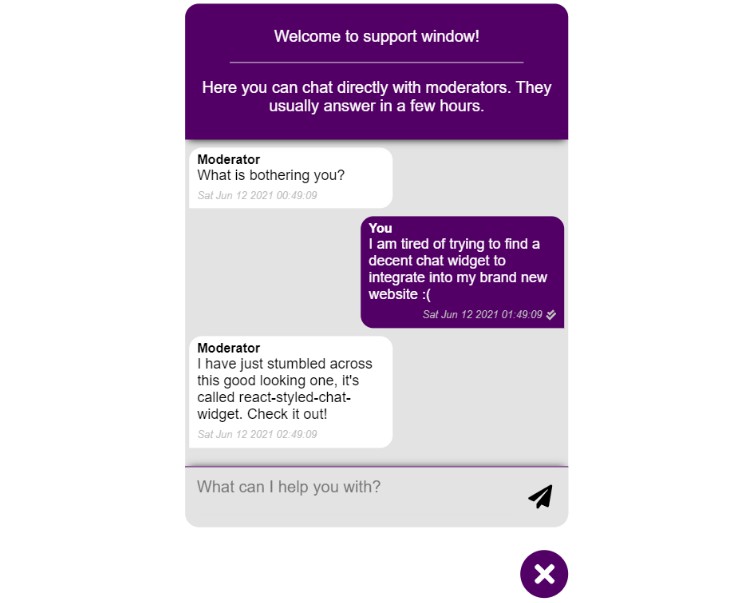
        <p>Welcome to support window!</p>
        <hr/>
        <p>Here you can chat directly with moderators. They usually answer in a few hours.</p>
      </div>
    </ChatWidget>
  );
}

export default App;
Tiny Warning
It's my first ui component released on NPM. So, you may experience some bugs during development even though I didn't find any by myself :)
Chat Widget API
Below you will find all the properties that chat widget accepts. Pay attention to the ones that are marked as required!
Without them widget won't work!
| Property | Type | Required | Default | Example/Description |
|---|---|---|---|---|
| indent | number | no | window.innerWidth * 0.015 | Indent from screen borders for the button that opens widget |
| size | number | no | window.innerWidth * 3 / 100 | Size of the opening button. Percent of the screen width |
| minSize | number | no | 60 | Minimal size of the opening button. Specified in pixels |
| mainContentWidth | number | no | 25 | Width of the whole widget specified in percents of it's corresponding property - screen Width |
| mainContentHeight | number | no | 60 | Height of the whole widget specified in percents of it's corresponding property - screen Height |
| chatOffset | number | no | 10 | When widget is opened, there is a space between it and button. |
| messages | Messages[] |
yes | - | Messages that should be passed according to Messages[] type |
| loading | boolean | yes | - | When loading is true the spinner is shown |
| onMessageSend | MessageSendHandler |
yes | - | Interesting option. This function gets invoked when message appears on the screen, but let's say "has not been saved in your db yet". So, calling setDeliveryStatus which comes as a second argument you are able to toggle "delivery check mark" on. |
| onSendClick | SendClickHandler |
yes | - | Event handler that gets invoked when user smashes send button |
| primary | color code | no | gray | Sets background color of widget |
| secondary | color code | no | purple | Color of the stroke at the top of textarea |
| defaultPosition | "topLeft" "topRight" "bottomLeft" "bottomRight" |
no | "bottomRight" |
Default position of the chat opening button |
| isDraggable | boolean | no | true | Here it comes, draggable chat opening button. Yes, chat widget is draggable by it's button. You can turn it off by setting this property to false, otherwise users will play with this widget forever. Is it cool or not, idk, you decide :) |
| spinner | JSX.Element |
yes | - | Component that is shown while loading option is true |
| primaryAuthorNameColor | color code | no | white | Author thumb color of sender |
| secondaryAuthorNameColor | color code | no | black | Author thumb color of "moderator" |
| primaryMessageBackground | color code | no | purple | BG of sender's messages |
| secondaryMessageBackground | color code | no | white | BG of moderator's messages |
| primaryMessageTextColor | color code | no | white | Text color for sender |
| secondaryMessageTextColor | color code | no | black | Text color for moderator |
| buttonBackground | color code | no | purple | BG of the opening button |
| buttonTextColor | color code | no | white | Text color of the opening button |
| placeHolder | string | no | What can I help you with? | Textarea placeholder |
| greeting | string | no | Feel free to ask anything you want to! | Placeholder in case messages property is an empty array! |
| sendButton | JSX.Element |
no | Cool icon there | You can replace send button to your own component. All the event handlers will be binded automatically |
| backgroundClassName | string | no | - | You can assign your custom classname in case you want to customize bg |
| inputContainerClassName | string | no | - | Textarea container classname for customization |
| buttonClassName | string | no | - | Opening button classname for customization purposes |
