Supercons
A friendly set of open source React icons.

Usage
yarn add supercons
# npm i supercons
import React from 'react'
import Icon from 'supercons'
export default () => (
<div style={{ color: 'magenta' }}>
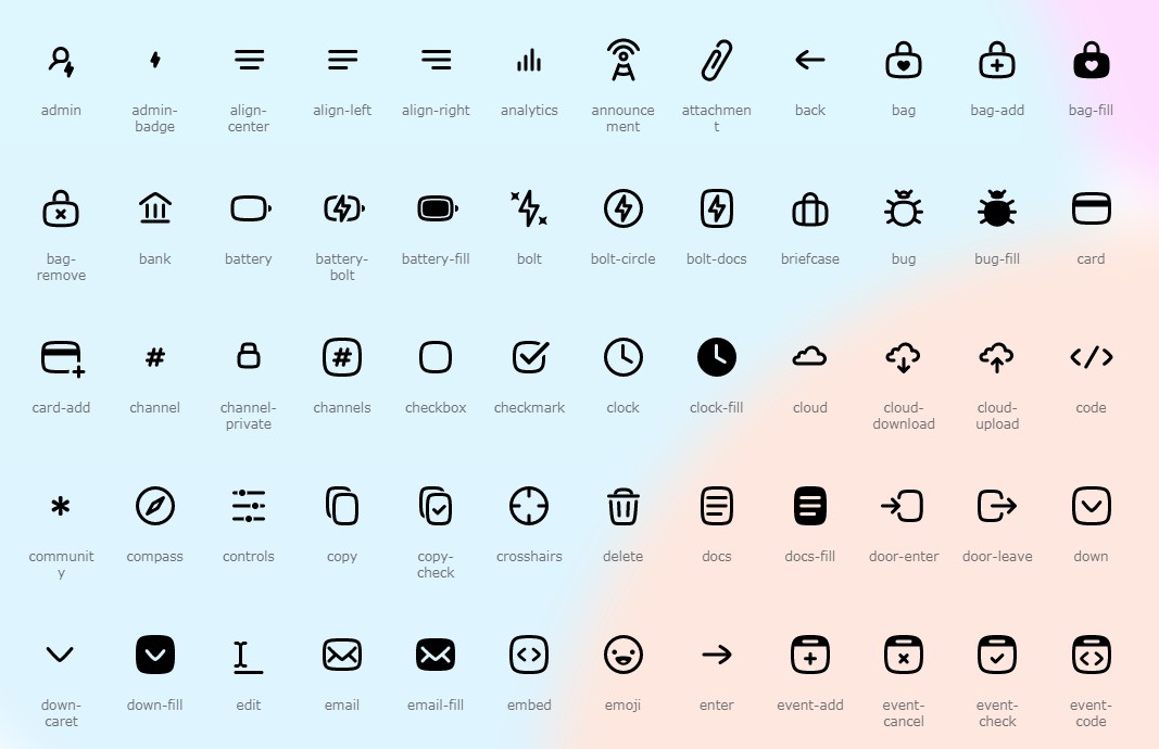
<Icon glyph="like" size={128} />
<Icon glyph="cloud" size={32} />
</div>
)
Built with/supports TypeScript.
Props
| Prop | Type | Default | Details |
|---|---|---|---|
glyph |
String, required | like |
See [docs] |
size |
Number or string | 32 |
Sets width & height |
as |
React component | svg |
Must render svg tag |
You can also pass any other props. Remember to make your icons accessible with aria-label or title, use aria-hidden if they’re purely decorative, etc.
Development setup
- Clone & enter the repo.
$ git clone https://github.com/lachlanjc/supercons.git
$ cd supercons
- Install dependencies.
$ yarn
- Run docs locally.
yarn run dev
- After making changes to icons, build the library.
yarn run prepare
To-do list
- [x] Drop PropTypes for TypeScript (thanks @anirudhb!)
- [x] Use Microbundle for build
- [ ] Allow tree-shaking by programatically generating a component for each icon
- [ ] Forward refs (with proper TypeScript support)
- [ ] Add more icons