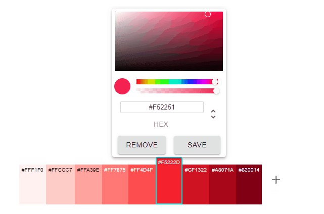
React-Color-List
A color list manager for React.

Installation
React-Color-List is available as an npm package.
// with npm
npm install react-color-list
Usage
import React, { useState } from "react"
import ColorList from "react-color-list"

function App() {
const [colors, setColors] = useState(["#bf4040","#ab3f3f","#9f3737","#8d3434","#812929"])

return <ColorList colors={colors} colorFormat="hex" onChange={(c) => setColors(c)} />
}
Props
| Hello | Type | Required? | Default | Description |
|---|---|---|---|---|
| colors | array of colors | required | none | Colors displayed by list |
| onChange | function | required | none | New list of colors and event that triggered change |
| colorFormat | "hex"| "rgb" |"hsl" |
optional | "hex" |
Format of colors in colors array |
| defaultColor | string color in same format as those in colors array | optional | White | The default color for new colors added |
| disableAlpha | bool | optional | false | Whether alpha slider should be visible |
| maxColors | positive integer | optional | Infinity | Max number of colors that can be added to list |
| minColors | positive integer | optional | 0 | Min number of colors that can be in the color list |
| onMaxColorsReached | function | optional | none | Function that is called when user has attempted to add more than max number of colors |
| onMinColorsReached | function | optional | none | Function that is called when user has attempted to remove more than min number of colors |
| shouldAnimate | bool | optional | true | If the color swatches should animate in |
| animationLength | double | optional | 0.1 | Seconds for each swatch to animate in |
| animationOffset | double | optional | 0.05 | Seconds between start of each swatch animation |
| loadFromLeft | bool | optional | false | If new colors should be added to left side (at index 0) |
| flipAddButton | bool | optional | false | If add color button should be flipped to left side |
| popoverProps | object | optional | none | Props supplied to MUI Popover |
| containerProps | object | optional | none | Props supplied to list container, |
| className | string | optional | none | Class name supplied to list container |
| swatchLabelProps | object | optional | none | Props supplied to swatch label |
| removeButtonProps | object | optional | none | Props supplied to MUI Button for removing |
| saveButtonProps | object | optional | none | Props supplied to MUI Button for saving |
| saveButtonProps | object | optional | none | Props supplied to MUI IconButton for adding |
| swatchLabelColor | function | optional | black/white inverse | Color of swatch label in any format (hex, rgb, etc) |
| swatchActiveBorderColor | function | optional | inverse | Color of swatch border when swatch is active in any format (hex, rgb, etc) |
| AddButton | Element | optional | none | Button replacement for adding color that takes prop addColor function |
| RemoveButton | Element | optional | none | Button replacement for removing colors that takes prop removeColor function |
| SaveButton | Element | optional | none | Button replacement for saving colors that takes prop saveColor function |
Examples
import React, { useState } from "react"
import ColorList from "react-color-list"

function App() {
const [colors, setColors] = useState(["rgba(191,64,64,.5)","rgba(171,63,63,.6)","rgb(159,55,55)","rgb(141,52,52)","rgb(129,41,41)"])

return <ColorList colors = {colors} colorFormat = "rgb" onChange = {(c)=>setColors(c)} loadFromLeft flipAddButton maxColors = {10} minColors = {2} defaultColor="rgb(255,255,0)"/>
}
import React, { useState } from "react"
import ColorList from "react-color-list"

function App() {
const [colors, setColors] = useState(["#bf4040","#ab3f3f","#9f3737","#8d3434","#812929"])

return <ColorList colors={colors} colorFormat="hex" disableAlpha  maxColors={6} onMaxColorsReached={(num) = alert("Reached Max of " + num)} className="container"
onChange={(c, e) => {
	setColors(c)
	alert(e)
}}
AddButton={
({ addColor }) => {
	return <button onClick={() => addColor()}>Fancy Add Button</button>
}}
/>
}