react-aria-tabpanel
A React component that helps you build accessible tabs, by providing keyboard interactions and ARIA attributes described in the WAI-ARIA Tab Panel Design Pattern.
Project Goal
A React component that provides a style- and markup-agnostic foundation for fully accessible tab panels. You provide the inner elements: this module gives you "smart" wrapper components that will handle keyboard interactions and ARIA attributes.
If you think that this component could be even more accessible, please file an issue.
If you like this kind of module (accessible, flexible, unstyled, with framework-agnostic low-level modules) you should also check out these projects:
react-aria-modal
react-aria-menubutton
Installation
npm install react-aria-tabpanel
Dependencies:
- react 0.14.x
- react-dom 0.14.x
- focus-group
The modular approach of this library means you're much better off building it into your code with a module bundling system like browserify or webpack.
But if you need a UMD version (which will include focus-group, but of course not React), you can get it via npmcdm at https://unpkg.com/react-aria-tabpanel@[version-of-choice]/umd/ariaTabPanel.js.
If you don't know about unpkg, read about it here.
Usage
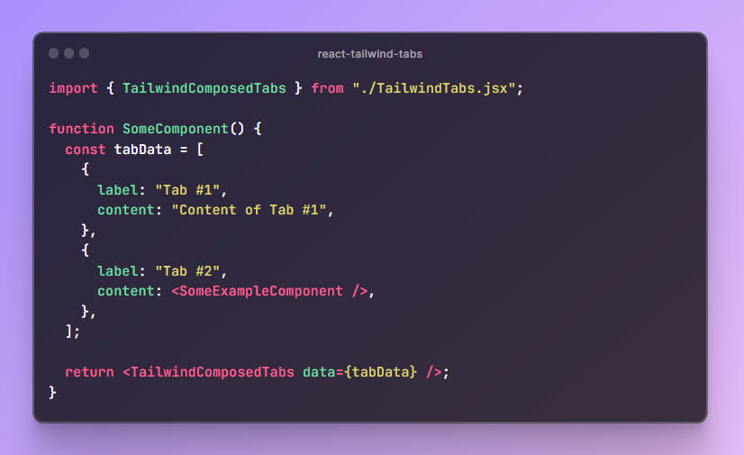
var AriaTabPanel = require('react-aria-tabpanel');

// Now use AriaTabPanel.Wrapper, AriaTabPanel.TabList,
// AriaTabPanel.Tab, and AriaTabPanel.TabPanel ...
Examples
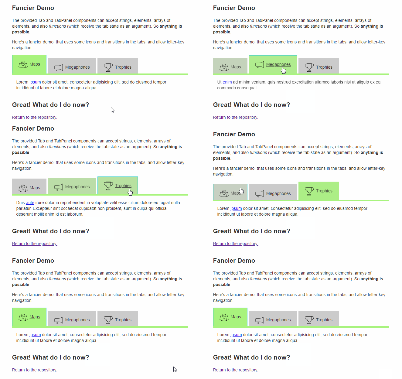
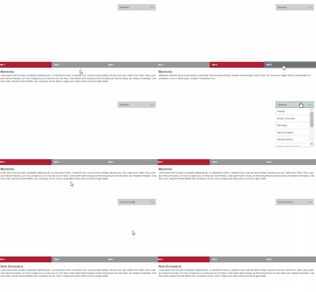
Have a look at the code in demo/js/ for varied examples.
API
The AriaTabPanel object exposes four components: Wrapper, TabList, Tab, and TabPanel. Each of these is documented below.
TabList, Tab, and TabPanel must always be wrapped in a Wrapper.
Wrapper
A simple component to group a TabList/Tab/TabPanel set, coordinating their interactions.
It should wrap your entire tab panel widget.
All TabList, Tab, and TabPanel components must be nested within a Wrapper component.
Each wrapper should contain only one TabList, multiple Tabs, and multiple TabPanels.
props
All props are optional.
onChange { Function }: A callback to run when the user changes tabs (i.e. clicks a tab or navigates to another with the arrow keys). It will be passed the the newly activated tab's ID.
By default, the tabs maintain state internally. Use this prop to make the tabs "stateless," and take control yourself. You can run any arbitrary code when the user performs an action that indicates a tab change (e.g. change your route and update a store, etc.).
Stateless tabs may make sense if you want to manage the tab's state in a Redux store, for example.
letterNavigation { Boolean }: If true, the tabs can be navigated not
only by arrow keys, but also by letters. This library uses
focus-group, so you
can read about how letter-key navigation in that module's "String Searching" docs.
activeTabId { String }: Directly tell the tabs which one is active. By default, the first tab provided will be the initially active tab, and from then on the active tab state is managed internally. This prop, then, can be used two ways:
- to give the tabs an initial active tab other than the first, or
- if you have seized control of the state (via an
onChangefunction), to continuously tell the tabs which one is active.
tag { String }: The HTML tag for this element. Default: 'div'.
Any additional props (e.g. id, className, data-whatever) are passed directly to the HTML element.
TabList
Wrap the Tabs with a TabList.
A TabList's children should be React elements.
props
All props are optional.
tag { String }: The HTML tag for this element. Default: 'div'.
Any additional props (e.g. id, className, data-whatever) are passed directly to the HTML element, unless TabList needs them itself.
Tab
The active tabs is focusable. Inactive tabs are not.
You can switch from one tab to another by clicking with the mouse or using the arrow keys.
A Tab's children may be any of the following:
- A string
- A React element
- A function accepting the following tab-state object:
{
  isActive: Boolean // self-explanatory
}
props
All props are optional except id.
id { String } Required. The id attribute for this element and the
identifier that ties this Tab to its TabPanel
(so there should be a TabPanel component with a matching tabId).
active { Boolean }: If you are controlling the state yourself (with an onChange function on your Wrapper),
use this prop to tell the Tab whether it is active or not.
letterNavigationText { String }: If you are using letter-key navigation
(having turned it on via the prop on Wrapper), you
can use this prop to specify this Tabs's searchable text.
By default, the element's textContent is used — which is
usually what you want.
tag { String }: The HTML tag for this element. Default: 'div'.
Any additional props (e.g. className, data-whatever) are passed directly to the HTML element, unless Tab needs them itself.
TabPanel
The content area for your tabs. The active tab panel is visible; the inactive tab panels are not.
A TabPanels's children may be any of the following:
- A string
- A React element
- A function accepting the following panel-state object:
{
  isActive: Boolean // self-explanatory
}
props
All props are optional except tabId.
tabId { String }: Required. The id of the Tab that corresponds
to this TabPanel.
active { Boolean }: If you are controlling the state yourself (with an onChange function on your Wrapper),
use this prop to tell the TabPanel whether it is active or not.
tag { String }: The HTML tag for this element. Default: 'div'.
Any additional props (e.g. className, data-whatever) are passed directly to the HTML element, unless TabPanel needs them itself.
Contributing & Development
Please note that this project is released with a Contributor Code of Conduct. By participating in this project you agree to abide by its terms.
Lint with npm run lint.
Test with npm run test-dev, which will give you a URL to open in your browser. Look at the console log for TAP output.


