react-diff-view
A git diff component to consume the git unified diff output.
Overview
Split view
Unified view
Optimized selection
Full features
- A clean and small core to display diff.
- Support split (side by side) and unified (one column) views.
- Tolerable performance.
- Configurable column diffs.
- Code select and highlight.
- Extensible widget architecture to support code commenting and various requirements.
- External syntax highlight support in an easy way.
- Customizable events and styles.
- A bunch of utility function to manipulate diff structure if source text is provided.
Run npm start to enjoy a full featured demo with diff display, collapsed code expansion, code comment and large diff lazy load.
You can modify the small.diff to large.diff in demo/App.js to test the performance, the large.diff is a 2.2MB diff file with 375 files changed, 18721 insertions(+), 35671 deletions(-), it can possibly hung your computer so use it in caution.
In my laptop (MacBook Pro 15-inch 2016, 2.6 GHz Intel Core i7, 16 GB 2133 MHz LPDDR3) it performs quite slow but tolerable:
parse: 88.73291015625ms
render: 26072.791015625ms
paint: 6199.848876953125ms
Install
npm install --save react-diff-view
Basic usage
Parse diff text
For best display effect, you should generate your diff text with git diff -U1 command.
The {File[] parseDiff({string} text, {Object} [options]) named export is a wrap of gitdiff-parser package with some extra options:
{boolean} stubHunk: Whether to add a stub empty hunk at the tail of each hunk list, this can provide an extra hunk header when customizing hunk header, for example, to expand code after the diff.{string} nearbySequences: The action to take when meet nearby sequences, only the"zip"value has its own behavior.
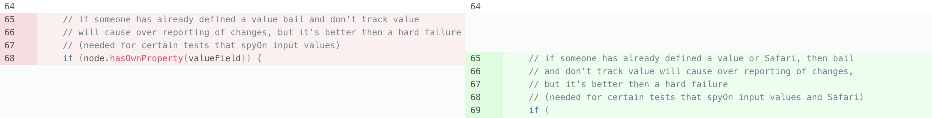
The nearbySequence can have a value of "zip" to "zip" a sequences of deletion and additions, as an example, here is a diff generated from react:
-    // if someone has already defined a value bail and don't track value
-    // will cause over reporting of changes, but it's better then a hard failure
-    // (needed for certain tests that spyOn input values)
-    if (node.hasOwnProperty(valueField)) {
+    // if someone has already defined a value or Safari, then bail
+    // and don't track value will cause over reporting of changes,
+    // but it's better then a hard failure
+    // (needed for certain tests that spyOn input values and Safari)
This is the normal behavior, which will displaed as 3 lines of deletion, 1 line of modification and 3 lines of addition:
When the value "zip" is passed, the diff will be modified to:
-    // if someone has already defined a value bail and don't track value
+    // if someone has already defined a value or Safari, then bail
-    // will cause over reporting of changes, but it's better then a hard failure
+    // and don't track value will cause over reporting of changes,
-    // (needed for certain tests that spyOn input values)
+    // but it's better then a hard failure
-    if (node.hasOwnProperty(valueField)) {
+    // (needed for certain tests that spyOn input values and Safari)
and as a result rendered as:

Sometimes it can provide a better look.
Render diff hunks
The Diff named export is a component which accepts a diff file object and correctly display it in either unified or split view, here is the full list of its props:
{Hunk[]} hunks: The hunks of diff, simply get it from theparseDiffoutput.{ReactElement[]} children: Instead of passing a list of hunks, you can make each hunk a more customizableHunkcomponent, see Customize hunk header section or its use case.{string} viewType: Can be either"unified"or"split"to determine how the diff should look like.{string} className: An extra css class.{Object} customEvents: An object containing events for different part, see Customize events section for detail.{Object} customClassNames: An object containing css classes for different part, see Customize styles section for detail.{string[]} selectedChanges: An array of selected changes's key, these changes will be highlighted.{Function} markEdits: A function to mark edits between old and new content, see Mark column edits section for detail.{Function} onRenderCode: Callback when code is rendered, can be used to further manipulate the DOM element containing code, see Syntax highlight section for detail.{Object} widgets: An object of{changeKey: element}to render widget for changes, see Add widgets section for detail.Function generateAnchorID: A function to generate a DOMidattribute for each change, this function receives achangeobject as the only argument and should return either a string orundefined, ifundefinedis returned noidattribute will be placed on DOM. Theidattribute will be placed on the gutter<td>element, for normal changes in split mode, only the left side gutter will have theidattribute.{boolean} gutterAnchor: Whether to create an<a>element in gutter so user can click gutter to scroll to corresponding line,generateAnchorIDprop must be specified if this prop istrue.{boolean} hideGutter: Whether to hide gutter (line number) columns.{boolean} optimizeSelection: Whether to optimize selection to a single column, when this prop is set totruein split mode, user can only select code from either old or new side, this can help copy and paste lines of code. This feature can cause some performance dropdown when the diff is extremely large, so it is turned off by default.
A basic use case is to pass hunks and viewType prop to Diff component, the diff will be rendered:
import {parseDiff, Diff} from 'react-diff-view';

const App = ({diffText}) => {
    const {files} = parseDiff(diffText);

    return (
        <div>
            {files.map(({hunks}, i) => <Diff key={i} hunks={hunks} viewType="split" />)}
        </div>
    );
};
This will render diff in a default split (side by side) view.
Key of change
In selectedChanges and widgets props the key of change is used to match a specific change, a change's key is simply a string computed by the following rules:
if (change.type === 'insert') {
    return 'I' + change.lineNumber;
}
else if (change.type === 'delete') {
    return 'D' + change.lineNumber;
}
else {
    return 'N' + change.oldLineNumber;
}
You are not required to compute this key yourself, the getChangeKey(change) exported function will do it.
Advanced
Customize hunk header
Sometimes you need to add functions to hunks, for example, to load collapsed code between 2 hunks, this can be archived with several steps:
- Instead of passing the
hunksprop, map each hunk to aHunkcomponent and pass it as children ofDiff. - Customize your
headerprop forHunkcomponent.
The Hunk named export is a component representing a hunk of diff, each hunk accepts a header prop with possible different types of values:
undefined: ThenHunkwill append a default header containing the content of hunk.null: Header will be removed completely.- A single react element: this will be rendered in the entire row.
- An array containing two react elements: The first element will be rendered in gutter position, the second will be rendered in code position.
When using hunks as children, you are not required to pass extra props such as viewType or customEvents to Hunk component, these props will be passed by Diff component, the only reason you build your own children is to add the header prop:
import {parseDiff, Diff, Hunk} from 'react-diff-view';

const renderHunk = hunk => {
    // Only render in the code section
    const header = [null, `${hunk.changes} changes below`];

    return <Hunk key={hunk.content} hunk={hunk} header={header} />;
};

const App = ({diffText}) => {
    const {files} = parseDiff(diffText);

    return (
        <div>
            {files.map(({hunks}, i) => <Diff key={i} viewType="split">{hunks.map(renderHunk)}</Diff>)}
        </div>
    );
};
Mark column edits
The term "column edits" stands for highlighted areas on a modified line, they are usually produced by further comparing the old and new line content.
To mark edits between changes, you can provide the markEdits function prop to Diff component, this function receives two changes and returns a tuple (array) of [Edit[], Edit[]], the first element is edits for the old change, the second element is for the new change.
A edit is simply an array with two numbers [startIndex, length], the first element is the start index in original text, the second number represents the length of this edit.
For example, we have a string "This is a good day" and two edits [5, 2] and [10, 4] as input, the result would be:
This <mark class="diff-code-edit">is</mark> a <mark class="diff-code-edit">good</mark> day
The markEdits function MUST comply with some extra restrictions:
- Either
oldChangeornewChangecan be null, you should check for it. - The return value cannot be null, it must be an array with two arrays, neither
nullor[null, null]is accepted, for the result of "no edit", just return[[], []]instead. - Edits must be sorted by
startIndex. - Edits cannot be overlapped with each other, the value
[[1, 3], [2, 3]]can result undefined behavior.
react-diff-view is shipped with 2 built-in markEdits functions, they are:
{Function} markWordEdits({Object} options)to diff two strings word by word.{Function} markCharacterEdits({Object} options)to diff two string character by character.
They both accept a options object with following properties:
{number} threshold: The maximum string distance when this function should try to mark edits, if two string's distance is greater than it, edits marking is disabled, the default value isInfinity.{boolean} markLongDistanceDiff: If istrue, two strings with distance greater thanthresholdwill create an edit containing the whole string, the default value isfalse.
For example, the following code asks the Diff component to compare old and new content word by word when their distance is shorter than 30, if the content's distance is longer than 30, the entires line is marked:
import {Diff, markWordEdits} from 'react-diff-view';

const markEdits = markWordEdits({threshold: 30, markLongDistanceDiff: true});

<Diff markEdits={markEdits} />
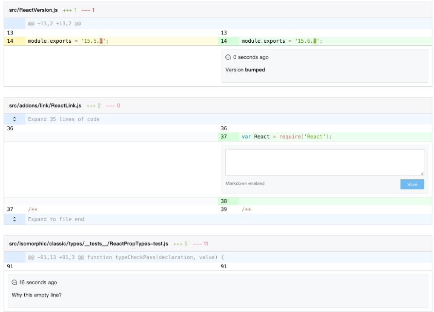
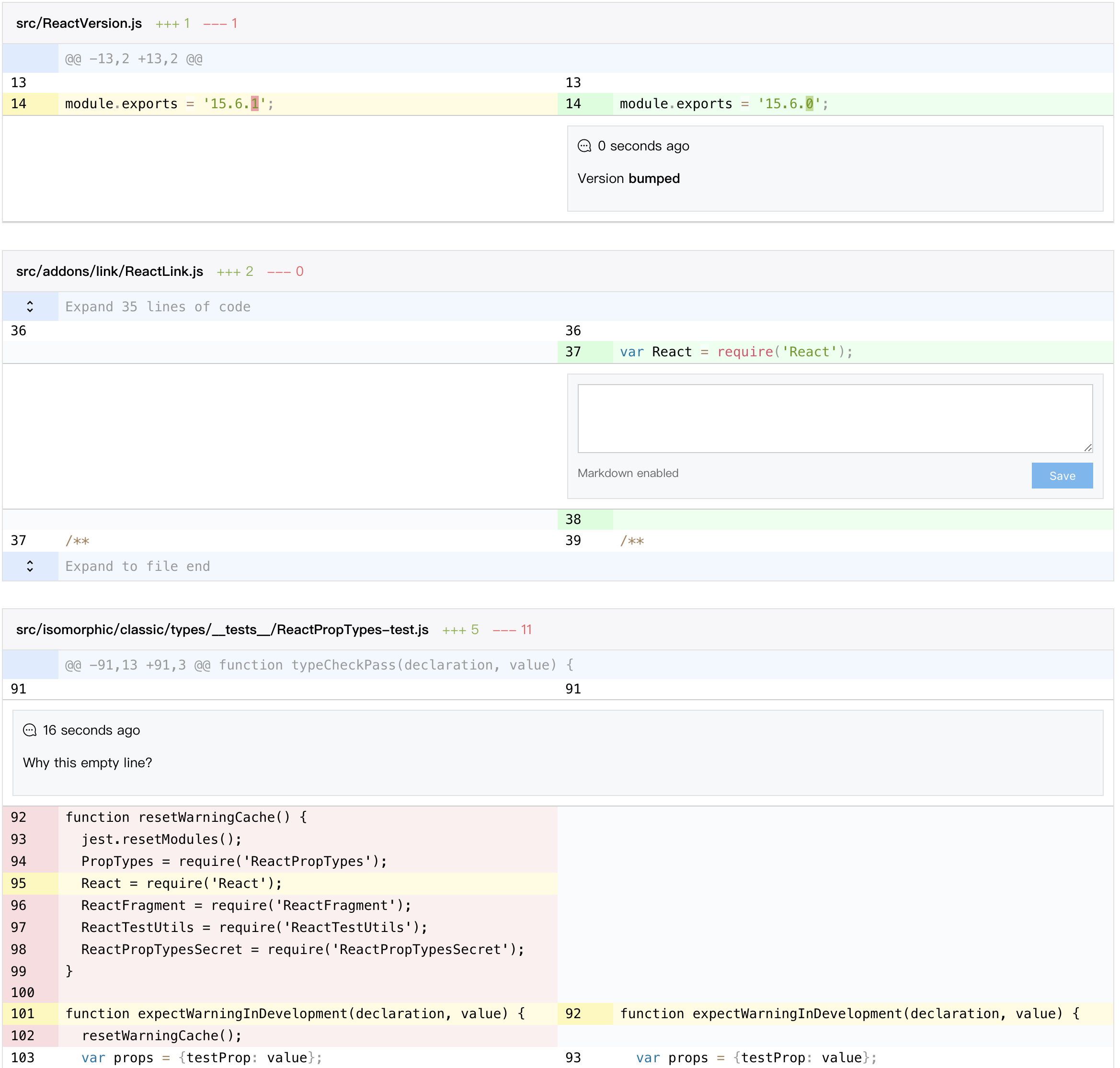
Add widgets
In some cases we need functions like commenting on change, react-diff-view provides an extensible solution called widget to archive such senarios.
A widget is any react element bound to a change object, a widget is configured in an object with change and element property, when rendering diff changes, if there is a widget object with the same change object, the element will be rendered below the line of code.
In split view a widget will be rendered to its corresponding side if change object is of type addition or deletion, otherwise the widget will be rendered across the entire row.
Note although the widgets prop is of type array, each change can only render one widget, so if there are entries with the same change property, only the first one will be rendered.
Here is a very basic example which adds a warning text on long lines:
import {parseDiff, getChangeKey, Diff} from 'react-diff-view';

const getWidgets = ({hunks}) => {
    const changes = hunks.reduce((result, {changes}) => [...result, ...changes], []);
    const longLines = changes.filter(({content}) => content.length > 120);
    return longLines.reduce(
        (widgets, change) => {
            const changeKey = getChangeKey(change);

            return {
                ...widgets,
                [changeKey]: <span className="error">Line too long</span>
            };
        },
        {}
    );
};

const App = ({diffText}) => {
    const {files} = parseDiff(diffText);

    return (
        <div>
            {files.map(({hunks}, i) => <Diff key={i} hunks={hunks} widgets={getWidgets(hunks)} viewType="split" />)}
        </div>
    );
};
For a more complex case, you can reference the example in demo/File.js about implementing code comments with the widgets prop.
Customize styles
The basic theme of react-diff-view is simply "picked" from github, with some additional colors for column diffs, the style is bundled with js using style-loader by default, if you want to separate the style, you can build it from the src folder, webpack's resolve.aliases configuration can help to archive this.
You can override styles on certian css classes to customize the appearance of react-diff-view, here is a list of css classes generated by component:
diff: The diff container, a<table>element.diff-gutter-col: The<col>element to control the gutter column.diff-hunk: The<tbody>element representing a diff hunk.diff-hunk-header: The<tr>element reprensenting the hunk's header.diff-hunk-header-gutter: The<td>element corresponding to gutter within hunk header.diff-hunk-header-content: The<td>element corresponding to code content within hunk header.diff-gutter: The<td>element containing the line number.diff-gutter-normal: Gutter of a normal change.diff-gutter-add: Gutter of an addition.diff-gutter-del: Gutter of a deletion.diff-gutter-omit: Gutter with no content.diff-gutter-selected: Gutter of a selected change.diff-line: The<tr>element for a diff line.diff-line-old-only: The<tr>element which only contains the left side columns, appears in split viewdiff-line-new-only: The<tr>element which only contains the right side columns, appears in split viewdiff-code: The<td>element containing code.diff-code-normal: Code of a normal change.diff-code-add: Code of an addition.diff-code-del: Code of a deletion.diff-code-omit: Code with no content.diff-code-selected: Code of a selected change.diff-code-edit: Edits on a line of code.diff-widget: The<tr>element to render widget.diff-widget-content: The<td>element to render widget content.
You can pass the className prop to a Diff component to add a custom class to the <table> element.
The Diff component also accepts a customClassNames prop which contains custom css classes for a different part, it can be an object with multiple keys: hunk, hunkHeader, gutterHeader, codeHeader, line, gutter, code. Each value can be a string, and the value will be appended to corresponding part's className prop.
Customize events
You can pass a customEvents object to a Diff component to add events to different parts. The accepted keys are gutterHeader, codeHeader, gutter and code. Each value is an object containing DOM events key/value pair.
One of the common cases for customEvents is to add code selecting functionality. This can be archived simply by passing an onClick event to gutter and manipulating the selectedChanges prop:
import {PureComponent} from 'react';
import {bind} from 'lodash-decorators';
import {Diff} from 'react-diff-view';

class File extends PureComponent {
    state = {
        selectedChanges: [],
        customEvents: {
            gutter: {
                onClick: this.selectChange
            }
        }
    };

    @bind()
    selectChange(change) {
        const {selectedChanges} = this.state;
        const selected = selectedChanges.includes(change);
        this.setState({selectedChanges: selected ? without(selectedChanges, change) : [...selectedChanges, change]});
    }

    render() {
        return <Diff {...this.props} {...this.state}>;
    }
}
customEvents can also be utilized to add a comment or expand collapsed code, see demo/File.js for more implementation details.
Syntax highlight
As a minimum core component, react-diff-view itself does not provide any highlight functions, however the onRenderCode prop will be called each time a line of code is rendered, this can be used to enable code highlight.
The onRenderCode callback prop receives two elements: a <td> DOM element and its corresponding change object, the code is already rendered in the <td> element, you can simply call any syntax highlight library to highlight the code.
Note if columnDiff is enabled, there may be multiple <span> elements in <td> to highlight column differences, your syntax highlight library may stripped out all of them. Here we recommend Prism as the syntax highlighting library, combining with its keep-markup plugin the column difference can be preserved perfectly.
Another problem is most syntax highlighting library requires a css class on the container element, this can be solved by adding the code property in customClassNames prop, a very simple example could be:
import {PureComponent} from 'react';
import parsePath from 'path-parse';
import {languages} from 'lang-map';
import {bind} from 'lodash-decorators';
import {Diff} from 'react-diff-view';
// Create your custom bundle of Prism with keep-markup plugin enabled
import Prism from './3rd/prism';
import './3rd/prism.css';

const highlight = element => Prisim.highlightElement(element);

class File extends PureComponent {
    state = {
        selectedChanges: [],
        customEvents: {
            code: {
                onClick: highlight
            }
        }
    };

    @bind()
    selectChange(change) {
        const {selectedChanges} = this.state;
        const selected = selectedChanges.includes(change);
        this.setState({selectedChanges: selected ? without(selectedChanges, change) : [...selectedChanges, change]});
    }

    render() {
        const {from, to} = this.props;
        const filename = to === '/dev/null' ? from : to;
        const {ext = ''} = parsePath(filename);
        const [language] = languages(ext);
        const classNames = {
            code: `language-${language || 'unknown'}`
        };
        return <Diff {...this.props} {...this.state} customClassNames={classNames}>;
    }
}
Utilities
react-diff-view comes with some utility functions to help simplify common issues:
{Hunk[]} addStubHunk({Hunk[]} hunks): Adds a stub hunk (with no actual changes) to the end ofhunks, this is useful when you want to expand code after the last line of diff.{number} computeOldLineNumber({Change} change): Compute the line number in old revision for a change, returns-1on insert changes.{number} computeNewLineNumber({Change} change): Compute the line number in new revision for a change, returns-1on delete changes.{Hunk} textLinesToHunk({string[]} lines, {number} oldStartLineNumber, {number} newStartLineNumber): Create a hunk with all normal changes, this is useful when expanding code between two hunks.{Hunk[]} insertHunk({Hunk[]} hunks, {Hunk} insertion): Insert a new hunk into the original list, it will merge sibling hunks if possible, useful for expanding code.{number} computeCorrespondingOldLineNumber({Hunk[]} hunks, {number} newLineNumber): Get the corresponding old line number by a line number on the new side. This function returns-1when no corresponding line exists (pure insert and delete changes).{number} computeCorrespondingNewLineNumber({Hunk[]} hunks, {number} oldLineNumber): Opposite tocomputeCorrespondingOldLineNumberfunction.{Change} findChangeByOldLineNumber({Hunk[]} hunks, {number} oldLineNumber): Find the change by a line number on the old side, if none is found, returnsundefined.{Change} findChangeByNewLineNumber({Hunk[]} hunks, {number} newLineNumber): Opposite tofindChangeByNewLineNumberfunction.{number} getCollapsedLinesCountBetween({Hunk} previousHunk, {Hunk} nextHunk): Get the count of collapsed line between given sibling hunks.
Enjoy more with raw text provided
Once you can provide a rawCodeOrLines object (which can be a string, or an array of lines of code), there are many more utility function you can use to help organize hunks:
{Hunk[]} expandFromRawCode({Hunk[]} hunks, {string|string[]} rawCodeOrLines, {number} start, {number} end): Create a hunk from source code slicing fromstarttoend, then insert this hunk intohunks, merging with existing hunks are automatically done.{Hunk[]} addStubHunk({Hunk[]} hunks, {string|string[]} referenceRawCodeOrLines): This is an overload ofaddStubHunkfunction, once you provide the secondreferenceRawCodeOrLines, the stub hunk will only be appended when there is more code after the last hunk.{Hunk[]} expandCollapsedBlockBy({Hunk[]} hunks, {string|string[]} rawCodeOrLines, {Function} predicate): Iterate over all collapsed block (lines between 2 hunks) and expand those withpredicatereturnstrue. Thepredicatefunction receives({number} lines, {number} oldStart, {number} newStart)as arguments.
Unsupported
Wordwrap
No, there isn't a wordwrap configuration. Lines are automatically wrapped by default, and it is almost impossible to implement other wrap styles, unless we choose table-layout: auto which critically hinders the performance.
Any solutions for this issue are welcome.
Test
I don't really know how to test such a complicated and UI centric component, any help is welcome.