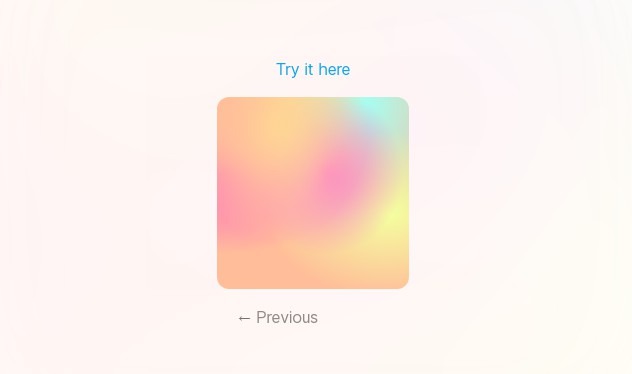
searchpal (search palette)
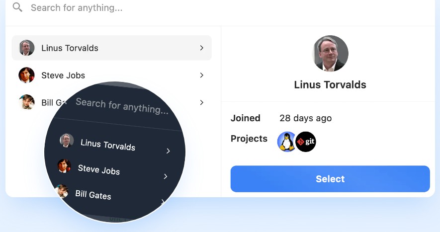
Simple, good lookin’ & customizable. Autocomplete, search previews & more. Set search function to find exact and/or fuzzy matches.
Screenshots

Pass in your own light & dark shades ?

Getting Started
Installation
Get started by installing the npm package:
npm i searchpal
Then you can import the components & types within your React application:
import { Search, Option, Detail } from "searchpal";
Peer Dependencies
Alongside react and react-dom, the only other peer dependency is styled-components. If you currently have any of those packages installed, the minimum versions compatible with searchpal are:
| Package | Min Version |
|---|---|
| react | 16.8 |
| react-dom | 16.8 |
| styled-components | 4.0 |
Basic Usage
Simply import the Search & Option components. Add a few required props to the Search: open and onClose. Map out your options as children, each option only requiring a label. Provide each option with some keywords utilizing a built-in keyword filterer & interpreter:
import { Search, Option, Detail } from "searchpal";

const UsersSearch = ({ users, session }) => {
  const [open, setOpen] = useState(false);

  return (
    <>
      <button onClick={() => setOpen(true)}>Search for a user</button>
      <Search
        label="Search for a user..."
        open={open}
        onClose={() => setOpen(false)}
        link={({ href, children }) => <a href={href}>{children}</a>}
      >
        {users.map((user) => (
          <Option
            label={user.name}
            sublabel={user.email}
            img={{ src: user.avatar, alt: `${user.name} profile picture` }}
            href={`/users/${user.id}`}
            keywords={(getKeywords) =>
              getKeywords(
                user.email,
                user.social && user.social.handle,
                user.organizations.map((org) => [
                  org.name,
                  org.locations.map((location) => [
                    location.city,
                    location.state,
                  ]),
                ])
              )
            }
            key={user.id}
          >
            <Detail label="Joined" value={user.joined} />
            {user.organizations.length && (
              <Detail
                label="Organizations"
                value={<Organizations items={user.organizations} />}
              />
            )}
          </Option>
        ))}
      </Search>
    </>
  );
};
Components
Comes with three seperate components which can be used in combination to build out your search palette.
| Search | Option | Detail |
|---|
Search
Import the Search component:
import { Search } from "searchpal";
Search Props
The Search component has tons of props, all offering unique customizations. The only required props are open and onClose. Read all about the props below (sorted by category).
| Prop | Accepts | Default | Description |
|---|---|---|---|
open* |
boolean |
Open/close state of the search modal. Pass through true to open, false to close. |
|
onClose* |
() => void |
Function that flips the open prop to false when a user closes the search modal. |
|
label |
string |
"Search for anything..." |
Label which displays as the search input’s placeholder. Also utilized as an input label (only visible to screen readers). |
algo |
'fuzz', 'exact' or 'combo'What are these? |
'combo' |
Select the search algorithm used to narrow results. Learn more about these algorithms. |
dark |
true, false or 'user'See example |
'user' |
Enforce a specific light / dark mode, or base it on user preference. |
palette |
Palette or Dynamic Palette | View default palette | Configure/customize all colors utilized throughout the component. Accepts a single Palette object, or seperate ones for light & dark modes. |
labels |
Labels | View default labels | All other labels utilized throughout the component can be configured here. With the expecting of the noResults property, all of these are only visible to screen readers. |
startExpanded |
boolean |
false |
Do you want options to be shown when the search query is empty? |
animate |
grow, fade or slide |
slide |
Select the animation utilized when the Search appears/disappears. |
previewBreakpoint |
number |
570 (570px) |
Option previews would take up too much space on mobile devices, so by default they are hidden below 570px. If you’d like to change the breakpoint for this, you can via this prop. |
link |
Link | Custom component used to add anchors/routing to options and options. Note: This will only be utilized if the option is provided an href. |
Search Algorithms
Search comes with two seperate search algorithms (and one combination of the two). You can decide whichever one best suits your use case. See how the seperate algorithms work:
| Algorithm | Demo | Description |
|---|---|---|
exact |
 |
Exclusively searches for exact occurances of shared words between the query/keywords and ranks based on number of occurances. |
fuzz |
 |
‘Fuzzy’ search chunks will split each keyword into seperate, smaller chunks and individually compare them to the query, then compares scores between the options (only showing options within a score within close enough range of the option with the highest score). Essentially, users don’t need to type everything perfectly to see relevant results. |
combo |
 |
Combo initially performs an exact search, and in the event there are no matches, runs a fuzz search. Solid mix of both algos, which is why this is the default search algorithm. |
Color Palette
Customize the Search’s color palette. You’re able to choose between setting a static or dynamic (light/dark) color scheme.
Palette Object
In the Accepts column, Color signifies a valid color value (RGB, RGBA, Hexadecimal, HSL, etc) in the form of a string.
| Key | Accepts | Description |
|---|---|---|
accent |
Color or { color: Color, text: Color } |
Accent color utilized in some places of the modal (primarily buttons). The default overlaid text color is white (#fff). If you want to change the color of overlaid text, pass through an object with the following keys: text (text color) & color (accent color). |
bg |
Color |
Background color of the modal. |
text |
Color |
Color of nearly all text (ignoring text overlaid on accent color) within the modal. |
border |
Color |
Color of borders used throughout modal. |
shadow |
Color |
Shadow color of the modal. |
optionSelected |
Color |
Background color of an option when it is highlighted/selected. |
backdrop |
Color |
Background color of the backdrop overlay. |
Default Palette
By default, the palette is chosen from the dark/light versions below depending on the user’s dark mode preferences. See how to force a singular palette/mode.
{
  light {
    bg: "#fff",
    text: "#27272a",
    border: "#f2f3f6",
    backdrop: "#e5e7eb",
    shadow: "rgba(156,163,175,.2)",
    optionSelected: "#f4f4f5",
    accent: {
      color: "#3b82f6",
      text: "#fff",
    },
  },
  dark: {
    bg: "#1f2937",
    text: "#fff",
    border: "#374151",
    backdrop: "#111827",
    shadow: "rgba(31,41,55,0.8)",
    optionSelected: "#4b5563",
    accent: {
      color: "#3b82f6",
      text: "#fff",
    },
  },
}
Palette Examples
Dynamic Light / Dark
<Search
  dark="user" // Default value, decides light/dark via a media query
  palette={{
    dark: {
      backdrop: "rgba(0,0,0,.5)",
      accent: "#4a8fff",
    },
    light: {
      backdrop: "rgba(180,180,180,.5)",
      accent: {
        color: "#b8d3ff",
        text: "#002663",
      },
    },
  }}
/>
No Dynamic Light & Dark / Static Palette
If you’d like to force light / dark mode, you can either pass a boolean (true or false) through the Search’s dark prop, or pass through a static Palette object. If you choose to use a static Palette and are not using it alongside the dark prop, make sure it is complete and all properties/colors are provided. Otherwise, the missing properties will be pulled from the default palette above (corresponding with the active light/dark mode).
Force light / dark mode:
// Force light mode
<Search dark={false} />
// Force dark mode
<Search dark />
Static / singular Palette:
<Search palette={{ accent: "blue", backdrop: "rgb(0,0,0,.5)" }} />
Labels
Customize aria-labels only visible to screen readers and other text content within the Search.
Label Object
| Key | Accepts | Description |
|---|---|---|
title |
string |
Utilized by the main Search modal as an aria-labeledby, otherwise not visible. |
subtitle |
string |
Utilized by the main Search modal as an aria-describedby, otherwise not visible. |
results |
string |
Used to describe the search results ul element, otherwise not visible. |
noResults |
{ title: string, subtitle: string } |
Message displayed to users when no search results can be found. Also utilized on the search input to describe it’s aria-invalid status to screen readers. |
Default Labels
{
  title: 'Search prompt',
  subtitle: 'Use this dialog to perform a quick search.'
  results: 'Search results',
  noResults: {
    title: 'No results found for query.',
    subtitle: 'Try searching for something else.'
  }
}
Custom Labels Example
<Search
  labels={{
    results: "Matching users",
    noResults: { title: "No users found." },
  }}
/>
Link
Use if you’d like to wrap options/buttons with anchors (<a>) in the event that the Option was provided with an href. As an alternative, you could add an onClick to any Option and include your routing within it.

Link Example
The href will always be a string (if there is no url, your Link component won’t even be called). Make sure to render children!
import Search, { LinkComponent } from "searchpal";
import Link from "next/link";

const Anchor: LinkComponent = ({ href, children }) => {
  return (
    <Link href={href} passHref>
      <a>{children}</a>
    </Link>
  );
};

const SearchLinked = () => {
  return <Search {...props} link={Anchor} />;
};
Link Types
All available for use in your code:
type LinkProps = {
  href: string;
  children: ReactNode;
};

type LinkComponent = FunctionComponent<LinkProps>;
Option
An Option is just a searchable object with extra props for it’s display/action customizations. Import the Option component:
import { Option } from "searchpal";
Option Props
An Option‘s props have some caveats, along with a few features to make things easier for you. Each Option only requires a single prop: label.
| Key | Accepts | Description |
|---|---|---|
label* |
string |
Required string utilized as the primary label for an Option in search results and previews. Does not need to be unique. |
sublabel |
Renderable | Utilized within the preview panel, typically beneath the label. |
keywords |
string[] or Interpreter Function See examples |
Strings used alongside the label when searching options for search results. Accepts an array of strings, or a function which will allow you to access an automatic keyword filterer/interpreter.For more advanced cases in which you’d like to determine keywords via conditional logic, nested-arrays/mappings, inline functions, etc – the auto-interpreter should save you some time (and also make your code cleaner). |
img |
{ src: string; alt?: string } |
Pass through an image associated with the option, as an object with a src and optional alt. By default, it’s displayed in search results and preview panels. Note: Without an alt, images become invisible to screen readers by default. |
onClick |
(e: MouseEvent<HTMLButtonElement>) => void |
Pass through a function which will run when the Option receives one of the following events:
|
href |
string |
Add a direct link to an option in search results and the button in its preview panel. The href prop is only utilized if you’ve provided the parent Search with a custom Link.If you’ve provided an href and a Link, and the user has the Option highlighted in search results, they will also be redirected on Enter. |
cta |
Renderable | Label for button used in the option’s preview panel. Default is 'Select'. |
previewless |
boolean |
Turn off the preview panel for an Option. |
media |
Renderable or MediaComponent | Fills in the image/avatar frames on search results and in Option preview panels. |
arrow |
Renderable or ArrowComponent | Replaces the little arrow icon on each option in search results. |
preview |
Renderable or PreviewComponent | Fully replaces the top section of the preview panel. |
Keywords
Each Option will automatically receive the label prop as a keyword, so no need to re-add it. If you’d like to include other keywords, you can utilize keywords in two seperate ways:
Array of Strings
Pass through a simple array of your keywords. Must be strings. Good enough for basic use cases.
<Option
  keywords={[
    user.email,
    ...(user?.social ? [user.social.handle] : []),
    ...(user.organizations
      ? user.organizations.map((organization) => organization.name)
      : []),
  ]}
/>
Keyword Interpreter
The keywords prop can be used to access a filterer/interpreter. All you need to do is pass an inline-function through the keywords props, the interpreter will be available as its only param. Have the inline function return the interpreter with as many arguements as you’d like.
The interpreter accepts anything as a value and will turn it into an array of strings. Nested arrays & functions can all be utilized to generate your keywords array.
<Option
  keywords={(interpret) =>
    interpret(
      user.email,
      // Falsey values auto-filtered
      user.social && user.social.handle,
      // Nested arrays are traversed & filtered
      user.organizations.length &&
        user.organizations.map((organization) => [
          organization.name,
          organization.locations.length &&
            organization.locations.map((location) => [
              location.city,
              location.state,
            ]),
        ]),
      // Functions executed & returns filtered
      () => {
        switch (user.permissions) {
          case "super":
            return "admin";
          case "raised":
            return "moderator";
          default:
            return "customer";
        }
      }
      // ... continue adding as many arguments/keywords as you want!
    )
  }
/>
Note: Only strings will end up in the final array of keywords. Any other received/interpreted values will not end up in the final array of keywords.
Media
Pass through a custom component or element utilized to display an option’s img (or anything you’d like).
| Custom Media | Default Media |
|---|---|
 |
 |
Media Examples
The media prop accepts a simple Renderable object or a custom component constructor.
| Renderable Object |
|---|
import { Option } from "searchpal";

users.map((user) => (
  <Option media={<Avatar img={user.image} name={user.name} />} />
));
|
| Custom Media Component |
|---|
import { Option, MediaComponent } from "searchpal";

const Media: MediaComponent = ({ img, label }) => {
  return (
    <div className="avatar">
      {img ? (
        <img src={img.src} alt={img.alt} />
      ) : (
        <span>{label.charAt(0).toUpperCase()}</span>
      )}
    </div>
  );
};

users.map((user) => <Option media={Media} />);
|
Media Types
The following types are available to you via import from searchpal:
type MediaProps = {
  img?: { src: string; alt?: string }; // Copied from the Option's 'img' prop
  label: string; // Copied from the Option's 'label' prop
  active: boolean; // Whether or not option is selected/highlighted in search results
  hovered: boolean; // Hover state of parent option
  focused: boolean; // Focus state of parent option
};

type MediaComponent = FunctionComponent<MediaProps>;
Note: The active, hovered and focused props will only ever return true if the MediaComponent is utilized within search results.
Arrow
Replace the arrow which appears on each option in search results.
| Custom Arrow | Default Arrow |
|---|---|
 |
 |
Arrow Examples
The arrow prop accepts a simple Renderable object or a custom component constructor.
| Renderable Object |
|---|
import { Option } from "searchpal";

users.map((user) => (
  <Option
    arrow={
      <div className="checkbox">
        {selected.includes(user.id) && <Checkbox />}
      </div>
    }
  />
));
|
| Custom Arrow Component |
|---|
import { Option, ArrowProps } from "searchpal";

const Arrow = ({ checked, focused }: ArrowProps & { checked: boolean }) => {
  return (
    <div
      className={[
        "checkbox",
        checked ? "checkbox-checked" : "checkbox-empty",
        focused ? "checkbox-focus" : "",
      ].join(" ")}
    >
      {checked && <Checkbox />}
    </div>
  );
};

users.map((user) => (
  <Option
    arrow={(props) => <Arrow checked={selected.includes(user.id)} {...props} />}
  />
));
|
Arrow Types
All available to you via import from searchpal:
type ArrowProps = {
  active: boolean; // Whether or not option is selected/highlighted in search results
  hovered: boolean; // Hover state of parent option
  focused: boolean; // Focus state of parent option
};

type ArrowComponent = FunctionComponent<ArrowProps>;
Preview
Customize the option preview which appears on the right-hand side of the Search when an option is selected (on desktop).
| Custom Preview | Default Preview |
|---|---|
 |
 |
Preview Examples
The preview prop accepts a simple Renderable object or a custom component constructor.
| Renderable Object |
|---|
import { Option } from "searchpal";

users.map((user) => (
  <Option
    preview={
      <div className="preview">
        <img src={user.img} className="avatar" />
        <h2>{user.name}</h2>
      </div>
    }
  />
));
|
| Custom Preview Component |
|---|
import { Option, PreviewComponent } from "searchpal";

const Preview: PreviewComponent = ({ img, media, label, sublabel }) => {
  return (
    <div className="preview">
      {(img || media) && (
        <div className="media">{media || (img && <img src={img.src} />)}</div>
      )}
      <div>
        <h2>{label}</h2>
        <span>{sublabel}</span>
      </div>
    </div>
  );
};

users.map((user) => <Option preview={Preview} />);
|
Preview Types
The PreviewComponent‘s media prop is reduced from the object/component you passed through the Option‘s media prop (i.e. if you passed through a custom MediaComponent, you will receive its return as a valid ReactElement). The following types are all available to you via import from searchpal:
type PreviewProps = {
  label: string; // Copied from the Option's 'label' prop
  sublabel?: Renderable; // Copied from Option's 'sublabel' prop
  img?: { src: string; alt?: string }; // Copied from the Option's 'img' prop
  media?: ReactElement; // Reduced from Option's 'media' prop
};

type PreviewComponent = FunctionComponent<PreviewProps>;
Button
Customize the button displayed in an option’s preview panel.
| Custom Button | Default Button (with cta) |
|---|---|
 |
 |
If the Option has an href and you passed through a custom Link component, then your custom button will automatically be wrapped by your Link (essentially, in those circumtances, it is unnecessary to include an href on your custom button).
Button Examples
The button prop accepts a simple Renderable object or a custom component constructor.
| Renderable Object |
|---|
import { Option } from "searchpal";

users.map((user) => (
  <Option
    button={
      <button className="button" onClick={() => message(user.id)}>
        Message {user.name}
      </button>
    }
  />
));
|
| Custom Button Component |
|---|
import { Option, ButtonComponent } from "searchpal";

const Button: ButtonComponent = ({ cta, onClick }) => {
  return (
    <button className="button" onClick={onClick}>
      {cta}
    </button>
  );
};

users.map((user) => (
  <Option
    label={user.name}
    cta={[`Message ${user.name.split(" ")[0]}`, <MessageSvg />]}
    onClick={() => message(user.id)}
    button={Button}
  />
));
|
Button Types
export type ButtonProps = {
  label: string; // Option's label
  onClick?: ClickEventHandler<HTMLButtonElement>; // Taken from Option's 'onClick' prop
  cta: Renderable; // Taken from Option's 'cta' prop, default is "Select"
};
export type ButtonComponent = FunctionComponent<ButtonProps>;
Detail
The Detail component can be used to add a row of info inside an Option‘s preview panel.

Import the Detail component:
import { Detail } from "searchpal";
Detail Usage
Simply import the Detail component an add it as a child to it’s related Option.
import { Option, Detail } from "searchpal";

users.map((user) => (
  <Option label={user.name} key={user.id}>
    <Detail label="Email" value={user.email} />
    {user.organizations && (
      <Detail
        label="Organizations"
        value={<Orgs orgs={user.organizations} />}
      />
    )}
    {user.locations &&
      user.locations.map((location, i) => (
        <Detail label={`Location #${i + 1}`} value={location.city} />
      ))}
  </Option>
));
The Option‘s children are intelligently traversed, so if your use-case requires it you can add Details as subchildren. They will still be included:
users.map((user) => (
  <Option label={user.name} key={user.id}>
    {user.profiles && (
      <>
        {user.profiles.twitter && (
          <Detail label="Twitter" value={user.profile.twitter} />
        )}
        {user.profiles.facebook && (
          <Detail label="Facebook" value={user.profile.facebook} />
        )}
        {user.profiles.github && (
          <Detail label="Github" value={user.profile.github} />
        )}
      </>
    )}
  </Option>
));
Detail Props
Both label and value are required props.
| Prop | Accepts | Description |
|---|---|---|
label* |
string |
The label/descriptor of the detail (left column). |
value* |
Renderable | The value of the detail (right column). |
If you pass value a Renderable object which exclusively contains falsey objects, the Detail might not display (alongside an error). As an example:
<Detail
  label="Sample"
  value={[user?.name && user.name.first, user.verified && <VerifiedIcon />]}
/>
In the event that both of those conditions return false, the Detail cannot be displayed. Internally searchpal runs a check on every Renderable prop and filters out falsey values. If the prop exclusively contains falsey values, it will default to undefined (an error, considering value is required).
What is Renderable?
Needed to come up with an abbreviation as the same type is utilized repeatedly throughout this lib. In general, Renderable signifies all truthy types within ReactNode, or an array of them. Pretty much any object that can be successfully rendered is a Renderable. Acceptable types are:
stringnumberReactElementChunk of JSX:<div>Sample</div>,<>Sample</>,<Sample />, etcfalseGets auto-filtered, exclusively included to allow used of conditionals (&&) without type errors.- Or an
arrayof the above types
Note: If the Renderable prop is required (i.e. the Detail value) and you pass through false or an array of false you will notice errors. We automatically filter falsey values from Renderable props, and in the event that we are leftover with no truthy objects, the required prop will then default to undefined.
Valid Renderable Examples ✅
users.map((user) => (
  <Option
    // String
    sublabel={user.email}
    // ReactElement or Fragment
    sublabel={
      <>
        {user.email}
        {user.emailVerified && <VerifiedIcon />}
      </>
    }
    // Array of Renderables
    sublabel={[user.email, user.emailVerified && <VerifiedIcon />]} // [ReactElement, ReactElement || false] in this sample
  />
));
Development
Get started by cloning this repository:
git clone https://github.com/elijahharry/searchpal.git
Run npm install from within the primary directory:
cd searchpal
npm i
Within the primary directory, you can launch the sandbox/demo React app via:
npm run dev
Or create a fresh build of the lib via:
npm run build
Inside of the demo directory (sandbox), you can import directly from lib for testing purposes:
Import directly from lib (non-build, hot-reload):
import { Search } from "@searchpal/dev";
Import latest build of lib:
import { Search } from "@searchpal/build";