Introduction
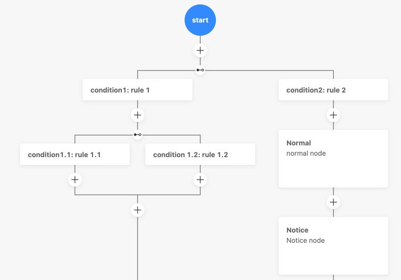
A highly customizable streaming flow builder. The registration ability can flexibly customize your nodes, different types of node display and form, etc.
 |
 |
|---|
Try it out
https://react-flow-builder.web.cloudendpoint.cn/
Installation
yarn add react-flow-builder

or

npm install react-flow-builder
Usage
import React, { useState } from 'react';
import FlowBuilder from 'react-flow-builder';

const registerNodes = [
  {
    type: 'start',
    name: 'start',
  },
  {
    type: 'end',
    name: 'end',
  },
  {
    type: 'common',
    name: 'common',
  },
  {
    type: 'branch',
    name: 'branch',
    conditionNodeType: 'condition',
  },
  {
    type: 'condition',
    name: 'condition',
  },
];

export default function () {
  const [nodes, setNodes] = useState([]);
  return (
    <FlowBuilder
      registerNodes={registerNodes}
      nodes={nodes}
      onChange={setNodes}
    />
  );
}
API
FlowBuilder
| Property | Description | Type | Required | Default |
|---|---|---|---|---|
| backgroundColor | The color of background | string | #F7F7F7 |
|
| className | The class name of the container | string | – | |
| drawerProps | Extra props of Drawer Component from antd. visible and onClose have already in FlowBuilder, and {title: “Configuration”, width: 480, destroyOnClose: true, maskClosable: false} |
– | ||
| layout | Use vertical or horizontal layout | vertical | horizontal |
vertical |
|
| lineColor | The color of line | string | #999999 |
|
| registerNodes | The registered nodes | RegisterNode[] | ✓ | – |
| spaceX | Horizontal spacing between nodes | number | 16 |
|
| spaceY | Vertical spacing between nodes | number | 16 |
|
| nodes | The nodes of FlowBuilder | Node[] | ✓ | – |
| onChange | Callback function for when the data change | (nodes: Node[], changeEvent?: string) => void |
✓ | – |
RegisterNode
| Property | Description | Type | Required | Default |
|---|---|---|---|---|
| addIcon | The icon in addable node list (There are already some default icons) | React.ReactNode | – | |
| conditionNodeType | The type of condition node | string | – | |
| configComponent | The Component of configuring node form | React.FC<ConfigComponent> | – | |
| deleteConfirmTitle | The confirmation information before deleting the node. The title of Popconfirm | string | Are you sure to delete this node? |
|
| displayComponent | The Component of displaying node | React.FC<DisplayComponent> | – | |
| extraData | The extra data of the node | any | – | |
| name | The name of node | string | ✓ | – |
| type | The type of node, promise start is start node type and end is end node type |
string | ✓ | – |
DisplayComponent
| Property | Description | Type | Default |
|---|---|---|---|
| node | The all information of node | Node | – |
ConfigComponent
| Property | Description | Type | Default |
|---|---|---|---|
| node | The all information of node | Node | – |
| onCancel | Called on cancel, used to close the drawer | () => void | – |
| onSave | Called on save node data (automatically close the drawer, no need to call onCancel). FlowBuilder will set the validateStatusError property according to validateErrors |
(values: any, validateErrors?: any) => void | – |
Node
| Property | Description | Type | Default |
|---|---|---|---|
| branchs | The condition nodes array of branch node | Node[] | – |
| configuring | Whether configuring of node. The display Component can highlight the node according to this property | boolean | – |
| data | The data of node | any | – |
| extraData | The extra data of node. Same as the extraData of the registered node, not deep clone |
any | – |
| id | The unique id of node | string | – |
| name | The name of node. Same as the name of the registered node |
string | – |
| next | The next flow of condition node | Node[] | – |
| path | The full path in FlowBuilder | any[] | – |
| type | The type of node. Same as the type of the registered node |
string | – |
| validateStatusError | The Component of configuring node form validate failed. The display Component can highlight the node according to this property | boolean | – |