range-slider-input
A lightweight (~2kB) library to create range sliders that can capture a value or a range of values with one or two drag handles.
✨ Features
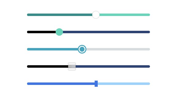
- High CSS customizability
- Touch and keyboard accessible
- Supports negative values
- Vertical orientation
- Small and fast
- Supported by all major browsers
- Has a React component wrapper
Installation
npm
npm install range-slider-input
Import the rangeSlider constructor and the core CSS:
import rangeSlider from 'range-slider-input';
import 'range-slider-input/dist/style.css';
CDN
<script src="https://cdn.jsdelivr.net/npm/range-slider-input@2/dist/rangeslider.umd.min.js"></script>
or
<script src="https://unpkg.com/range-slider-input@2"></script>
The core CSS comes bundled with the jsDelivr and unpkg imports.
Usage
import rangeSlider from 'range-slider-input';
import 'range-slider-input/dist/style.css';

const rangeSliderElement = rangeSlider(element);
API
rangeSlider(element, options = {})
Returns an object of functions that can be called to read or write the properties initially set by options.
Parameters
element
options
Object that specifies the characteristics of the range slider element with the following available properties:
| Property | Type | Default value | Description |
|---|---|---|---|
min |
number | 0 | Number that specifies the lowest value in the range of permitted values.Its value must be less than that of max. |
max |
number | 100 | Number that specifies the greatest value in the range of permitted values.Its value must be greater than that of min. |
step |
number / string | 1 | Number that specifies the amount by which the slider value(s) will change upon user interaction.Other than numbers, the value of step can be a string value of any.
From MDN,
|
value |
number[] | [25, 75] | Array of two numbers that specify the values of the lower and upper offsets of the range slider element respectively. |
onInput |
function | NOOP | Function to be called when there is a change in the value(s) of range sliders upon user interaction or upon calling min(), max(), step() or value(). |
disabled |
boolean | false | Boolean that specifies if the range slider element is disabled or not. |
rangeSlideDisabled |
boolean | false | Boolean that specifies if the range is slidable or not. |
thumbsDisabled |
boolean[] | [false, false] | Array of two Booleans which specify if the lower and upper thumbs are disabled or not, respectively. If only one Boolean value is passed instead of an array, the value will apply to both thumbs. |
orientation |
string | horizontal | String that specifies the axis along which the user interaction is to be registered. By default, the range slider element registers the user interaction along the X-axis. It takes two different values: horizontal and vertical. |
Return value
Object of functions that can be called to read or write the properties initially set by the options parameter. Available functions:
min(), max(), step(), value() and orientation()
These are simple getter and setter functions. So, while calling these functions, if a parameter is supplied, the corresponding values will be set, and if a parameter is not supplied, the corresponding values will be returned.
E.g. Calling step() will return the step value, and calling value([0, 0.5]) will set the lower and upper offsets to 0 and 0.5 respectively.
disabled(), rangeSlideDisabled()
The default parameter is set to true. So, if they are called without a parameter, they will set the corresponding values to true.
Thus, calling disabled() or disabled(true) will set options.disabled = true and calling disabled(false) will set options.disabled = false.
thumbsDisabled()
The default parameter is set to [true, true]. So, if it is called without a parameter, it will disable both thumbs. Example uses:
//                          thumbs -> lower     upper
//                                    -----     -----
thumbsDisabled()                // disabled  disabled
thumbsDisabled(true)            // disabled  disabled
thumbsDisabled(false)           //  enabled   enabled
thumbsDisabled([])              //  enabled   enabled
thumbsDisabled([false])         //  enabled   enabled
thumbsDisabled([true])          // disabled   enabled
thumbsDisabled([true, false])   // disabled   enabled
thumbsDisabled([false, true])   //  enabled  disabled
thumbsDisabled([false, false])  //  enabled   enabled
thumbsDisabled([true, true])    // disabled  disabled
Elements
<div class="range-slider"><!-- range slider element -->
    <input type="range" /><!-- hidden -->
    <input type="range" /><!-- hidden -->
    <div class="range-slider__thumb" data-lower></div>
    <div class="range-slider__thumb" data-upper></div>
    <div class="range-slider__range"></div>
</div>
<div class="range-slider"></div> is the wrapper element that was used to instantiate the range slider initially and is added with a CSS class named range-slider.
<input type="range" /> elements are used to set values and are hidden.
<div class="range-slider__thumb"></div> elements are the slidable thumbs replacing the original thumbs from the <input type="range" /> elements.
<div class="range-slider__range"></div> element fills up the space between the thumbs.
Styling
element-selector {
    /* CSS for the wrapper element */
}
element-selector[data-disabled] {
    /* CSS for disabled range slider element */
}
element-selector .range-slider__range {
    /* CSS for range */
}
element-selector .range-slider__range[data-active] {
    /* CSS for active (actively being dragged) range */
}
element-selector .range-slider__thumb {
    /* CSS for thumbs */
}
element-selector .range-slider__thumb[data-lower] {
    /* CSS for lower thumb */
}
element-selector .range-slider__thumb[data-upper] {
    /* CSS for upper thumb */
}
element-selector .range-slider__thumb[data-active] {
    /* CSS for active (actively being dragged) thumbs */
}
element-selector .range-slider__thumb[data-disabled] {
    /* CSS for disabled thumbs */
}
Refer to the style.css file to know more about styling the range slider element and its children.
Component Wrappers
React: react-range-slider-input
License
MIT © Utkarsh Verma


