Tool Cool Range Slider


Responsive range slider library written in typescript and using web component technologies. Pure JavaScript without additional dependencies. It has a rich set of settings, including a vertical slider, touch and keyboard support.

- Responsive, touch and keyboard support.
- Accessible via ARIA-attributes.
- ES6 JavaScript + TypeScript.
- No dependencies.
- Predefined themes (optional).
- Customizable with a large set of style attributes.
- Horizontal and vertical sliders.
- Based on web component technologies.
Table of contents
- Basic usage
- CDN
- Node.js usage
- Main Properties
- Width, Height, and Border Radius
- Predefined Styles (Themes)
- Colors
- Vertical Slider
- Touch & Keyboard Support
- TypeScript Usage
- Usage with React and TypeScript
- License
Basic Usage
Download the latest toolcool-range-slider.min.js script:
Add the following html to the page:
<toolcool-range-slider></toolcool-range-slider>

<script type="text/javascript" src="toolcool-range-slider.min.js"></script>
You can control the range slider by referencing the toolcool-range-slider HTML tag.
<toolcool-range-slider id="slider-1"></toolcool-range-slider>

<script type="text/javascript" src="toolcool-range-slider.min.js"></script>

<script>
    // get the reference
    const $slider = document.getElementById('slider-1');

    // change value
    $slider.value = 50;

    // get value
    console.log($slider.value);

    // listen to the change event
    $slider.addEventListener('change', (evt) => {
      const value = Math.round(evt.detail.value);
      console.log(value);
    });
</script>
CDN
The ToolCool Range Slider is also available in the jsDelivr CND:
<toolcool-range-slider></toolcool-range-slider>

<script type="text/javascript" src="https://cdn.jsdelivr.net/npm/toolcool-range-slider/dist/toolcool-range-slider.min.js"></script>
Node.js usage

Range slider may also be included as a node module using npm:
npm i toolcool-range-slider
or with Yarn:
yarn add toolcool-range-slider
And then you can include it in your application like this:
import 'toolcool-range-slider';
NPM package can fe found here.
Main Properties
Range slider has the following main properties: min, max, value, and step. All properties are optional, including step. Usage examples:
<toolcool-range-slider></toolcool-range-slider>

<toolcool-range-slider min="10" max="50"></toolcool-range-slider>

<toolcool-range-slider min="-100" max="100" value="50"></toolcool-range-slider>

<toolcool-range-slider min="0" max="100" value="50"></toolcool-range-slider>

<toolcool-range-slider min="100" max="200" value="150" step="10"></toolcool-range-slider>
The properties have the following default values:
| Property | Default Value |
|---|---|
| min | 0 |
| max | 100 |
| value | 0 |
| step | undefined |
Width, Height, and Border Radius
By default, the slider width is 100% and the height is 0.25 rem. These values can be changed using the slider-width and slider-height properties:
<toolcool-range-slider
        slider-width="300px"
        slider-height="15px"
        slider-radius="0.5rem"></toolcool-range-slider>

<toolcool-range-slider
       slider-width="100%"
       slider-height="1rem"></toolcool-range-slider>
Pointer width, height, and border-radius can be change using pointer-width, pointer-height, and pointer-radius properties:
<toolcool-range-slider
        pointer-width="35px"
        pointer-height="35px"
        pointer-radius="5px"></toolcool-range-slider>
Default values table:
| Property | Default Value |
|---|---|
| slider-width | 300px |
| slider-height | 0.25rem |
| slider-radius | 1rem |
| pointer-width | 1rem |
| pointer-height | 1rem |
| pointer-radius | 100% |
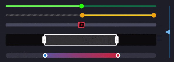
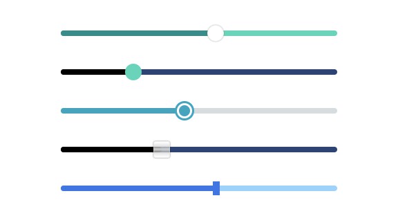
Predefined Styles (Themes)
The slider has several optional predefined themes. Each theme defines a unique look-and-feel and can be used “as is” without defining each style parameter separately.
All themes are fully optional and can be partially or completely replaced by custom styles, as described later in this documentation.
The slider has the following themes:
| Theme Code Name |
|---|
| target |
| glass |
| rect |
| circle |
Usage examples:
<toolcool-range-slider
  slider-width="400px"
  slider-height="0.5rem"
  theme="rect"></toolcool-range-slider>
It’s possible to combine themes together with custom properties like this:
 <toolcool-range-slider
  slider-width="400px"
  slider-height="0.5rem"
  theme="rect"
  slider-bg="red"></toolcool-range-slider>
Colors
Color and other styles can be customized with the following attributes:
<toolcool-range-slider
        slider-width="400px"
        slider-height="0.5rem"
        pointer-width="1.5rem"
        pointer-height="1.5rem"
        slider-bg="#6AD3BA"
        slider-bg-hover="#3F8A8A"
        pointer-border-hover="1px solid #79D6C0"
        pointer-border-focus="1px solid #79D6C0"></toolcool-range-slider>


<toolcool-range-slider
          slider-width="400px"
          slider-height="0.5rem"
          pointer-width="1.5rem"
          pointer-height="1.5rem"
          pointer-bg="#6AD3BA"
          pointer-bg-hover="#50BDA3"
          pointer-shadow="none"
          pointer-shadow-hover="none"
          pointer-border="0"
          pointer-border-hover="1px solid #3F8A8A"
          pointer-border-focus="1px solid #3F8A8A"></toolcool-range-slider>
The list of attributes and default values:
| Property | Default Value |
|---|---|
| slider-bg | #2D4373 |
| slider-bg-hover | #5f79b7 |
| slider-bg-fill | #000 |
| pointer-bg | #fff |
| pointer-bg-hover | #dcdcdc |
| pointer-bg-focus | #dcdcdc |
| pointer-shadow | 0 0 2px rgba(0, 0, 0, 0.6) |
| pointer-shadow-hover | 0 0 2px rgb(0, 0, 0) |
| pointer-shadow-focus | 0 0 2px rgb(0, 0, 0) |
| pointer-border | 1px solid hsla(0, 0%, 88%, 0.5) |
| pointer-border-hover | 1px solid hsla(0, 0%, 88%, 0.5) |
| pointer-border-focus | 1px solid hsl(201, 72%, 59%) |
Vertical Slider

Vertical slider can be achieved using the type attribute as following:
<toolcool-range-slider type="vertical"></toolcool-range-slider>
It accepts all the same attributes as the horizontal slider. The default height of a vertical slider is 300px unless the height attribute is provided.
Touch & Keyboard Support
The library supports touch screens and also handles the following keys:
| Key | Function |
|---|---|
| left arrow | goes one step to the left in a horizontal slider or up in a vertical slider |
| right arrow | goes one step to the right in a horizontal slider or down in a vertical slider |
| left up | jumps to the min value |
| right down | jumps to the max value |
TypeScript Usage
import 'toolcool-range-slider';
import RangeSlider from 'toolcool-range-slider';

// ...

const $slider = document.getElementById('slider-1') as ColorPicker;

$slider.addEventListener('change', (evt: Event) => {
    const customEvent = evt as CustomEvent;
    const value = Math.round(evt.detail.value);
    console.log(value);
});

$slider.value = 10;
Usage with React and TypeScript
import 'toolcool-range-slider';

declare global {
    namespace JSX {
        interface IntrinsicElements {
            'toolcool-range-slider': any;
        }
    }
}

const RangeSliderExample = () => {

    const rangeSliderRef = useRef<HTMLElement>();

    useEffect(() => {

        const slider = rangeSliderRef.current;

        const onChange = (evt: Event) => {
            const customEvent = evt as CustomEvent;
            const value = Math.round(evt.detail.value);
            console.log(value);
        };

        slider?.addEventListener('change', onChange);

        return () => {
          slider?.removeEventListener('change', onChange);
        };
    }, []);

    return (
        <toolcool-range-slider ref={ rangeSliderRef } />;
    )
};

export default RangeSliderExample;