@lls/react-light-calendar is a tiny calendar component which does NOT depend on any date lib. @lls/react-light-calendar use timestamp format date which allows it to be coupled with any date lib.
Why ?
Because most calendar components depend on heavy date library. This make the bundle become very big and if forces you to his date library dependence.
This can be a huge problem on big projects that already have had a lot of dependencies, especially for projects that use another date library.
The purpose of @lls/react-light-calendar is to propose a minimalistic and powerful component to be able to be used on any project.
How to use ✍️
Install @lls/react-light-calendar via npm :
npm install --save @lls/react-light-calendar
Or via yarn :
yarn add @lls/react-light-calendar
Use it :
import Calendar from '@lls/react-light-calendar'
import '@lls/react-light-calendar/dist/index.css' // Default Style

<Calendar startDate={startDate} onChange={this.onChange} />
❗️Notice the style import. If you want to use a custom style, just remove this line and use your own style.
Compatibility ✅
react / react-dom
@lls/react-light-calendar has react and react-dom as peer dependencies.
| @lls/react-light-calendar | react / react-dom |
|---|---|
| 1.x | >= 16.3.0 |
Browsers
According to BrowseEmAll.
| Chrome 42 | Firefox 37 | Safari 8 | Internet Explorer 10 | Microsoft Edge |
|---|---|---|---|---|
| ✅ | ✅ | ✅ | ✅ | ✅ |
Changelog ?️
API ?
The following list represent all available @lls/react-light-calendar's props.
startDate
- Type : Int (timestamp)
- Default value : null
- Required : false
- Available since : v1.0.0
Default date (timestamp) selected or first date selected if endDate is defined.
endDate
- Type : Int (timestamp)
- Default value : null
- Required : false
- Available since : v1.0.0
Last date selected.
onChange
- Type : Function(startDate [Int], endDate [Int])
- Default value : empty function
- Required : false
- Available since : v1.0.0
This function is called every time a day is selected/updated.
disableDates
- Type : Function(date [Int])
- Default value : empty function
- Required : false
- Available since : v1.0.0
This function describe wich days must be disabled (when disabled, a day can't be selected).
Example, disabled all passed day :
<Calendar disableDates={date => date < new Date().getTime()} />
displayTime
- Type : Boolean
- Default value : false
- Required : false
- Available since : v1.0.0
If time input must be displayed.
dayLabels
- Type : Array[String]
- Default value :
['Monday', 'Tuesday', 'Wednesday', 'Thursday', 'Friday', 'Saturday', 'Sunday'] - Required : false
- Available since : v1.0.0
Days name, starting with Monday.
monthLabels
- Type : Array[String]
- Default value :
['January', 'February', 'March', 'April', 'May', 'June', 'July', 'August', 'September', 'October', 'November', 'December'] - Required : false
- Available since : v1.0.0
Months name, starting with January.
timezone
- Type : String
- Default value :
UTC - Required : false
- Available since : v1.0.0
Calendar timezone.
Examples ?
Basic example
import ReactLightCalendar from '@lls/react-light-calendar'
import '@lls/react-light-calendar/dist/index.css'
const DAY_LABELS = ['Lundi', 'Mardi', 'Mercredi', 'Jeudi', 'Vendredi', 'Samedi', 'Dimanche']
const MONTH_LABELS = ['Janvier', 'Fevrier', 'Mars', 'Avril', 'Mai', 'Juin', 'Juillet', 'Aûot', 'Septembre', 'Octobre', 'Novembre', 'Décembre']
class Calendar extends Component {
constructor(props) {
super(props)
const date = new Date()
const startDate = date.getTime()
this.state = {
startDate, // Today
endDate: new Date(startDate).setDate(date.getDate() + 6) // Today + 6 days
}
}
onChange = (startDate, endDate) => this.setState({ startDate, endDate })
render = () => {
const { startDate, endDate } = this.state
return (
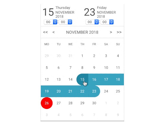
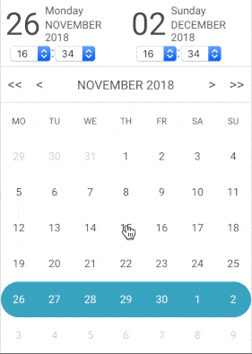
<ReactLightCalendar startDate={startDate} endDate={endDate} onChange={this.onChange} range displayTime />
)
}
}
Good practice example
The best way to avoid massive code and code duplication is to create a Calendar composant based on react-light-component and use it where you want.
Input example
react-light-component is delivered with only one component : a calendar.
If you want to use it like a datetime input, you can follow this examples.
Development ?
// Clone the project
git clone [email protected]:lelivrescolaire/react-light-calendar.git

// ⬇️ Install node modules
npm install

// ? Start the project
npm run start

// ✅ Run tests
npm run test

// ?️ Build the project
npm run build

// ? Keep an eye on the bundle size
npm run size