@novas/components
Minimal and performant React component library built on styled-components
Installation
yarn add @novas/components styled-components
babel-plugin-styled-components is also required to use the css prop (strongly recommended)
Components
Layout
FlexStackGrid
Form – coming soon
CheckboxRadioSelectToggle
Styles
Global
State
Triggers
Motivation
Foregoing a themeing library like styled-system saves on both runtime performance and bundle size. Relying on the css prop provided by babel-plugin-styled-components gives us the best of all worlds:
- Colocate CSS styles inline with components
- Easily extend and customize existing components
- Props and theme access
- Supports all CSS instead of a subset
- Better runtime performance than style props
- Smaller bundle size (realistically ~5kb smaller)
CSS custom properties can be used for theming instead of a JavaScript object, which will prevent the need to access the theme via props. Accessing the
theme via props is still supported of course.
Usage
You should prefer to create new custom elements using the css prop or styled function syntax.
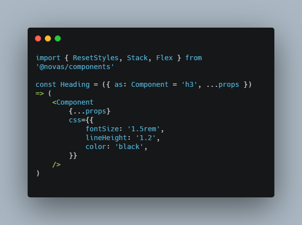
import { ResetStyles, Stack, Flex } from '@novas/components'

const Heading = ({ as: Component = 'h3', ...props }) => (
	<Component
		{...props}
		css={{
			fontSize: '1.5rem',
			lineHeight: '1.2',
			color: 'black',
		}}
	/>
)

const Card = (props) => (
	<Stack
		{...props}
		css={{
			padding: '16px',
			borderRadius: '4px',
			boxShadow: '0 2px 3px 0 rgba(0, 0, 0, 0.2)',
		}}
	/>
)

const App = () => (
	<>
		<Global
			reset
			style={`
				--color-blue: #0000ff;
			`}
		/>
		<Stack>
			<Heading as="h1" css={{ color: '--color-blue' }}>
				Hello world!
			</Heading>
			<main css={{ marginTop: '16px' }}>
				<Flex as="section" css={{ padding: '8px' }}>
					<Card>
						<Heading>Hello world</Heading>
						<p>Thanks for taking a look!</p>
					</Card>
				</Flex>
			</main>
		</Stack>
	</>
)