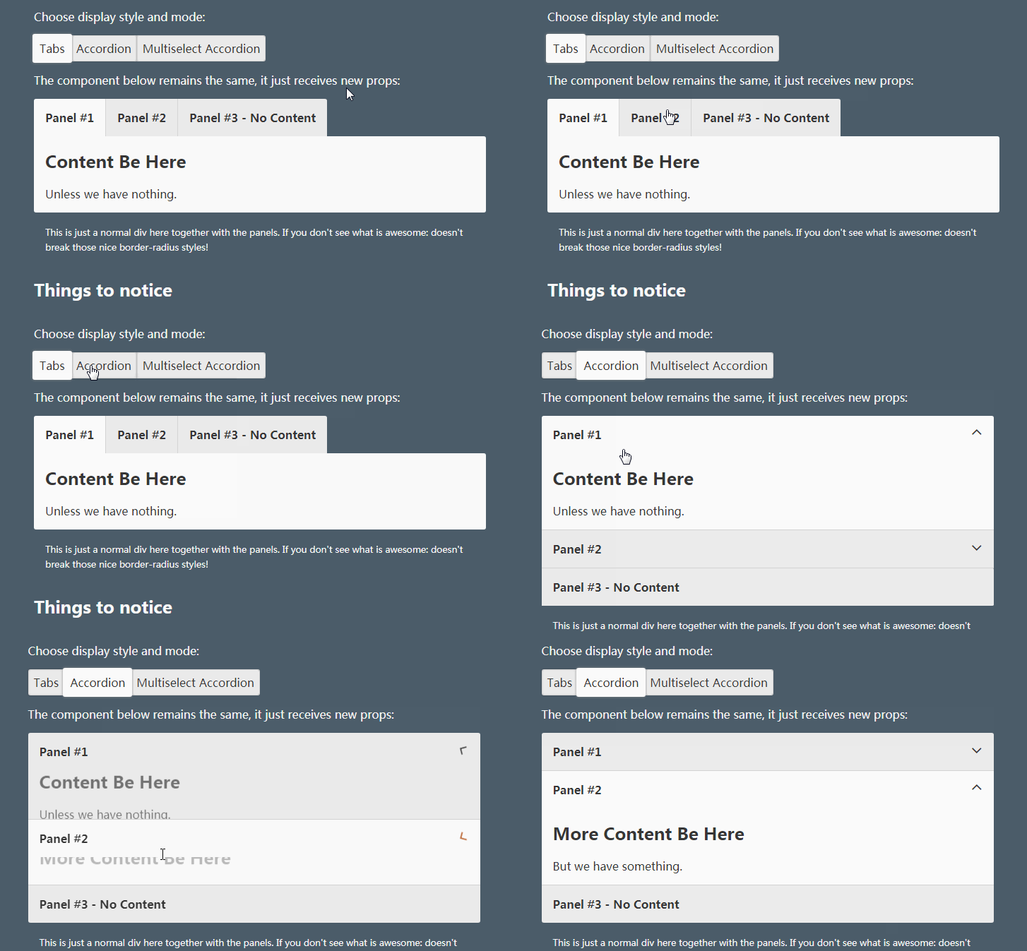
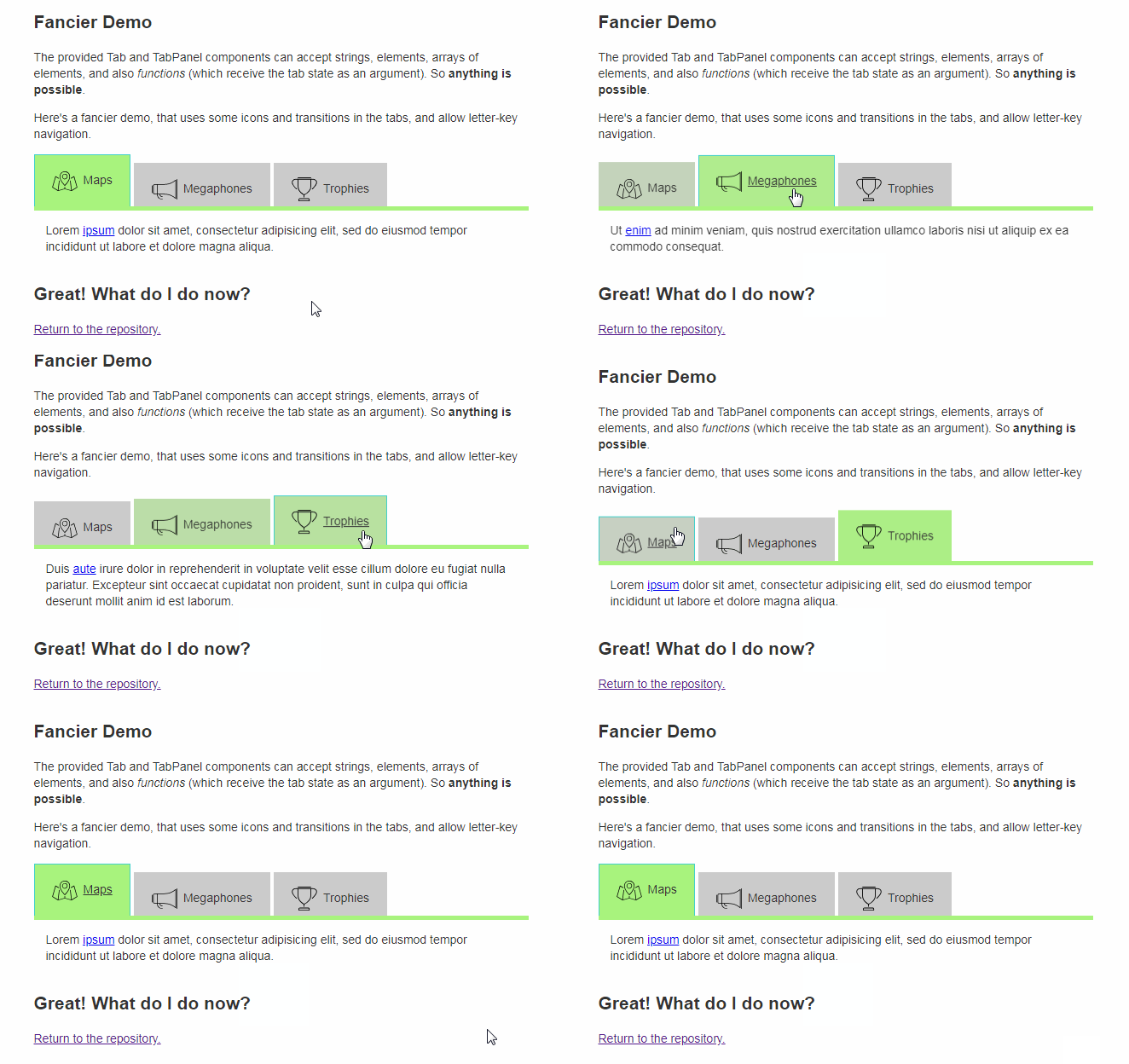
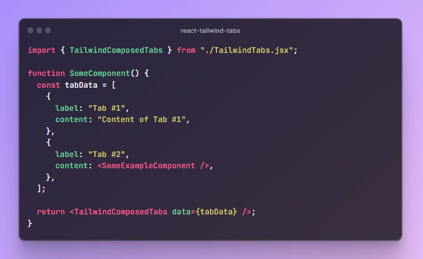
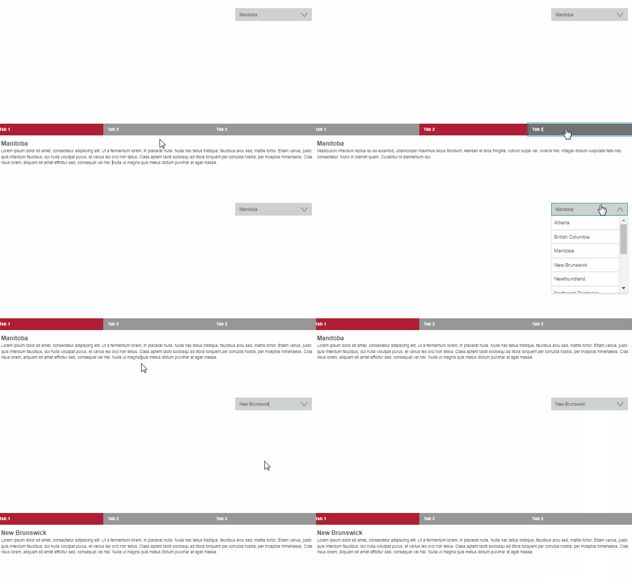
REACT-TABTAB
A mobile support, draggable, editable and api based Tab for ReactJS.
Support react v16 and v15

Features
- Mobile supported — Touch support. Easy to use on mobile device
- Draggable tab — Support drag and drop tab
- Add & Delete — Tab can be added and deleted
- Async content — Lazy load panel content
- Customizable style — Based on
styled-components, super easy to customize tab style - API based — All actions are controllable
- ARIA accessible
Installation
Install it with npm.
$ npm install react-tabtab --save
Then, import the module by module bundler like webpack, browserify
// es6
import {Tabs, DragTabList, DragTab, PanelList, Panel, ExtraButton} from 'react-tabtab';

// not using es6
var Tabtab = require('react-tabtab');
var Tabs = Tabtab.Tabs;
var DragTabList = Tabtab.DragTabList;
var DragTab = Tabtab.DragTab;
var PanelList = Tabtab.PanelList;
var Panel = Tabtab.Panel;
var ExtraButton = Tabtab.ExtraButton;
UMD build is also available. If you do this, you'll need to include the dependencies:
For example:
<script src="https://unpkg.com/[email protected]/umd/react.production.min.js"></script>
<script src="https://unpkg.com/[email protected]/umd/react-dom.production.min.js"></script>
<script src="https://unpkg.com/[email protected]/prop-types.min.js"></script>
<script src="https://unpkg.com/[email protected]/index.js"></script>
<script src="https://unpkg.com/styled-components/dist/styled-components.min.js" type="text/javascript"></script>
<script src="https://unpkg.com/react-sortable-hoc/dist/umd/react-sortable-hoc.js"></script>
<script src="https://unpkg.com/react-poppop/dist/react-poppop.min.js"></script>
<script src="https://unpkg.com/react-tabtab/dist/react-tabtab.min.js"></script>
You can reference standalone.html example.
Usage
React-tabtab is a tab component with highly customization. You can create a tab in simply setting. You also can create a tab system full with draggable, async loading, close and create button.
All the actions are api based. It means there is no state in the component. Developers have full control.
Minimal setup
import React, {Component} from 'react';
import ReactDOM from 'react-dom';
import {Tabs, TabList, Tab, PanelList, Panel} from 'react-tabtab';

class Basic extends Component {
  render() {
    return (
      <Tabs>
        <TabList>
          <Tab>Tab1</Tab>
          <Tab>Tab2</Tab>
        </TabList>
        <PanelList>
          <Panel>Content1</Panel>
          <Panel>Content2</Panel>
        </PanelList>
      </Tabs>
    )
  }
}

ReactDOM.render(<Basic/>, document.getElementById('root'));
It's simple to use. Zero configuration!
Draggable tab
import React, {Component} from 'react';
import {Tabs, DragTabList, DragTab, PanelList, Panel} from 'react-tabtab';
import {simpleSwitch} from 'react-tabtab/lib/helpers/move';

export default class Drag extends Component {
  constructor(props) {
    super(props);
    this.handleTabChange = this.handleTabChange.bind(this);
    this.handleTabSequenceChange = this.handleTabSequenceChange.bind(this);
    this.state = {
      activeIndex: 0,
    }
  }

  handleTabChange(index) {
    this.setState({activeIndex: index});
  }

  handleTabSequenceChange({oldIndex, newIndex}) {
    const {tabs} = this.state;
    const updateTabs = simpleSwitch(tabs, oldIndex, newIndex);
    this.setState({tabs: updateTabs, activeIndex: newIndex});
  }

  render() {
    const {activeIndex} = this.state;
    return (
      <Tabs activeIndex={activeIndex}
            onTabChange={this.handleTabChange}
            onTabSequenceChange={this.handleTabSequenceChange}>
        <DragTabList>
          <DragTab>DragTab1</DragTab>
          <DragTab>DragTab2</DragTab>
        </DragTabList>
        <PanelList>
          <Panel>Content1</Panel>
          <Panel>Content2</Panel>
        </PanelList>
      </Tabs>
    )
  }
}
ReactDOM.render(<Basic/>, document.getElementById('root'));
Based on above example, the different to implement normal tab or drag tab is using different wrapper and child.
And all the actions are controllable. You can customize your switch action. But if you don't want to write customized switch logic, you can directly use import {simpleSwitch} from 'react-tabtab/lib/helpers/move' this built-in function.
normal tab
<Tabs>
  <TabList>
    <Tab>Tab1</Tab>
  </TabList>
  <PanelList>
    <Panel>Content1</Panel>
  </PanelList>
</Tabs>
drag tab
<Tabs>
  <DragTabList>
    <DragTab>DragTab1</DragTab>
  </DragTabList>
  <PanelList>
    <Panel>Content1</Panel>
  </PanelList>
</Tabs>
Async Panel
In some case, if the data is large or we want to save the bandwidth, lazy loading the content is possible solution. You can use AsyncPanel to laze load panel content.
Moreover, you can mix lazy load panel with normal panel!
import React, {Component} from 'react';
import ReactDOM from 'react-dom';
import {Tabs, TabList, Tab, PanelList, AsyncPanel, Panel} from 'react-tabtab';

function loadContentFunc(callback) {
  setTimeout(() => {
    callback(null, [
      {product: 'json'},
      {product: 'joseph'}
    ]);
  }, 100);
}

// You also can provide promise as return function:
// function loadContentFunc() {
//   return fetch('/products')
//     .then(resp => resp.json())
//     .then(data => data);
// }

class AsyncTab extends Component {
  render() {
    return (
      <Tabs>
        <TabList>
          <Tab>Tab1</Tab>
          <Tab>Tab2</Tab>
        </TabList>
        <PanelList>
          <Panel>Content1</Panel>
          <AsyncPanel loadContent={loadContentFunc}
                      render={data => (<div>{JSON.stringify(data)}</div>)}
                      renderLoading={() => (<div>Loading...</div>)}
                      cache={true}
          />
        </PanelList>
      </Tabs>
    )
  }
}

ReactDOM.render(<AsyncTab/>, document.getElementById('root'));
To implement lazy loading, use AsyncPanel to wrap your panel content. Remember to provide loadContent, render, renderLoading these 3 props.
In loadContent props, both callback and promise type are supported.
If you use callback, remember to call callback when finish async loading.
If you use promise, need to return promise action.
When data is loading, the panel content will show renderLoading component.
After finishing loading data, the panel content will show render component and react-tabtab will pass the loadContent result as first parameter. So you can customize the component of panel content.
Live example: Link
Another Example
Except drag and drop tab, react-tabtab also support other usable application, like:
- Add and close button: Example
- Modal view at mobile support: Example
- Auto detect number of tab and make it scrollable
- All the action is controllable:Example
All of these features are api based, so you can customize each action on demand.
More code examples are avalable here.
Components / Api
<Tabs />
<Tabs/> is the main component of react-tabtab. Most of the api is passed from it.
| props | type | default | |
|---|---|---|---|
| defaultIndex | int |
null | set the initial active key |
| activeIndex | int |
null | control current activeIndex. You need to pass new activeIndex value if you want to show different tab. |
| defaultIndex | int |
null | set the initial active key |
| showModalButton | booleannumber |
4 |
|
| showArrowButton | autoboolean |
auto |
|
| ExtraButton | React Node |
null | customize extra button content, example: `+` button |
| onTabChange | () => tabIndex |
null |
return tabIndex is clicked You can use this api with activeIndex. When user click tab, update activeIndex.
|
| onTabSequenceChange | () => {oldIndex, newIndex} |
null |
return changed oldIndex and newIndex value With this api, you can do switch tab very easily. Note:This api is only called by <DragTab/>
|
| onTabEdit | () => {type: [delete], index} |
null | When user click close button , this api will return the clicked close button index. |
| customStyle |
|
Bootstrap theme | customized tab style component |
<TabList />
Use to wrap <Tab/>.
<Tab />
Normal Tab. Show the children component on tab.
| props | type | default | |
|---|---|---|---|
| closable | boolean |
false | whether to show close button |
Example
<Tab>
  <i className="fa fa-map-pin"></i>
  map tab
</Tab>
<DragTabList />
Use to wrap <DragTab/>.
<DragTab/ >
A draggable tab. Api is the same with <Tab/>
<PanelList/ >
Use to wrap <Panel/>
<Panel />
Tab content.
<AsyncPanel />
Lazy loading panel content.
| props | type | default | |
|---|---|---|---|
| loadContent * |
(cb) => cb(error, data) or (cb) => Promise
|
null | when loadContent finish, call the callback or you can return promise |
| render * |
(data) => Component
|
null | when finish loading data, render this component |
| renderLoading * |
() => Component
|
null | when it is loading data, render this component |
| cache |
boolean
|
true | should cache the data |
Customize style
react-tabtab is based on styled-components. Therefore, it's super easy to customize the tab style.
Just extend the default component style and pass it to customStyle props.
Use current style
You can check the current style at src/themes folder.
For example, if you want to use material-design, import the style and pass to customStyle props.
Example:
import {Component} from 'react';
import {Tabs, TabList, Tab, PanelList, Panel} from 'react-tabtab';
import * as customStyle from 'react-tabtab/lib/themes/material-design';

class Customized extends Component {
  render() {
    return (
      <Tabs customStyle={customStyle}>
        <TabList>
          <Tab>Tab1</Tab>
          <Tab>Tab2</Tab>
        </TabList>
        <PanelList>
          <Panel>Content1</Panel>
          <Panel>Content2</Panel>
        </PanelList>
      </Tabs>
    )
  }
}
And now your tab is material design style!
Make your own style
If current theme doesn't meet your demand, follow this three steps and create a new one.
First step: import current style
import {styled} from 'react-tabtab';
let {TabListStyle, ActionButtonStyle, TabStyle, PanelStyle} = styled;
Second: extend style and export it
import {styled} from 'react-tabtab';
let {TabListStyle, ActionButtonStyle, TabStyle, PanelStyle} = styled;

TabListStyle = TabListStyle.extend`
  // write css
`;

TabStyle = TabStyle.extend`
  // write css
`;

ActionButtonStyle = ActionButtonStyle.extend`
  // write css
`;

PanelStyle = PanelStyle.extend`
  // write css
`;

// need to follow this object naming
module.exports = {
  TabList: TabListStyle,
  ActionButton: ActionButtonStyle,
  Tab: TabStyle,
  Panel: PanelStyle
}


