React Payment Card Component
A modern credit card component for React.
This React component will help you building your checkout on your e-commerce.
The first version of a payment card modal was used in Pagar.me's checkout 1.0, but as we're now rewriting it to version 2.0 in React, why not creating a component so people also can use it the way they prefer?
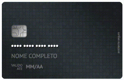
By having a lot of credit cards from many different banks, brands and types, users will be able to see a digital version of their credit cards as they type the credit card number.
Usage
To use this component in your React app, start by adding it to the project dependencies list:
npm version > 5
npm i react-payment-card-component
npm version < 5
npm i react-payment-card-component --save
yarn
yarn add react-payment-card-component
And then, import it:
import PaymentCard from 'react-payment-card-component'

render () {
  return (
    <PaymentCard
      bank="itau"
      model="personnalite"
      type="black"
      brand="mastercard"
      number="4111111111111111"
      cvv="202"
      holderName="Owen Lars"
      expiration="12/20"
      flipped={false}
    />
  );
}
Flipping the card
You can use React to manage the card state and implement your own logic, like flipping the card with a button or when user is typing the CVV (Card Verification Value).
flipCard () {
  const flipped = !this.state.flipped
  this.setState({ flipped })
}
Available Props
| Name | Type | Required | Description |
|---|---|---|---|
bank |
String | true | The bank prop defines the major style for the card, like the elements positions, background color and logos. Examples.: default, itau, santander, nubank |
model |
String | false | Model refers to the card model. Examples.: normal, prime, personnalite |
type |
String | false (although it's not required, some styles may not properly work without it) | The type is used alongside with bank and model to get the final card styling. They are the types of a credit card that each bank can emit. Examples.: gold, black, platinum |
brand |
String | true | This prop is used to get the correct logo and position of the brand used in the card. Examples: mastercard, visa. |
number |
String | false | The card number printed in the card |
cvv |
String | false | 3-digit CVV (Card Verification Value) |
holderName |
String | false | The holder name as printed in the card |
expiration |
String | false | The expiration month and year following the pattern: MM/YY |
flipped |
Boolean | false | If true the backface of the card will be shown |
Customizing
Styling
The CSS files to manage the banks styles are under ./src/components/PaymentCard/styles, where each bank needs its own file under the banks folder and have it imported in the main ./src/components/PaymentCard/styles/index.css file.
To add a new style, remember to create classes following the pattern: bankName-cardModel-cardType:
.santander-normal-black {
  background: #000000;
}
Logos
We currently have 3 types of logos:
- bankLogo
- brandLogo
- modelLogo
If you need to add new assets for corresponding logos, do it under the proper component folder in the images folder.
Guidelines
- Prefer .svg files or .png (in that order)
- Keep them as small as possible, even if they are going to be compressed in the build process