onyxia-ui
A disruptive UI toolkit
Optimized for TypeScript
Highly customizable but looks great out of the box.
Compatible with material-ui large library of components
onyxia-ui is a ui toolkit for React build on top of material-ui.
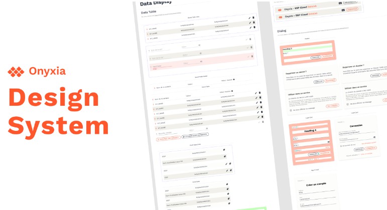
Default design system carefully crafted by Marc Hufschmitt
Motivation
Material-ui is at it's core a vanilla JavaScript library.
We argue that the experience for TypeScript developers is not optimal and somewhat frustrating.
Also we find problematic how hard it is to build an app that won't break on any other screen size.
In consequence, we wanted to create a ui toolkit that would be compatible with
material-ui's large library of components but that would also improves it in the following ways:
- Optimized for typescript, theme customization without module augmentation.
- Responsive design way more easy to implement.
- Built in support for the dark mode, persistent across reload, without white flashes.
- Easier, more guided, theme customization.
- Provide splash screen that hides your components while they are not yet loaded.
- Leverages an arguably better styling API: TSS.
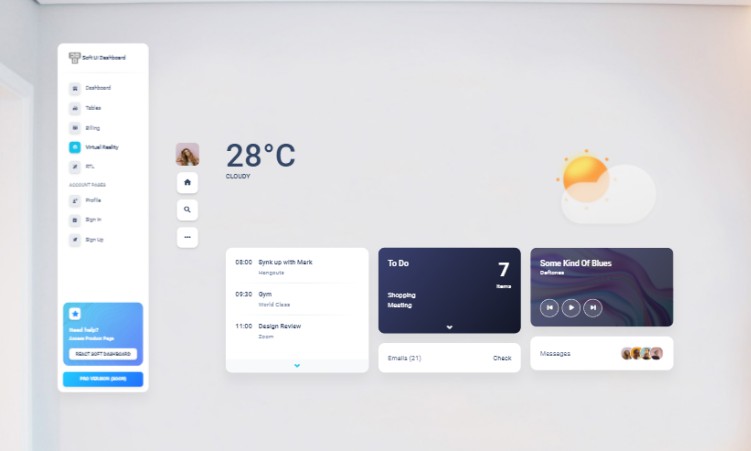
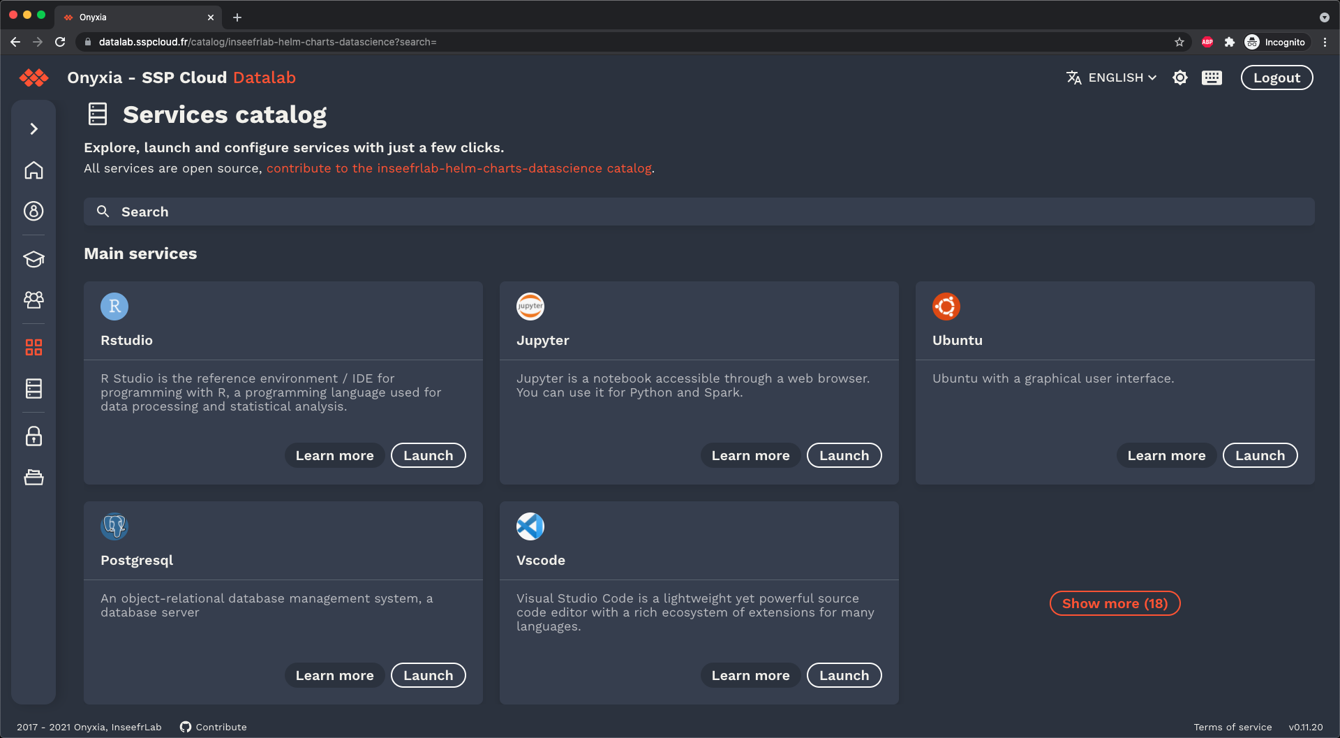
Showcase
UI built with this toolkit.
datalab.sspcloud.fr


sspcloud.fr
Quick start
yarn add onyxia-ui tss-react @material-ui/core@^4.12.1

# If you plan on using icons from: https://material-ui.com/components/material-icons/
yarn add @material-ui/icons@^4.11.2

# Only necessary for onyxia-ui/Alert and if you want
# to use components from https://material-ui.com/components/material-icons/
yarn add @material-ui/lab@^4.0.0-alpha.58
At this stage, the documentation is under the form of a very simple demo project.
The actual theme configuration happens here.
If you want to experiment with it you can run the demo app with:
git clone https://github.com/garronej/onyxia-ui
cd onyxia-ui
yarn
yarn build
yarn start