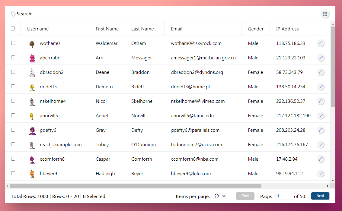
react-grid-table
A modular table, based on a CSS grid layout, optimized for customization.
Supported features:
- Sort by column
- Column resize
- Column reorder
- Search with highlight
- Pagination
- Row selection
- Inline row editing
- Column pinning (pre-configured)
- Column visibility management
- Sticky header
- Dynamic row height
Install
npm install --save @nadavshaar/react-grid-table
Usage
import React from "react";

import GridTable from '@nadavshaar/react-grid-table'
// applying styles - required
import '@nadavshaar/react-grid-table/dist/index.css'

import Username from "./components/Username"
import * as MOCK_DATA from "./MOCK_DATA.json";

let rows = MOCK_DATA.default;
// row data example:
// {
//     "id": 1,
//     "username": "wotham0",
//     "gender": "Male",
//     "last_visited": "12/08/2019",
//     "object_value_field": {"x": 1, "y": 2},
//     ...
// }

const MyAwesomeTable = () => {

    const columns = [
        {
            id: 1,
            field: 'checkbox',
            pinned: true,
        },
        {
            id: 2,
            field: 'username',
            label: 'Username',
            cellRenderer: Username,
        },
        {
            id: 3,
            field: 'gender',
            label: 'Gender',
        },
        {
            id: 4,
            field: 'last_visited',
            label: 'Last Visited',
            sort: ({a, b, isAscending}) => {
                let aa = a.split('/').reverse().join(),
                bb = b.split('/').reverse().join();
                return aa < bb ? isAscending ? -1 : 1 : (aa > bb ? isAscending ? 1 : -1 : 0);
            }
        },
        {
            id: 5,
            field: 'object_value_field',
            label: 'Object Value',
            getValue: ({value, column}) => value.x.toString(),
        }
    ];

    return (
        <GridTable
            columns={columns}
            rows={rows}
        />
    )
};

export default MyAwesomeTable;
Table of contents
- Components structure
- Props
- Table configuration props
- Event props
- Custom rendering props
- The
columnsprop - The
checkboxcolumn - The
rowsprop - The
headerRendererprop - The
footerRendererprop - Row-Editing
- Styling
Components structure
props
| name | type | description | default value |
|---|---|---|---|
| columns* | array of objects | columns configuration (details) | [ ] |
| rows* | array of objects | rows data (details) | [ ] |
| rowIdField | string | the name of the field in the row's data that should be used as the row identifier - must be unique | 'id' |
| selectedRowsIds | array of ids | selected rows ids (details) | [ ] |
| searchText | string | text for search | "" |
| isRowSelectable | function | whether row selection for the current row is disabled or not | row => true |
| isRowEditable | function | whether row editing for the current row is disabled or not | row => true |
| editRowId | string, number, null | the id of the row to edit, (more details about row editing) | null |
| cellProps | object | global props for all data cells | { } |
| headerCellProps | object | global props for all header cells | { } |
Table configuration props
| name | type | description | default value |
|---|---|---|---|
| isPaginated | boolean | determine whether the pagination controls sholuld be shown in the footer and if the rows data should be splitted into pages | true |
| pageSizes | array of numbers | page size options | [20, 50, 100] |
| pageSize | number | the selected page size | 20 |
| sortBy | string, number, null | the id of the column that should be sorted | null |
| sortAscending | boolean | determine the sort direction | true |
| minColumnWidth | number | minimum width for all columns | 70 |
| highlightSearch | boolean | whether to highlight the search term | true |
| showSearch | boolean | whether to show the search in the header | true |
| searchMinChars | number | the minimum characters to apply search and highlighting | 2 |
| isLoading | boolean | whether to render a loader | false |
| isHeaderSticky | boolean | whether the table header will be stick to the top when scrolling or not | true |
| manageColumnVisibility | boolean | whether to display the columns visibility management button (located at the top right of the header) | true |
| icons | object with nodes | custom icons config (current supprt for sort icons only) | { sort: { ascending: ▲, descending: ▼ } } |
Event props
| name | type | description | usage |
|---|---|---|---|
| onColumnsChange | function | triggers when the columns has been changed |
columns => { } |
| onSelectedRowsChange | function | triggers when rows selection has been changed | selectedRowsIds => { } |
| onSearchChange | function | used for updating the search text when controlled from outside of the component | searchText => { } |
| onSortChange | function | used for updating the sortBy and its direction when controlled from outside of the component | (columnId, isAscending) => { } |
| onRowClick | function | triggers when a row has been clicked | ({rowIndex, row, column, event}) => { } |
Custom rendering props
A set of functions that are used for rendering custom components.
| name | type | description | usage |
|---|---|---|---|
| headerRenderer | function | used for rendering a custom header (details) | ({searchText, setSearchText, setColumnVisibility, columns}) => ( children ) |
| footerRenderer | function | used for rendering a custom footer (details) | ({page, totalPages, handlePagination, pageSize, pageSizes, setPageSize, setPage, totalRows, selectedRowsLength, numberOfRows }) => ( children ) |
| loaderRenderer | function | used for rendering a custom loader | () => ( children ) |
| noResultsRenderer | function | used for rendering a custom component when there is no data to display | () => ( children ) |
| searchRenderer | function | used for rendering a custom search component (details) | ({searchText, setSearchText}) => ( children ) |
| columnVisibilityRenderer | function | used for rendering a custom columns visibility management component (details) | ({columns, setColumnVisibility}) => ( children ) |
| dragHandleRenderer | function | used for rendering a drag handle for the column reorder | () => ( children ) |
props - detailed
columns
Type: array of objects.
This prop defines the columns configuration.
Each column supports the following properties:
| name | type | description | default value |
|---|---|---|---|
| id* | string, number | a unique id for the column | --- |
| field* | string | the name of the field as in the row data / 'checkbox' (more details about checkbox column) | --- |
| label | string | the label to display in the header cell | the field property |
| pinned | boolean | whether the column will be pinned to the side, supported only in the first and last columns | false |
| visible | boolean | whether to show the column (pinned columns are always visible) | true |
| className | string | a custom class selector for all column cells | "" |
| width | string | the initial width of the column in grid values (full list of values) | "max-content" |
| minWidth | number, null | the minimum width of the column when resizing | null |
| maxWidth | number, null | the maximum width of the column when resizing | null |
| getValue | function | used for getting the cell value (usefull when the cell value is not a string - details) | (({value, column}) => value |
| setValue | function | used for updating the cell value (usefull when the cell value is not a string) - details | ({value, row, setRow, column}) => { setRow({...row, [column.field]: value}) } |
| searchable | boolean | whether to apply search filtering on the column | true |
| editable | boolean | whether to allow editing for the column | true |
| sortable | boolean | whether to allow sort for the column | true |
| resizable | boolean | whether to allow resizing for the column | true |
| sortableColumn | boolean | whether to allow column reorder | true |
| search | function | the search function for this column | ({value, searchText}) => value.toLowerCase().includes(searchText.toLowerCase()) |
| sort | function | the sort function for this column | ({a, b, isAscending}) => { if(a.toLowerCase() > b.toLowerCase()) return isAscending ? 1 : -1; else if(a.toLowerCase() < b.toLowerCase()) return isAscending ? -1 : 1; return 0; } |
| cellRenderer | function | used for custom rendering the cell ({value, row, column, rowIndex, searchText}) => ( children ) |
--- |
| headerCellRenderer | function | used for custom rendering the header cell ({label, column}) => ( children ) |
--- |
| editorCellRenderer | function | used for custom rendering the cell in edit mode ({value, field, onChange, row, rows, column, rowIndex}) => ( children ) |
--- |
Example:
// column config

{
  id: 'some-unique-id',
  field: 'first_name',
  label: 'First Name',
  className: '',
  pinned: false,
  width: 'max-content',
  getValue: ({value, column}) => value,
  setValue: ({value, row, setRow, column}) => { setRow({...row, [column.field]: value}) },
  minWidth: null,
  maxWidth: null,
  sortable: true,
  editable: true,
  searchable: true,
  visible: true,
  resizable: true,
  sortableColumn: true,
  // search: ({value, searchText}) => { },
  // sort: ({a, b, isAscending}) => { },
  // cellRenderer: ({value, row, column, rowIndex, searchText}) => { },
  // headerCellRenderer: ({label, column}) => ( ),
  // editorCellRenderer: ({value, field, onChange, row, rows, column, rowIndex}) => { }
}
checkbox-column
Rows selection is done by a predefined column, simply add a column with a field name of 'checkbox'.
Checkbox column has supports the following properties:
| name | type | description | default value |
|---|---|---|---|
| id* | string, number | a unique id for the column | --- |
| field* | string | defines the column as a 'checkbox' column | 'checkbox' |
| pinned | boolean | whether the column will be pinned to the side, supported only in the first and last columns | false |
| visible | boolean | whether to show the column (pinned columns are always visible) | true |
| className | string | a custom class for all column cells | "" |
| width | string | the initial width of the column in grid values (full list of values) | "max-content" |
| minWidth | number, null | the minimum width of the column when resizing | null |
| maxWidth | number, null | the maximum width of the column when resizing | null |
| resizable | boolean | whether to allow resizing for the column | true |
| cellRenderer | function | used for custom rendering the checkbox cell ({isChecked, callback, disabled, rowIndex}) => ( <input type="checkbox" onChange={ callback } checked={ isChecked } disabled={ disabled } /> ) |
--- |
| headerCellRenderer | function | used for custom rendering the checkbox header cell ({isChecked, callback, disabled}) => ( <input type="checkbox" onChange={ callback } checked={ isChecked } disabled={ disabled } /> ) |
--- |
Example:
// checkbox column config

{
  id: 'some-unique-id',
  field: 'checkbox',
  pinned: true,
  className: '',
  width: '53px',
  minWidth: null,
  maxWidth: null,
  resizable: false,
  visible: true,
  // cellRenderer: ({isChecked, callback, disabled, rowIndex}) => ( children )
  // headerCellRenderer: ({isChecked, callback, disabled}) => ( children )
}
rows
Type: array of objects.
This prop containes the data for the rows.
Each row should have a unique identifier field, which by default is id, but it can be changed to a different field using the rowIdField prop.
// row data

{
  "id": "some-unique-id",
  "objectValueField": {"x": 1, "y": 2},
  "username":"wotham0",
  "first_name":"Waldemar",
  "last_name":"Otham",
  "avatar":"https://robohash.org/atquenihillaboriosam.bmp?size=32x32&set=set1",
  "email":"[email protected]",
  "gender":"Male",
  "ip_address":"113.75.186.33",
  "last_visited":"12/08/2019"
}
Note: If a property value is not of type string, you'll have to use the getValue function on the column in order to format the value.
Example:
Let's say the field's value for a cell is an object:
{ ... , fullName: {firstName: 'some-first-name', lastName: 'some-last-name'} },
Its getValue function for displaying the first and last name as a full name, would be:
getValue: (({value, column}) => value.firstName + ' ' + value.lastName
The value that returns from the getValue function will be used for searching, sorting etc...
headerRenderer
Type: function
This function is used for rendering a custom header.
By default the header renders a search and column visibility components, you can render your own custom components and still use the table's callbacks.
If you just want to replace the search or the column visibility management components, you can use the searchRenderer or the columnVisibilityRenderer props.
Arguments:
| name | type | description | default value |
|---|---|---|---|
| searchText | string | text for search | "" |
| setSearchText | function | a callback function to update search text | setSearchText(searchText) |
| setColumnVisibility | function | a callback function to update columns visibility that accepts the id of the column that should be toggled | setColumnVisibility(columnId) |
| columns | function | the columns configuration |
[ ] |
Example:
headerRenderer={({searchText, setSearchText, setColumnVisibility, columns}) => (
    <div style={{display: 'flex', flexDirection: 'column', padding: '10px 20px', background: '#fff', width: '100%'}}>
        <div>
            <label htmlFor="my-search" style={{fontWeight: 500, marginRight: 10}}>
                Search for:
            </label>
            <input
                name="my-search"
                type="search"
                value={searchText}
                onChange={e => setSearchText(e.target.value)}
                style={{width: 300}}
            />
        </div>
        <div style={{display: 'flex', marginTop: 10}}>
            <span style={{ marginRight: 10, fontWeight: 500 }}>Columns:</span>
            {
                columns.map((cd, idx) => (
                    <div key={idx} style={{flex: 1}}>
                        <input
                            id={`checkbox-${idx}`}
                            type="checkbox"
                            onChange={ e => setColumnVisibility(cd.id) }
                            checked={ cd.visible !== false }
                        />
                        <label htmlFor={`checkbox-${idx}`} style={{flex: 1, cursor: 'pointer'}}>
                          {cd.label || cd.field}
                        </label>
                    </div>
                ))
            }
        </div>
    </div>
)}
footerRenderer
Type: function
This function is used for rendering a custom footer.
By default the footer renders items information and pagination controls, you can render your own custom components and still use the table's callbacks.
Arguments:
| name | type | description | default value |
|---|---|---|---|
| page | number | the current page | 1 |
| totalPages | number | the total number of pages | 0 |
| handlePagination | function | sets the page to display | handlePagination(pageNumber) |
| pageSizes | array of numbers | page size options | [20, 50, 100] |
| pageSize | number | the selected page size | 20 |
| setPageSize | function | updates the page size | setPageSize(pageSizeOption) |
| totalRows | number | total number of rows in the table | 0 |
| selectedRowsLength | number | total number of selected rows | 0 |
| numberOfRows | number | total number of rows in the page | 0 |
Example:
footerRenderer={({
    page,
    totalPages,
    handlePagination,
    pageSize,
    pageSizes,
    setPageSize,
    totalRows,
    selectedRowsLength,
    numberOfRows
}) => (
    <div style={{display: 'flex', justifyContent: 'space-between', flex: 1, padding: '12px 20px'}}>
        <div style={{display: 'flex'}}>
          {`Total Rows: ${totalRows}
          | Rows: ${numberOfRows * page - numberOfRows} - ${numberOfRows * page}
          | ${selectedRowsLength} Selected`}
        </div>
        <div style={{display: 'flex'}}>
            <div style={{width: 200, marginRight: 50}}>
                <span>Items per page: </span>
                <select
                    value={pageSize}
                    onChange={e => {setPageSize(e.target.value); handlePagination(1)}}
                >
                    { pageSizes.map((op, idx) => <option key={idx} value={op}>{op}</option>) }
                </select>
            </div>
            <div style={{display: 'flex', justifyContent: 'space-between', width: 280}}>
                <button
                    disabled={page-1 < 1}
                    onClick={e => handlePagination(page-1)}
                >Back</button>

                <div>
                    <span>Page: </span>
                    <input
                        style={{width: 50, marginRight: 5}}
                        onClick={e => e.target.select()}
                        type='number'
                        value={totalPages ? page : 0}
                        onChange={e => handlePagination(e.target.value*1)}
                    />
                    <span>of {totalPages}</span>
                </div>

                <button
                    disabled={page+1 > totalPages}
                    onClick={e => handlePagination(page+1)}
                >Next</button>
            </div>
        </div>
    </div>
)}
How to...
Row-Editing
Row editing can be done by rendering your row edit button using the cellRenderer property in the column configuration, then when clicked, it will set a state proprty with the clicked row id, and that row id would be used in the editRowId prop, then the table will render the editing components for columns that are defined as editable (true by default), and as was defined in the editorCellRenderer which by default will render a text input.
// state
const [rows, setRows] = useState(MOCK_DATA);
const [editRowId, setEditRowId] = useState(null)

// columns
let columns = [
  ...,
  {
    id: 'my-buttons-column'
    field: 'buttons',
    label: '',
    pinned: true,
    sortable: false,
    resizable: false,
    cellRenderer: ({value, row, column, rowIndex, searchText}) => (
      <button onClick={e => setEditRowId(row.id)}>Edit</button>
    )
    editorCellRenderer: ({value, field, onChange, row, rows, column, rowIndex}) => (
      <div style={{display: 'inline-flex'}}>
        <button onClick={e => setEditRowId(null)}>Cancel</button>
        <button onClick={e => {
          let rowsClone = [...rows];
          let updatedRowIndex = rowsClone.findIndex(r => r.id === row.id);
          rowsClone[updatedRowIndex] = row;

          setRows(rowsClone);
          setEditRowId(null);
        }}>Save</button>
      </div>
    )
  }
];

// update handler
const updateRowData = (row) => {
  let rowsClone = [...rows];
  let rowIndex = rowsClone.findIndex(it => it.id === item.id);
  rowsClone[rowIndex] = row;
  setRows(rowsClone);
}

// render
<GridTable
    columns={columns}
    rows={rows}
    editRowId={editRowId}
    ...
/>
For columns which holds values other than string, you'll have to also define the setValue function on the column so the updated value won't override the original value.
Example:
  setValue: ({value, row, setRow, column}) => {
    // value: '35',
    // row: { ..., { fieldToUpdate: '27' }}
    let rowClone = { ...row };
    rowClone[column.field].fieldToUpdate = value;
    setRow(rowClone);
  }
Styling
Styling is done by css class selectors. the table's components are mapped with pre-defined classes, and you can add your own custom class per column in the columns configuration.
| Component | All available class selectors |
|---|---|
| Wrapper | rgt-wrapper |
| Header | rgt-header-container |
| Search | rgt-search-container rgt-search-label rgt-search-icon rgt-search-input rgt-search-highlight |
| Columns Visibility Manager | rgt-columns-manager-wrapper rgt-columns-manager-button rgt-columns-manager-popover rgt-columns-manager-popover-open rgt-columns-manager-popover-row |
| Table | rgt-container |
| Header Cell | rgt-cell-header rgt-cell-header-checkbox rgt-cell-header-[column.field] rgt-cell-header-sortable / rgt-cell-header-not-sortable rgt-cell-header-sticky rgt-cell-header-resizable / rgt-cell-header-not-resizable rgt-cell-header-searchable / rgt-cell-header-not-searchable rgt-cell-header-sortable-column / rgt-cell-header-not-sortable-column rgt-cell-header-pinned rgt-cell-header-pinned-left / rgt-cell-header-pinned-right [column.className] rgt-cell-header-inner rgt-cell-header-inner-checkbox-column rgt-header-checkbox-cell rgt-resize-handle rgt-sort-icon rgt-sort-icon-ascending / rgt-sort-icon-descending rgt-column-sort-ghost |
| Cell | rgt-cell rgt-cell-[column.field] rgt-row-[rowNumber] rgt-row-odd / rgt-row-even rgt-row-hover rgt-row-selectable / rgt-row-not-selectable rgt-cell-inner rgt-cell-checkbox rgt-cell-pinned rgt-cell-pinned-left / rgt-cell-pinned-right rgt-cell-editor rgt-cell-editor-inner rgt-cell-editor-input |
| Pagination | rgt-footer-items-per-page rgt-footer-pagination-button rgt-footer-pagination-container rgt-footer-page-input |
| Footer | rgt-footer rgt-footer-items-information rgt-footer-right-container |
| Utils | rgt-text-truncate rgt-clickable rgt-disabled rgt-disabled-button rgt-flex-child |