react-tabs-navigation
react-tabs-navigation is a nice react component that enables navigation through tabs in your web app.
This react component enables navigating through tabs in your web app.
It is composed of three different parts:
-
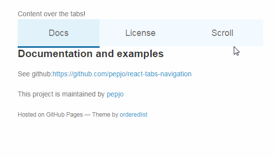
Banner
This content does not change with tabs and sits on top of the tabs bar. When the user scrolls past the banner the tabs bar stick on top of the page
-
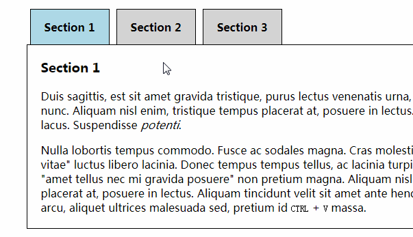
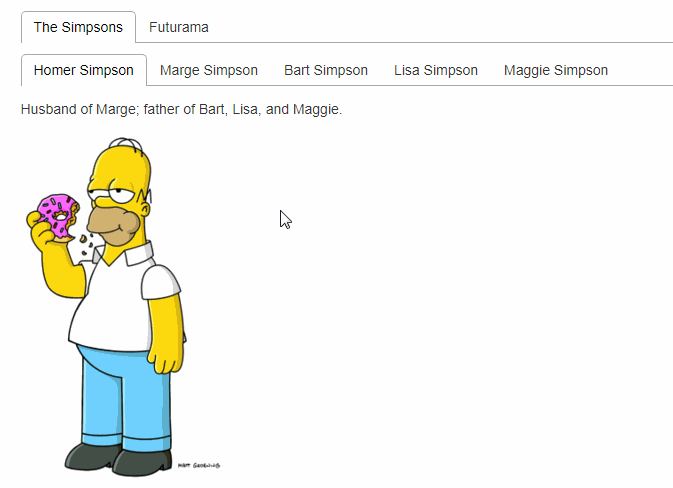
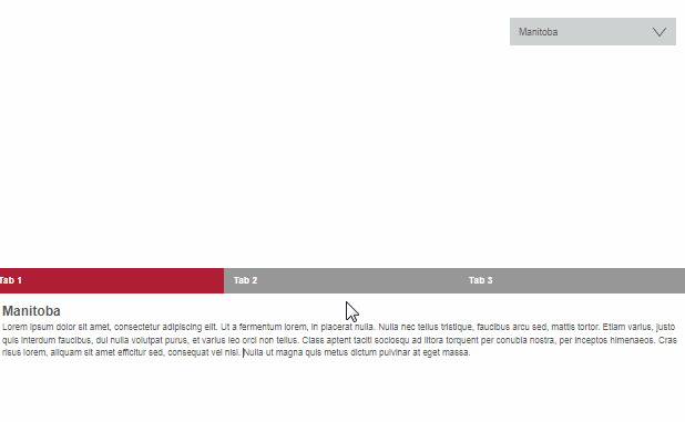
Tabs
The tabs of the element. They are horizontal. You can define their styles, hover styles and selected styles.
The selected tab in underlined, this animates to the newly selected tab when a new tab is selected.
-
Content
The content that changes when the user changes the tab.
Installing
$ npm install react-tabs-navigation
Props
This component accept the following props:
-
banner [object]
content over the tab bar
-
children [func|node]
a node or a function that returns a node (recommended)
-
-
color [string]
main color (can be overridden on lineStyles and tabStyles)
-
fixOffset [number]
The tabs bar fixes on the sreen when you scroll pass to it.
If you want it to fix below the upper limit of the document set here the offset
If you want it to not fix set the offset to at least -(the height of the bar) -
lineStyle [object]
Styles of the underline.
UsebackgroundColorto change the color and height to change thewidth(default 3px) of the line.
(Accepts Radium properties like:hover) -
onTabChange [func]
Function that gets executed when a tab changes, first argument is the index of the tab.
If you returnfalsethe tab will not change. Of course, you will still be
able to change it changing the selectedTab prop. -
selected [string|number]
The index or the
keyNameof the tab selected initially -
selectedTabStyle [object]
The style of the tab when it is selected.
(Accepts Radium properties like:hover) -
tabs [array] -required-
An array of objects, one for each tab
-
children [func|node]
a node or a function that returns a node (recommended)
-
displayName [string]
the name displayed on the tab
-
-
tabsBarClassName [string]
className of the tabs bar element
-
tabsBarStyle [object]
The style of the tabs bar
-
tabsClassName [string]
className of each tab. When they are selected they also have the class
is-selected -
tabsStyle [object]
The style of the tab.
(Accepts Radium properties like:hover)
Public Methods
changeSelectedTab(indexTab)to change the selected tab
Simple example
One of the simplest examples one could use
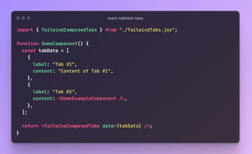
import Tabs from 'react-tabs-navigation'

<Tabs
  banner={{
    children: 'Content over the tabs!'
  }}
  tabs={[
    {
      children: () => (
        <div>
          This is the first tab content
        </div>
      ),
      displayName: 'Tab 1'
    },
    {
      children: () => (
        <div>
          This is the second tab content
        </div>
      ),
      displayName: 'Tab 2'
    }
  ]}
/>
Full example
A more complete example using more functionalities
import Tabs from 'react-tabs-navigation'

<Tabs
  banner={{
    children: 'Content over the tabs!'
  }}
  tabs={[
    {
      children: () => (
        <div>
          This is the first tab content
        </div>
      ),
      displayName: 'Tab 1'
    },
    {
      children: () => (
        <div>
          This is the second tab content
        </div>
      ),
      displayName: 'Tab 2'
    }
  ]}
/>
To do list
- [x] Use travis
- [x] Write some tests
- [ ] Optional animation when changing between tabs
- [x] Keyboard navigation
- [ ] Optional scroll behavior