react-table-plain
A NPM package that helps creating HTML tables in a React-way. It was partly inspired by react-table.
@dccs/react-table-plain is written in Typescript and comes with its own type definitions.
Installation
You should install react-table-plain with npm or yarn:
npm install @dccs/react-table-plain
or
yarn add @dccs/react-table-plain
This command will download and install react-table-plain and all required dependencies.
Minimal version
import React from "react";
import { TablePlain } from "@dccs/react-table-plain";
function App() {
return (
<TablePlain
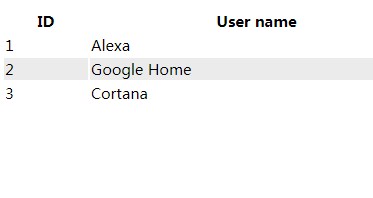
data={[
{ id: 1, name: "Alexa" },
{ id: 2, name: "Google Home" },
{ id: 3, name: "Cortana" }
]}
colDef={[
{
prop: "id",
header: "ID"
},
{
prop: "name",
header: "User name",
sortable: true
}
]}
/>
);
}

Properties
| Property | Type | Optional | Description |
|---|---|---|---|
| rootElement | React.ReactNode | x | Normaly <table> |
| rowElement | React.ReactNode | x | Normaly <tr> |
| cellElement | React.ReactNode | x | Normaly <td> |
| headerCellElement | React.ReactNode | x | Normaly <th> |
| headerElement | React.ReactNode | x | Normaly <thead> |
| bodyElement | React.ReactNode | x | Normaly <tbody> |
| footerElement? | React.ReactNode | x | Normaly <tfooter> |
| renderSortLabel? | colDef: IColDef, desc: boolean) => React.ReactNode | x | Render the sort label (arrow down/up) in header |
| data | any[] | Data array to render | |
| colDef? | IColDef[] | x | Definitions for all columns |
| orderedBy? | IColDef | x | |
| desc | boolean | ||
| onChangeOrderBy? | colDef: IColDef) => void | x | Called, when sorting changed |
| onChangeFilter? | ChangeFilterHandler | x | Called, when filter changed |
| onRowClick? | data: any) => void | x | Called, when one row has bee clicked |
| renderRoot? | children: React.ReactNode) => React.ReactNode | x | Returns root element to render |
| renderHeaderCell? | col: IColDef, idx: number) => React.ReactNode | x | Returns header element to render |
| renderFooterCell? | ( col: IColDef, data: any[], idx: number) => React.ReactNode | x | Returns footer element to render |
| renderFilter? | (col: IColDef, idx: number) => React.ReactNode | x | Returns the filter for a column |
| renderExpansionIndicator? | (expanded: boolean) => React.ReactNode | x | Returns the expanstion indicator to toggle a sub-component. |
| subComponent? | (data: any) => React.ReactNode | x | Returns the subcomponent for a row. |
| rowProps? | (data: any) => object | x | Callback that returns the props for a row. |
| cellProps? | (data: any) => object | x | Callback that returns the props for a cell. |
| filter? | object | x | Current filter object. |
| defaultFilter? | object | x | One time filter object. |
| ellipsis? | boolean | x | Use text ellipsis to shorten lengthy text content? |
Features
Sorting
react-table-plain supports sorting by a single column.
class App extends React.Component {
  state = {
    orderby: "",
    desc: false,
    data: [
      { id: 1, name: "Alexa" },
      { id: 2, name: "Google Home" },
      { id: 3, name: "Cortana" }
    ]
  };
  render() {
    return (
      <TablePlain
        data={this.state.data}
        colDef={[
          {
            prop: "id",
            header: "ID"
          },
          {
            prop: "name",
            header: "User name",
            sortable: true
          }
        ]}
        orderedBy={this.state.orderby}
        desc={this.state.desc}
        onChangeOrderBy={this.handleChangeOrderBy}
      />
    );
  }

  handleChangeOrderBy = col => {
    let desc = false;
    if (this.state.orderby === col.prop) {
      desc = !this.state.desc;
    }
    this.setState(prev => ({
      orderby: col.prop,
      desc,
      data: sortData(prev.data, col.prop, desc)
    }));
  };
}

function sortData(data, prop, desc) {
  let result = data.sort((a, b) => a[prop] > b[prop]);
  return desc ? result.reverse() : result;
}
IMPORTANT: react-table-plain doesn't do the sorting. It just displays the data.
The caller is responsible for sorting the data.
Render custom cells
TODO
Set row props
You can set the props of each row, depending on the data for each row. For example to highlight a single row.
import React from "react";
import { TablePlain } from "@dccs/react-table-plain";

function App() {
  return (
    <TablePlain
      data={[
        { id: 1, name: "Alexa" },
        { id: 2, name: "Google Home" },
        { id: 3, name: "Cortana" }
      ]}
      colDef={[
        {
          prop: "id",
          header: "ID"
        },
        {
          prop: "name",
          header: "User name",
          sortable: true
        }
      ]}
      rowProps={data => ({
        style: { background: data.id === 1 ? "yellow" : null }
      })}
    />
  );
}
Fixed Column width
Depending on the displayed data the width of the columns might vary. To prevent that (i.e. during paging) you may set the width of a column.
How does it work:
colDef={[{
    prop: "id",
    header: "ID",
    width: 1
  },
  {
    prop: "name",
    header: "Full name",
    width: 2
  },
  {
    prop: "ocupation",
    header: "Work",
    width: 2
  }]}
The total of all widths is 100% of the table width and each column is sized according to the width value. Like:
- Property "id" has a width of 1 of a total of 5. So the with is 1/5 of 100% that is 20% of the table width.
- Property "name" has a width of 2. The total width is still 5. So the width is 2/5. That is 40% of the table width.
Filter
You can add a filter for each row.
colDef={[
  {
    prop: "name",
    header: "Full name",
    filterable: true
  }
]}
This renders a <input type="text" /> below the header.
onChangeFilter reflects any changes to the filter.
Custom Filter inputs
To render custom filter inputs i.e. a datepicker you can provide the renderFilter property with a component.
colDef={[
  {
    prop: "name",
    header: "Full name",
    filterable: true,
    renderFilter: (value, handleChange) => <Datepicker value={value} onChange={e => handleChange(e.traget.value)}
  }
]}
The handleChange callback enables the table to collect all filter values and provide them to you.
Handling Filter State
By default the filter state is handled by react-table-plain. If you like to preset filter values or have control over the filter as a whole you can provide a filter property of type object.
Now it is your responsipility to update the filter property according to the changes delivered by the onChangeFilter callback. If you don't update the filter no updates will be seen in the view.
state = {
  filter: {}
}

render() {
  return <TablePlain
    colDef={[{
      prop: "name",
      header: "Full name",
      filterable: true
    }]}
    filter={this.state.filter}
    onChangeFilter={this.handleFilterChange}
    />;
}

handleFilterChange = (col, val) => {
  this.setState(p => ({
    filter: {
      {...p.filter},
      [col.prop]: val
    }
  }))
}
Cell properties for all cells
To set the props of all body cells you can use the cellProps property of the table like this:
<TablePlain
  cellProps={data => ({
    style: {
      whiteSpace: "nowrap",
      width: "100%",
      overflow: "hidden",
      textOverflow: "ellipsis"
    }
  })}
  // ...
/>
Content styling
Alignment
You can always set cell properties with props: () => ({style: {textAlign: "right"}}) to achive alignment of the cell content.
To make things easier we introduced the align property, that aligns header, body and footer cell content.
Ellipsis
This setting applies to all body cells.