react-shadow-component


react-shadow-component, a powerful and versatile package that allows you to easily add various box and text shadow styles to your React components. With this package, you can eliminate the need to write complex CSS code and add professional-looking shadows to your components with ease.
Installation
To install react-shadow-component, simply run the following command:
# NPM
npm install react-shadow-component

# Yarn
yarn add react-shadow-component
Usage
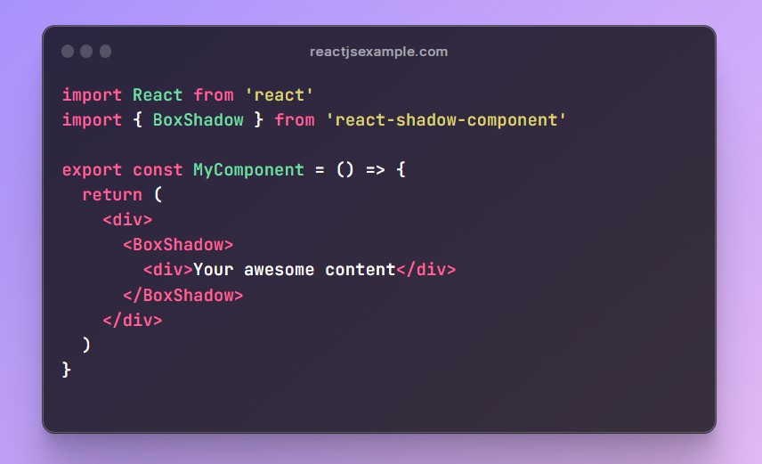
react-shadow-component is an HOC that can be applied to any React component. Here’s an example of how you can use it:
BoxShadow
import React from 'react'
import { BoxShadow } from 'react-shadow-component'

export const MyComponent = () => {
  return (
    <div>
      <BoxShadow>
        <div>Your awesome content</div>
      </BoxShadow>
    </div>
  )
}
WithShadow (HOC)
You can also use the WithShadow provider with props to style all BoxShadow component:
import React from 'react'
import { WithShadow } from 'react-shadow-component'

const MyApp = () => {
  return (
    <WithShadow shadowColor={['rgba(232, 0, 0, 0.19']}>
      <div>
        <BoxShadow>
          <div>This element has a box-shadow</div>
        </BoxShadow>
        <BoxShadow>
          <div>This element has a box-shadow</div>
        </BoxShadow>
      </div>
    </WithShadow>
  )
}

export default MyApp
Props
The BoxShadow component accepts the following props:
-
shadowColor: TheshadowColorprop is an array of strings that represents the color of the box-shadow. You can pass in any valid CSS color value, such as a named color, a hex code, or an RGB value -
shadowStyle: TheshadowStyleprop is a string that represents a predefined shadow style that you can apply to your elements. For example, the naming conventionshadowX_YwhereXis the number of predefined shadow andYis the number of shadows separated by commas.
For example, shadow1_3 means the first predefined shadow has three shadow separated by comma.
  return (
    <BoxShadow shadowStyle='shadow1_3'
    shadowColor={['#ff000000', 'rgb(0, 255, 0)' 'blue']}>
      <div>This element has a predefined shadow1_3 box-shadow</div>
    </BoxShadow>
  )
This naming convention makes it easier for the users to understand the predefined shadow styles and use them accordingly.
Conclusion
This package is a simple way to add box-shadow to your React elements. You can use the Shadow component to add a box-shadow to a single element, or the WithShadow provider to add style to all BoxShadow components. You can customize the shadow by passing in shadowColor and shadowStyle props to the Shadow component or WithShadow.