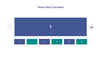
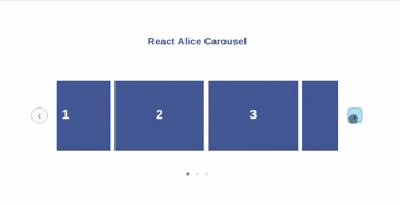
React Alice Carousel
React Alice Carousel is a React component for building content galleries, content rotators and any React carousels.
Features of react-alice-carousel
- Infinite loop
- FadeOut animation
- AutoPlay mode
- Mobile friendly
- Responsive design
- Swipe to slide
- Start index
- Slide to index
- RTL
- Keyboard navigation
- Touch and Drag support
- Custom rendered slides
- Custom animation duration
- Multiple items in the slide
- Show / hide anything (indicators, arrows, slides indexes)
How to use
npm install react-alice-carousel --save-dev
Style import
# SCSS
@import "react-alice-carousel/src/alice-carousel.scss";
# CSS
@import "react-alice-carousel/lib/alice-carousel.css";
# Webpack
import "react-alice-carousel/lib/alice-carousel.css";
Quick start
import React from 'react';
import AliceCarousel from 'react-alice-carousel';

const Gallery = () => (
  <AliceCarousel>
    <img src="/img1" className="yours-custom-class" />
    <img src="/img2" className="yours-custom-class" />
    <img src="/img3" className="yours-custom-class" />
    <img src="/img4" className="yours-custom-class" />
    <img src="/img5" className="yours-custom-class" />
  </AliceCarousel>
)
Advanced configuration
Props
-
duration: Number, default250- Duration of slides transition (milliseconds) -
responsive: Object, default{}- Number of items in the slide{ 0: { items: 1 }, 1024: { items: 3 } } -
buttonsDisabled: Boolean,false- Disable buttons control -
dotsDisabled: Boolean,false- Disable dots navigation -
startIndex: Number,0- The starting index of the carousel -
slideToIndex: Number,0- Sets the carousel at the specified position -
swipeDisabled: Boolean, defaultfalse- Disable swipe handlers -
mouseDragEnabled: Boolean, defaultfalse- Enable mouse drag animation -
infinite: Boolean, defaulttrue- Disable infinite mode -
fadeOutAnimation: Boolean,false- Enable fadeout animation. Fired when 1 item is in the slide -
keysControlDisabled: Boolean, defaultfalse- Disable keys controls (left, right, space) -
playButtonEnabled: Boolean, defaultfalse- Disable play/pause button -
autoPlay: Boolean, defaultfalse- Set auto play mode -
autoPlayInterval: Number, default250- Interval of auto play animation (milliseconds). If specified, a larger value will be taken from comparing this property and thedurationone -
autoPlayDirection: String, defaultltr- To run auto play in the left direction specifyrtlvalue -
autoPlayActionDisabled: Boolean, defaultfalse- If this property is identified astrueauto play animation will be stopped after clicking user on any gallery button -
stopAutoPlayOnHover: Boolean, defaulttrue- If this property is identified asfalseauto play animation won't stopped on hover -
showSlideIndex: Boolean, defaultfalse- Show slide index info -
onSlideChange: Function - Fired when the event object is changing / returns event object -
onSlideChanged: Function - Fired when the event object was changed / returns event objectBoth functions return next object
  {
      item: index,   // index of the item`s position
      slide: index   // index of the slide`s position
  }
Examples
import React from 'react';
import AliceCarousel from 'react-alice-carousel';

class Gallery extends React.Component {

  onSlideChange(e) {
    console.log('Item`s position during a change: ', e.item);
    console.log('Slide`s position during a change: ', e.slide);
  }

  onSlideChanged(e) {
    console.log('Item`s position after changes: ', e.item);
    console.log('Slide`s position after changes: ', e.slide);
  }

  render() {
    const responsive = {
      0: {
        items: 1
      },
      600: {
        items: 2
      },
      1024: {
        items: 3
      }
    };

    return (
      <AliceCarousel
        duration={400}
        autoPlay={true}
        startIndex = {1}
        fadeOutAnimation={true}
        mouseDragEnabled={true}
        playButtonEnabled={true}
        responsive={responsive}
        autoPlayInterval={2000}
        autoPlayDirection="rtl"
        autoPlayActionDisabled={true}
        onSlideChange={this.onSlideChange}
        onSlideChanged={this.onSlideChanged}
      >
        <div className="yours-custom-class"><h2>1</h2></div>
        <div className="yours-custom-class"><h2>2</h2></div>
        <div className="yours-custom-class"><h2>3</h2></div>
        <div className="yours-custom-class"><h2>4</h2></div>
        <div className="yours-custom-class"><h2>5</h2></div>
      </AliceCarousel>
    );
  }
}
Custom Prev / Next buttons, dots / thumbs navigation:
- Using - refs.
import React from 'react';
import AliceCarousel from 'react-alice-carousel';

class Gallery extends React.Component {
  renderThumbs = () =>
    <ul>
      {
        [1,2,3,4,5].map((item, i) =>
          <li key={i} onClick={() => this.Carousel._onDotClick(i)}>Thumb {item}</li>)
      }
    </ul>;

  render() {
    return (
      <div>
        <h3>Navigation</h3>
        { this.renderThumbs() }
        <button onClick={() => this.Carousel._slidePrev()}>Prev button</button>
        <button onClick={() => this.Carousel._slideNext()}>Next button</button>
        <h3>React Alice Carousel</h3>
        <AliceCarousel
          dotsDisabled={true}
          buttonsDisabled={true}
          ref={ el => this.Carousel = el }
        >
          <div className="yours-custom-class"><h2>1</h2></div>
          <div className="yours-custom-class"><h2>2</h2></div>
          <div className="yours-custom-class"><h2>3</h2></div>
          <div className="yours-custom-class"><h2>4</h2></div>
          <div className="yours-custom-class"><h2>5</h2></div>
        </AliceCarousel>
      </div>
    );
  }
}
- Using props
import React from 'react';
import AliceCarousel from 'react-alice-carousel';

class Gallery extends React.Component {
    constructor() {
      super();
      this.state = {
        currentIndex: 0,
        items: [1,2,3,4,5]
      };
    }

    slideTo = (i) => this.setState({ currentIndex: i });

    onSlideChanged = (e) => this.setState({ currentIndex: e.item });

    slideNext = () => this.setState({ currentIndex: this.state.currentIndex + 1 });

    slidePrev = () => this.setState({ currentIndex: this.state.currentIndex - 1 });

    renderThumbs = () =>
      <ul>{this.state.items.map((item, i) =>
        <li key={i} onClick={() => this.slideTo(i)}>Thumb {item}</li>)}
      </ul>;

    renderGallery() {
      const { currentIndex, items } = this.state;

      return (<AliceCarousel
        dotsDisabled={true}
        buttonsDisabled={true}
        slideToIndex={currentIndex}
        onSlideChanged={this.onSlideChanged}
      >
        { items.map((item, i) => <div key={i} className="yours-custom-class"><h2>{ item }</h2></div>) }
      </AliceCarousel>);
    }

    render() {
      return (
        <div>
          <h3>Navigation</h3>
          { this.renderThumbs() }
          <button onClick={() => this.slidePrev()}>Prev button</button>
          <button onClick={() => this.slideNext()}>Next button</button>
          <h3>React Alice Carousel</h3>
          { this.renderGallery() }
        </div>
      );
    }
}
Build the project locally
Clone
git clone https://github.com/maxmarinich/react-alice-carousel
cd react-alice-carousel
Run
npm i
npm start