react-slideshow
A react component for image slideshow supporting slide, fade and zoom.
A simple slideshow component built with react that supports slide, fade and zoom effects
Installation
npm install react-slideshow-image -S
yarn add react-slideshow-image
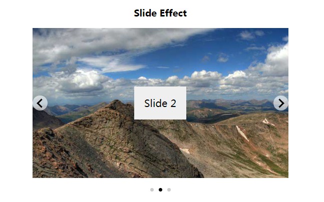
Slide Effect
import React from 'react';
import { Slide } from 'react-slideshow-image';

const slideImages = [
  'images/slide_2.jpg',
  'images/slide_3.jpg',
  'images/slide_4.jpg'
];

const properties = {
  duration: 5000,
  transitionDuration: 500,
  infinite: true,
  indicators: true,
  arrows: true
}

const Slideshow = () => {
    return (
      <Slide {...properties}>
        <div className="each-slide">
          <div style={{'backgroundImage': `url(${slideImages[0]})`}}>
            <span>Slide 1</span>
          </div>
        </div>
        <div className="each-slide">
          <div style={{'backgroundImage': `url(${slideImages[1]})`}}>
            <span>Slide 2</span>
          </div>
        </div>
        <div className="each-slide">
          <div style={{'backgroundImage': `url(${slideImages[2]})`}}>
            <span>Slide 3</span>
          </div>
        </div>
      </Slide>
    )
}
The default value for duration and transitionDuration is 5000 and 1000 milliseconds respectively
Fade Effect
import React from 'react';
import { Fade } from 'react-slideshow-image';

const fadeImages = [
  'images/slide_5.jpg',
  'images/slide_6.jpg',
  'images/slide_7.jpg'
];

const fadeProperties = {
  duration: 5000,
  transitionDuration: 500,
  infinite: false,
  indicators: true
}

const Slideshow = () => {
  return (
    <Fade {...fadeProperties}>
      <div className="each-fade">
        <div className="image-container">
          <img src={fadeImages[0]} />
        </div>
        <h2>First Slide</h2>
      </div>
      <div className="each-fade">
        <div className="image-container">
          <img src={fadeImages[1]} />
        </div>
        <h2>Second Slide</h2>
      </div>
      <div className="each-fade">
        <div className="image-container">
          <img src={fadeImages[2]} />
        </div>
        <h2>Third Slide</h2>
      </div>
    </Fade>
  )
}
The default value for duration and transitionDuration is 5000 and 1000 milliseconds respectively
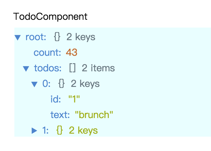
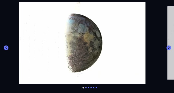
Zoom Effect
import React from 'react';
import { Zoom } from 'react-slideshow-image';

const images = [
  'images/slide_2.jpg',
  'images/slide_3.jpg',
  'images/slide_4.jpg',
  'images/slide_5.jpg',
  'images/slide_6.jpg',
  'images/slide_7.jpg'
];

const zoomOutProperties = {
  duration: 5000,
  transitionDuration: 500,
  infinite: true,
  indicators: true,
  scale: 0.4,
  arrows: true
}

const Slideshow = () => {
    return (
      <Zoom {...zoomOutProperties}>
        {
          images.map((each, index) => <img key={index} style={{width: "100%"}} src={each} />)
        }
      </Zoom>
    )
}
CSS
This is what my css looks like. You can customize this to your own taste
.slide-container {
  width: 70%;
  margin: auto; }

h3 {
  text-align: center; }

.each-slide > div {
  display: flex;
  align-items: center;
  justify-content: center;
  background-size: cover;
  height: 300px;
}

.each-slide span {
  padding: 20px;
  font-size: 20px;
  background: #efefef;
  text-align: center;
}

.each-fade {
  display: flex;
}

.each-fade .image-container {
  width: 75%;
  overflow: hidden;
}

.each-fade .image-container img {
  width: 100%;
}

.each-fade h2 {
  width: 25%;
  display: flex;
  justify-content: center;
  align-items: center;
  margin: 0;
  background: #adceed;
}
Webpack configuration
⚠️ If you bootstrapped the app without using create-react-app, you will need to add css loader and style loader to your webpack config
webpack.config.js
{
  module: {
    rules: [
      {
        test: /\.css$/,
        use: [
          { loader: "style-loader" },
          { loader: "css-loader" }
        ]
      }
    ]
  }
}
⚠️ For those using Next.js , this should be your next.config.jsinorder to avoid errors relating to importing css files within node modules
next.config.js
const withCSS = require('@zeit/next-css');

if (typeof require !== 'undefined') {
	require.extensions['.css'] = file => {};
}

module.exports = {
	webpack: config => {
		// Fixes npm packages that depend on `fs` module
		config.node = {
			fs: 'empty',
		};

		return config;
	},
};

module.exports = withCSS({
	cssModules: true,
	cssLoaderOptions: {
		url: true,
	},
});
HTML properties like className, data-* attributes and others will be applied to the parent div
Properties
| Properties | Type | DefaultValue | Description |
|---|---|---|---|
| duration | integer | 5000 | Time it takes (milliseconds) before next transition starts |
| transitionDuration | integer | 1000 | Determines how long the transition takes |
| infinite | boolean | true | Specifies if the transition should loop throughout |
| indicators | boolean | false | For specifying if there should be dots below the slideshow |
| scale | number | Required when using zoom to specify the scale the current slide should be zoomed to | |
| arrows | boolean | true | Determines if there should be a navigational arrow for going to the next or previous slide |
| autoplay | boolean | true | Responsible for determining if the slideshow should start automatically |