Smooth slide Toggle React
slide-toggle-react is a React component that provides a smooth slide animation for showing and hiding content. It allows you to easily create collapsible elements with customizable duration and easing functions.
Installation
You can install the package using npm:
npm install react-smooth-slide-toggle
Usage
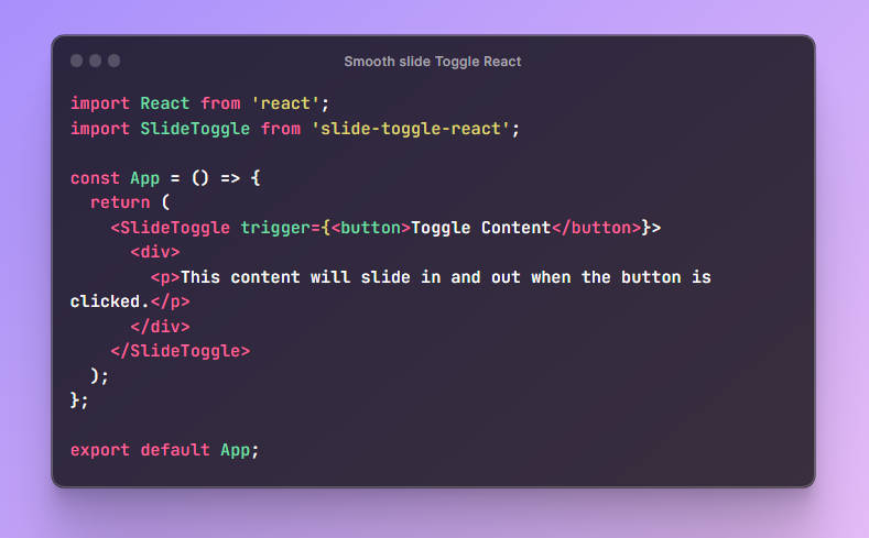
import React from 'react';
import SlideToggle from 'slide-toggle-react';

const App = () => {
  return (
    <SlideToggle trigger={<button>Toggle Content</button>}>
      <div>
        <p>This content will slide in and out when the button is clicked.</p>
      </div>
    </SlideToggle>
  );
};

export default App;
Props
The SlideToggle component accepts the following props:

trigger: (required) React element that serves as the trigger for the slide animation. When this element is clicked, the content will slide in or out.

easing: (optional) Specifies the easing function to be used for the slide animation. Available options are:

  'easeLinear'  Default
  'easeInQuad'
  'easeOutQuad'
  'easeInOutQuad'
  'easeInCubic'
  'easeOutCubic'
  'easeInOutCubic'
  'easeInQuart'
  'easeOutQuart'
  'easeInOutQuart'
  'easeInQuint'
  'easeOutQuint'
  easeInOutQuint'

duration: (optional) The duration of the slide animation in milliseconds. Default is 700ms.

expanded: (optional) If set to true, the content will be initially shown. If set to false, the content will be initially hidden. Default is false.

callBack: (optional) A callback function that will be called after the slide animation is completed.
API Reference
SlideToggle
A React component that handles slide animations for showing and hiding content.
getTotalHeightWithMargins(element: HTMLElement): number
A utility function to calculate the total height of an element, considering its height and top and bottom margins.
Example with Custom Easing and Duration
import React from 'react';
import SlideToggle from 'slide-toggle-react';

const App = () => {
  return (
    <SlideToggle
      trigger={<button>Toggle Content</button>}
      easing="easeOutQuad"
      duration={1000}
      expanded={true}
    >
      <div>
        <p>This content will slide in and out with a custom easing and duration.</p>
      </div>
    </SlideToggle>
  );
};

export default App;
Contribution
Contributions are welcome! If you find any issues or have suggestions for improvements, feel free to create a pull request or open an issue on GitHub.
License
This project is licensed under the MIT License.