react-insta-stories
A React component for Instagram like stories.
'See more' and video playback added! Watch the demo below!
Install
npm install --save react-insta-stories
Usage
import React, { Component } from 'react'
import Stories from 'react-insta-stories'
class App extends Component {
render () {
return (
<Stories
stories={stories}
defaultInterval={1500}
width={432}
height={768}
/>
)
}
}
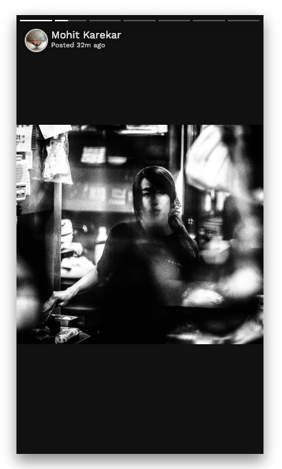
const stories = [{ url: 'https://picsum.photos/1080/1920', seeMore: <SeeMore />, header: { heading: 'Mohit Karekar', subheading: 'Posted 5h ago', profileImage: 'https://picsum.photos/1000/1000' } }, { url: 'https://fsa.zobj.net/crop.php?r=dyJ08vhfPsUL3UkJ2aFaLo1LK5lhjA_5o6qEmWe7CW6P4bdk5Se2tYqxc8M3tcgYCwKp0IAyf0cmw9yCmOviFYb5JteeZgYClrug_bvSGgQxKGEUjH9H3s7PS9fQa3rpK3DN3nx-qA-mf6XN', header: { heading: 'Mohit Karekar', subheading: 'Posted 32m ago', profileImage: 'https://picsum.photos/1080/1920' } }, { url: 'https://media.idownloadblog.com/wp-content/uploads/2016/04/iPhone-wallpaper-abstract-portrait-stars-macinmac.jpg', header: { heading: 'mohitk05/react-insta-stories', subheading: 'Posted 32m ago', profileImage: 'https://avatars0.githubusercontent.com/u/24852829?s=400&v=4' } }, { url: 'https://storage.googleapis.com/coverr-main/mp4/Footboys.mp4', type: 'video', duration: 1000 }, { url: 'http://commondatastorage.googleapis.com/gtv-videos-bucket/sample/ForBiggerJoyrides.mp4', type: 'video', seeMore: <SeeMore /> }, { url: 'http://commondatastorage.googleapis.com/gtv-videos-bucket/sample/ForBiggerBlazes.mp4', type: 'video' }, 'https://images.unsplash.com/photo-1534856966153-c86d43d53fe0?ixlib=rb-1.2.1&ixid=eyJhcHBfaWQiOjEyMDd9&auto=format&fit=crop&w=564&q=80']
Props
| Property | Type | Default | Description |
|---|---|---|---|
stories |
[String/Object] | required |
An array of image urls or array of story objects (options described below) |
defaultInterval |
Number | 1200 | Milliseconds duration for which a story persists |
loader |
Component | 'Loading..' | A loader component as a fallback until image loads from url |
header |
Component | Default header as in demo | A header component which sits at the top of each story. It receives the header object from the story object. Data for header to be sent with each story object. |
width |
Number | 360 | Width of the component in pixels |
height |
Number | 640 | Height of the component in pixels |
storyStyles |
Object | none | Override the default story styles mentioned below. |
Story object
Instead of simple string url, a comprehensive 'story object' can also be passed in the stories array.
| Property | Description |
|---|---|
url |
The url of the resource, be it image or video. |
duration |
Optional. Duration for which a story should persist. |
header |
Optional. Adds a header on the top. Object with heading, subheading and profileImage properties. |
seeMore |
Optional. Adds a see more icon at the bottom of the story. On clicking, opens up this component. |
type |
Optional. To distinguish a video story. type: 'video' is necessary for a video story. |
styles |
Optional. Override the default story styles mentioned below. |
Default story styles
Following are the default story content styles. Override them by providing your own style object with each story or a global override by using the storyStyles prop.
storyContent: {
    width: 'auto',
    maxWidth: '100%',
    maxHeight: '100%',
    margin: 'auto'
}