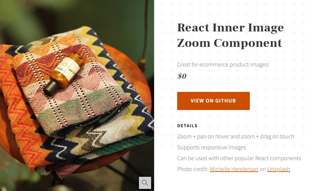
react-inner-image-zoom
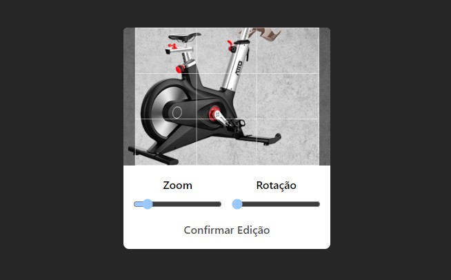
A React component for magnifying an image within its original container. The zoom behavior is triggered on click and the image can be moved by dragging on touch devices and by either dragging or hover panning on non-touch devices. The component supports responsive images and optional fullscreen zoom on mobile.
Installation
NPM
npm install react-inner-image-zoom
Yarn
yarn add react-inner-image-zoom
Styling
I was originally importing the CSS directly into the component but I've recently realized that makes too many assumptions about the wider build process. You can now download the raw CSS file at:
/src/InnerImageZoom/styles.css
or the minified raw minified version at:
/src/InnerImageZoom/styles.min.css
to include however you see fit. Or, if your setup supports it, import the files directory from your node_modules using:
import 'react-inner-image-zoom/lib/InnerImageZoom/styles.css';
or:
import 'react-inner-image-zoom/lib/InnerImageZoom/styles.min.css';
Usage
Import and render the component:
import InnerImageZoom from 'react-inner-image-zoom';

...

<InnerImageZoom src="/path/to/image.jpg" zoomSrc="/path/to/zoom-image.jpg" />
This is the simplest usage. For additional examples, visit the demo page.
Props
| Prop | Type | Default | Description |
|---|---|---|---|
| src | String | (Required) URL for the original image. | |
| srcSet | String | Default srcset attribute for a responsive original image. | |
| sizes | String | Default sizes attribute for use with srcset. | |
| sources | Array | A list of image sources for using the picture tag to serve the appropriate original image (see below for more details). | |
| zoomSrc | String | URL for the larger zoom image. Falls back to original image src if not defined. | |
| zoomScale | Number | 1 | Multiplied against the natural width and height of the zoomed image. This will generally be a decimal (example, 0.9 for 90%). |
| alt | String | Alternative text for the original image. | |
| moveType | String | pan | pan or drag. The user behavior for moving zoomed images on non-touch devices. |
| zoomType | String | click | click or hover. The zoom behavior for images. |
| fadeDuration | Number | 150 | Fade transition time in milliseconds. If zooming in on transparent images, set this to 0 for best results. |
| fullscreenOnMobile | Boolean | false | Enables fullscreen zoomed image on touch devices below a specified breakpoint. |
| mobileBreakpoint | Number | 640 | The maximum breakpoint for fullscreen zoom image when fullscreenOnMobile is true. |
| className | String | Custom classname for styling the component. | |
| afterZoomIn | Function | Function to be called after zoom in. | |
| afterZoomOut | Function | Function to be called after zoom out. | |
| startsActive | boolean | if set to true, sets the initial value of isActive to true. |
Sources
This prop accepts an array of objects which it uses to create a picture tag and source elements. The component looks for the following optional properties and you can find additional details on responsive images here:
| Prop | Type | Default | Description |
|---|---|---|---|
| srcSet | String | Srcset attribute for source tag. | |
| sizes | String | Sizes attribute for source tag. | |
| media | String | An attribute containing a media condition for use with the srcset. | |
| type | String | An image MIME type. This is useful for using newer formats like WebP. |