React Component for Octicons
react-component-octicons is a React component library for the latest Octicons (v7.x). This library wraps SVG icons and provides one React component
This library has no dependency because all
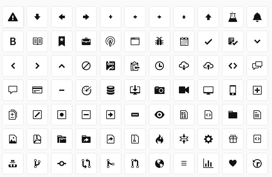
To see the catalog of icons, please visit the document page built with Storybook.
Installation
$ npm install --save react-component-octicons
Usage
<Octicon/> component has a required property name and optional properties zoom, style.
import * as React from 'react';
import { render } from 'react-dom';
import Octicon from 'react-component-octicons';

render(
    <div>
        // Normal size
        <Octicon name="alert" />

        // Twice bigger
        <Octicon name="star" zoom="x2" />

        // Size 100px x 100px
        <div style={{width: '100px', height: '100px'}}>
            <Octicon name="flame" zoom="100%" />
        </div>

        // Styled icon
        <Octicon name="flame" zoom="100%" style={{color: 'blue'}}/>
    </div>,
    document.getElementById('root'),
);
name property (required)
name is a symbol name for an icon. Symbol names are described in [Octicons document][Octicons].
zoom property (optional)
zoom is a string value and it represents the zoom factor of the icon.
x{N}:Nis a number (integer or float). Zoom the icon by xN (i.e.x4means 4 times bigger than normal).N%:Nis a number between 0~100. It means N% size of its parent element. So100%means to fit to the parent element.
style property (optional)
style is a CSS property to specify the style of the icon itself. The styles are applied to underlying <svg> element.
className property (optional)
className is a class name of underlying <svg> element.
Typo Safety for Icon Names
name property of <Octicon/> is restricted to actual symbol names. For example, following code contains typo allow-right (arrow-right is correct).
// ERROR! 'allow-right' is typo of 'arrow-right'
render(
    <Octicon name="allow-right" />,
    document.getElementById('root'),
);
It falls into a compilation error.
test.tsx(5,17): error TS2322: Type '{ name: "allow-right"; }' is not assignable to type 'IntrinsicAttributes & IntrinsicClassAttributes<Octicon> & Readonly<{ children?: ReactNode; }> & R...'.
  Type '{ name: "allow-right"; }' is not assignable to type 'Readonly<OcticonProps>'.
    Types of property 'name' are incompatible.
      Type '"allow-right"' is not assignable to type 'OcticonSymbol'.
Development
Following is a process to develop this library.
$ # Install all development dependencies
$ npm install

$ # Build the library and run all unit tests
$ npm test

$ # See manually if the library is working
$ # Open http://localhost:4321 in your browser
$ npm run smoke-test

$ # Run storybook locally on port 6006
$ npm run storybook

$ # Build storybook (catalog site) in docs/ directory
$ npm run build-storybook