React Mentions
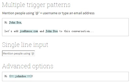
A React component that let's you mention people in a textarea like you are used to on Facebook or Twitter.
Getting started
Install the react-mentions package via npm:
npm install react-mentions --save
Require the react-mentions package, which exports the two relevant React components for rendering the mentions textarea:
import { MentionsInput, Mention } from 'react-mentions'
MentionsInput is the main component rendering the textarea control. It takes one or multiple Mention components as its children. Each Mention component represents a data source for a specific class of mentionable objects, such as users, template variables, issues, etc.
Example:
<MentionsInput value={this.state.value} onChange={this.handleChange}>
    <Mention trigger="@"
        data={this.props.users}
        renderSuggestion={this.renderUserSuggestion} />
    <Mention trigger="#"
        data={this.requestTag}
        renderSuggestion={this.renderTagSuggestion} />
</MentionsInput>
You can find more examples here: gh-pages/views/examples
Configuration
The MentionsInput supports the following props for configuring the widget:
| Prop name | Type | Default value | Description |
|---|---|---|---|
| value | string | '' |
The value containing markup for mentions |
| onChange | function (event, newValue, newPlainTextValue, mentions) | empty function | A callback that is invoked when the user changes the value in the mentions input |
| markup | string | '@[__display__](__id__)' |
A template string for the markup to use for mentions |
| singleLine | boolean | false |
Renders a single line text input instead of a textarea, if set to true |
| displayTransform | function (id, display, type) | returns display |
Accepts a function for customizing the string that is displayed for a mention |
| onBlur | function (event, clickedSuggestion) | empty function | Passes true as second argument if the blur was caused by a mousedown on a suggestion |
| allowSpaceInQuery | boolean | false | Keep suggestions open even if the user separates keywords with spaces. |
Each data source is configured using a Mention component, which has the following props:
| Prop name | Type | Default value | Description |
|---|---|---|---|
| trigger | regexp or string | '@' |
Defines the char sequence upon which to trigger querying the data source |
| type | string | null |
Identifier for the data source, when using multiple data sources (optional) |
| data | array or function (search, callback) | null |
An array of the mentionable data entries (objects with id & display keys, or a filtering function that returns an array based on a query parameter |
| renderSuggestion | function (entry, search, highlightedDisplay, index) | null |
Allows customizing how mention suggestions are rendered (optional) |
| onAdd | function (id, display) | empty function | Callback invoked when a suggestion has been added (optional) |
| appendSpaceOnAdd | boolean | false | Append a space when a suggestion has been added (optional) |
If a function is passed as the data prop, that function will be called with the current search query as first, and a callback function as second argument. The callback can be used to provide results asynchronously, e.g., after fetch requests. (It can even be called multiple times to update the list of suggestions.)
