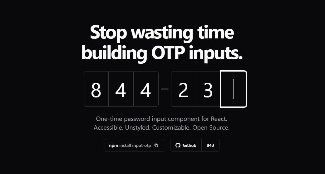
OTP Input for React
One-time password input component for React. Accessible. Unstyled. Customizable. Open Source.
Usage
npm install input-otp
Then import the component.
+'use client'
+import { OTPInput } from 'input-otp'

function MyForm() {
  return <form>
+   <OTPInput maxLength={6} render={({slots})  => (...)} />
  </form>
}
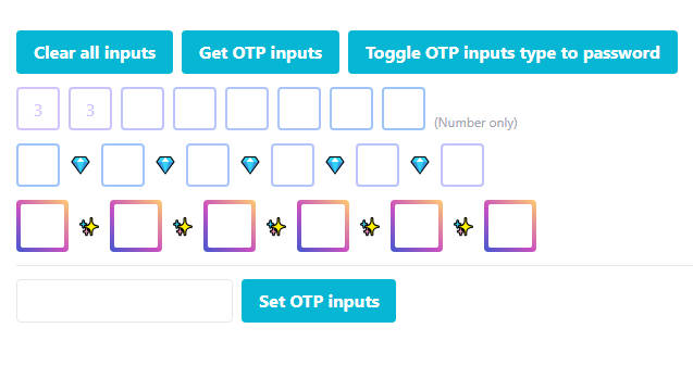
Default example
The example below uses tailwindcss @shadcn/ui tailwind-merge clsx:
'use client'
import { OTPInput, SlotProps } from 'input-otp'
<OTPInput
maxLength={6}
containerClassName="group flex items-center has-[:disabled]:opacity-30"
render={({ slots }) => (
<>
<div className="flex">
{slots.slice(0, 3).map((slot, idx) => (
<Slot key={idx} {...slot} />
))}
</div>
<FakeDash />
<div className="flex">
{slots.slice(3).map((slot, idx) => (
<Slot key={idx} {...slot} />
))}
</div>
</>
)}
/>
// Feel free to copy. Uses @shadcn/ui tailwind colors.
function Slot(props: SlotProps) {
return (
<div
className={cn(
'relative w-10 h-14 text-[2rem]',
'flex items-center justify-center',
'transition-all duration-300',
'border-border border-y border-r first:border-l first:rounded-l-md last:rounded-r-md',
'group-hover:border-accent-foreground/20 group-focus-within:border-accent-foreground/20',
'outline outline-0 outline-accent-foreground/20',
{ 'outline-4 outline-accent-foreground': props.isActive },
)}
>
{props.char !== null && <div>{props.char}</div>}
{props.hasFakeCaret && <FakeCaret />}
</div>
)
}
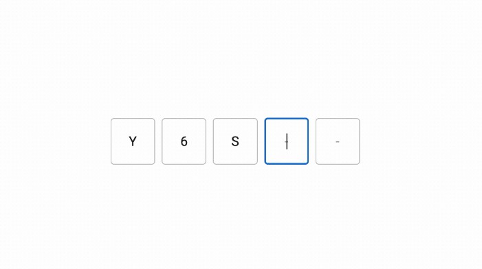
// You can emulate a fake textbox caret!
function FakeCaret() {
return (
<div className="absolute pointer-events-none inset-0 flex items-center justify-center animate-caret-blink">
<div className="w-px h-8 bg-white" />
</div>
)
}
// Inspired by Stripe's MFA input.
function FakeDash() {
return (
<div className="flex w-10 justify-center items-center">
<div className="w-3 h-1 rounded-full bg-border" />
</div>
)
}
// tailwind.config.ts for the blinking caret animation.
const config = {
theme: {
extend: {
keyframes: {
'caret-blink': {
'0%,70%,100%': { opacity: '1' },
'20%,50%': { opacity: '0' },
},
},
animation: {
'caret-blink': 'caret-blink 1.2s ease-out infinite',
},
},
},
}
// Small utility to merge class names.
import { clsx } from "clsx";
import { twMerge } from "tailwind-merge";
import type { ClassValue } from "clsx";
export function cn(...inputs: ClassValue[]) {
return twMerge(clsx(inputs));
}
How it works
There's currently no native OTP/2FA/MFA input in HTML, which means people are either going with 1. a simple input design or 2. custom designs like this one.
This library works by rendering an invisible input as a sibling of the slots, contained by a relatively positioned parent (the container root called OTPInput).
API Reference
OTPInput
The root container. Define settings for the input via props. Then, use the render prop to create the slots.