focus-trap-react
A React component that traps focus.
This component is a light wrapper around focus-trap, tailored to your React-specific needs.
You might want it for, say, building an accessible modal?
This module simply provides a React component that creates and manages a focus trap.
- The focus trap automatically activates when mounted (by default, though this can be changed).
- The focus trap automatically deactivates when unmounted.
- The focus trap can be activated and deactivated, paused and unpaused via props.
Installation
npm install focus-trap-react
dist/focus-trap-react.js is the Babel-compiled file that you'll use.
React dependency
Version 2+ is compatible with React >0.14+.
Version 1 is compatible with React 0.13.
Browser Support
Basically IE9+.
Why? Because this module's core functionality comes from focus-trap, which uses a couple of IE9+ functions.
Usage
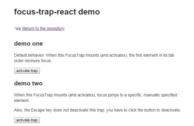
Read code in demo/ (it's very simple), and see how it works.
Here's one simple example:
const React = require('react');
const ReactDOM = require('react-dom');
const FocusTrap = require('../../dist/focus-trap-react');

const container = document.getElementById('demo-one');

class DemoOne extends React.Component {
  constructor(props) {
    super(props);

    this.state = {
      activeTrap: false
    };

    this.mountTrap = this.mountTrap.bind(this);
    this.unmountTrap = this.unmountTrap.bind(this);
  }

  mountTrap() {
    this.setState({ activeTrap: true });
  }

  unmountTrap() {
    this.setState({ activeTrap: false });
  }

  render() {
    const trap = this.state.activeTrap
      ? <FocusTrap
          focusTrapOptions={{
            onDeactivate: this.unmountTrap
          }}
        >
          <div className="trap">
            <p>
              Here is a focus trap
              {' '}
              <a href="#">with</a>
              {' '}
              <a href="#">some</a>
              {' '}
              <a href="#">focusable</a>
              {' '}
              parts.
            </p>
            <p>
              <button onClick={this.unmountTrap}>
                deactivate trap
              </button>
            </p>
          </div>
        </FocusTrap>
      : false;

    return (
      <div>
        <p>
          <button onClick={this.mountTrap}>
            activate trap
          </button>
        </p>
        {trap}
      </div>
    );
  }
}

ReactDOM.render(<DemoOne />, container);
Props
focusTrapOptions
Type: Object, optional
Pass any of the options available in focus-trap's createOptions.
active
Type: Boolean, optional
By default, the FocusTrap activates when it mounts. So you activate and deactivate it via mounting and unmounting. If, however, you want to keep the FocusTrap mounted while still toggling its activation state, you can do that with this prop.
See demo/demo-three.jsx.
paused
Type: Boolean, optional
If you would like to pause or unpause the focus trap (see focus-trap's documentation), toggle this prop.
tag
Type: String, Default: div, optional
An HTML tag for the FocusTrap's DOM node.
additional props
All props not mentioned above are passed directly to the rendered DOM element. This means that you can pass id, className, style, aria-attributes, data-attributes, or any other arbitrary property that you want to use to customize the element.
Contributing & Development
Please note that this project is released with a Contributor Code of Conduct. By participating in this project you agree to abide by its terms.
Lint with npm run lint.
Run the demos with npm start.
Test with npm run test.