React Modal Easy
Simple modal with good accessibility
The purpose of this component is to provide a simple interface. You won’t find predefined styles to cause you problems or unnecessary customizations.
Install
npm i react-modal-easy
Usage
// include styles
import 'react-modal-easy/dist/style.css';

const [visible, setVisible] = useState(false);

return (
  <Modal isVisible={visible} onClose={() => setVisible(false)}>
    <div style={{ backgroundColor: 'white', width: 500, padding: 20 }}>
      <Modal.Title>React Modal Easy</Modal.Title>
      ...
    </div>
  </Modal>
);

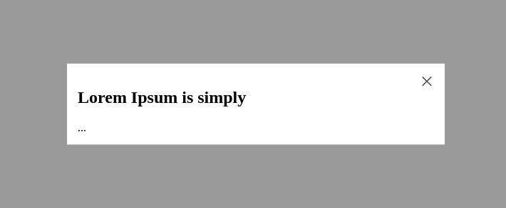
Acessibility
By internally using the Radix Dialog, this component comes with accessibility configurations by default. However, for the best use of this feature, also utilize the Title, Description and Close components.
...
return (
  <Modal
    isVisible={visible}
    onClose={onClose}
    closeButton={
      <Modal.Close onClick={onClose} aria-label='Close'>
        X
      </Modal.Close>
    }
  >
    <Modal.Title>Lorem Ipsum is simply</Modal.Title>
    <Modal.Description>
      Lorem Ipsum is simply dummy text of the printing and typesetting industry.
    </Modal.Description>
    ...
  </Modal>
);
Props
| Property | Type | Default | Description |
|---|---|---|---|
| isVisible | boolean | whether to show dialog | |
| onClose | function | handler called onClose of modal | |
| animation? | ‘scale’ , ‘translate’ , ‘none’ | scale | animation type |
| closeButton? | React.ReactNode | Component | close component, use null to disable. |
| className? | string | modal component class | |
| overlayClassName? | string | overlay component class |
Components
| Name | Description |
|---|---|
| Modal.Title | An accessible title to be announced when the dialog is opened. |
| Modal.Description | An optional accessible description to be announced when the dialog is opened. |
| Modal.Close | The button that closes the dialog. |