react-countup
A configurable React component wrapper around CountUp.js.
Installation
yarn add react-countup
Usage
import CountUp from 'react-countup';
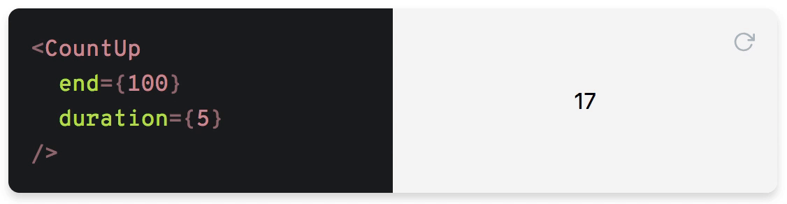
Simple example
<CountUp end={100} />
This will start a count up transition from 0 to 100 on render.
Render prop example
<CountUp
  start={-875.039}
  end={160527.012}
  duration={2.75}
  separator=" "
  decimals={4}
  decimal=","
  prefix="EUR "
  suffix=" left"
  onEnd={() => console.log('Ended! ?')}
  onStart={() => console.log('Started! ?')}
>
  {({ countUpRef, start }) => (
    <div>
      <span ref={countUpRef} />
      <button onClick={start}>Start</button>
    </div>
  )}
</CountUp>
The transition won't start on initial render as it needs to be triggered manually here.
Tip: If you need to start the render prop component immediately, you can set delay={0}.
More examples
Manually start with render prop
<CountUp start={0} end={100}>
  {({ countUpRef, start }) => (
    <div>
      <span ref={countUpRef} />
      <button onClick={start}>Start</button>
    </div>
  )}
</CountUp>
Autostart with render prop
Render start value but start transition on first render:
<CountUp start={0} end={100} delay={0}>
  {({ countUpRef, start }) => (
    <div>
      <span ref={countUpRef} />
      <button onClick={start}>Start</button>
    </div>
  )}
</CountUp>
Note that delay={0} will automatically start the count up.
Delay start
<CountUp delay={2} end={100} />
API
Props
className: string
CSS class name of the span element.
Note: This won't be applied when using CountUp with render props.
decimal: string
Specifies decimal character.
Default: .
decimals: number
Amount of decimals to display.
Default: 0
delay: ?number
Delay in seconds before starting the transition.
Default: null
Note:
delay={0}will automatically start the count up.
duration: number
Duration in seconds.
Default: 2
end: number
Target value.
prefix: string
Static text before the transitioning value.
redraw: boolean
Forces count up transition on every component update.
Default: false
separator: string
Specifies character of thousands separator.
start: number
Initial value.
Default: 0
suffix: string
Static text after the transitioning value.
useEasing: boolean
Enables easing. Set to false for a linear transition.
Default: true
easingFn: (t: number, b: number, c: number, d: number) => number
Easing function. Click here for more details.
Default: easeInExpo
formattingFn: (value: number) => string
Function to customize the formatting of the number
onEnd: ({ pauseResume, reset, start, update }) => void
Callback function on transition end.
onStart: ({ pauseResume, reset, update }) => void
Callback function on transition start.
onPauseResume: ({ reset, start, update }) => void
Callback function on pause or resume.
onReset: ({ pauseResume, start, update }) => void
Callback function on reset.
onUpdate: ({ pauseResume, reset, start }) => void
Callback function on update.
Render props
countUpRef: () => void
Ref to hook the countUp instance to
pauseResume: () => void
Pauses or resumes the transition
reset: () => void
Resets to initial value
start: () => void
Starts or restarts the transition
update: (newEnd: number?) => void
Updates transition to the new end value (if given)
Protips
By default, the animation is triggered if any of the following props has changed:
durationendstart
If redraw is set to true your component will start the transition on every component update.