react-collapse
Component-wrapper for collapse animation for elements with variable (and dynamic) height
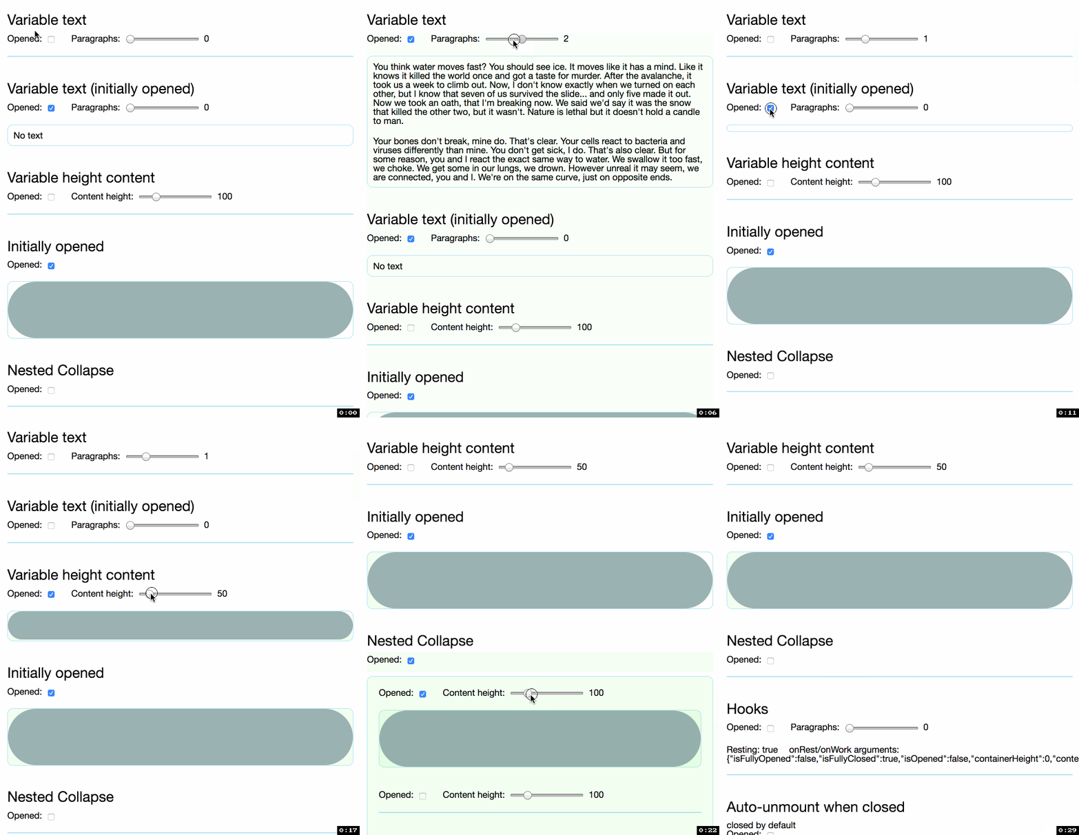
Codepen demo
http://codepen.io/nkbt/pen/MarzEg
Installation
NPM
npm install --save react-collapse
yarn
yarn add react-collapse
1998 Script Tag:
<script src="https://unpkg.com/react/umd/react.production.min.js"></script>
<script src="https://unpkg.com/react-collapse/build/react-collapse.min.js"></script>
(Module exposed as `ReactCollapse`)
Usage
1. Content is always mounted (default)
import {Collapse} from 'react-collapse';

// ...
<Collapse isOpened={true || false}>
  <div>Random content</div>
</Collapse>
2. Content unmounts when collapsed
Use Unmount component provided as:
import {UnmountClosed} from 'react-collapse';

// ...
<UnmountClosed isOpened={true || false}>
  <div>Random content</div>
</UnmountClosed>
Example example/App/AutoUnmount.js
3. Controlled and accessible
If you want a controlled and accessible implementation, check out this example
Options
isOpened: PropTypes.boolean.isRequired
Expands or collapses content.
children: PropTypes.node.isRequired
One or multiple children with static, variable or dynamic height.
<Collapse isOpened={true}>
  <p>Paragraph of text</p>
  <p>Another paragraph is also OK</p>
  <p>Images and any other content are ok too</p>
  <img src="nyancat.gif" />
</Collapse>
theme: PropTypes.objectOf(PropTypes.string)
It is possible to set className for extra div elements that ReactCollapse creates.
Example:
<Collapse theme={{collapse: 'foo', content: 'bar'}}>
  <div>Customly animated container</div>
</Collapse>
Default values:
const theme = {
  collapse: 'ReactCollapse--collapse',
  content: 'ReactCollapse--content'
}
Which ends up in the following markup:
<div class="ReactCollapse--collapse">
  <div class="ReactCollapse--content">
    {children}
  </div>
</div>
IMPORTANT: these are not style objects, but class names!
onRest, onWork: PropTypes.func
Callback functions, triggered when animation has completed (onRest) or has just started (onWork)
Both functions are called with argument:
const arg = {
  isFullyOpened: true || false, // `true` only when Collapse reached final height
  isFullyClosed: true || false, // `true` only when Collapse is fully closed and height is zero
  isOpened: true || false, // `true` if Collapse has any non-zero height
  containerHeight: 123, // current pixel height of Collapse container (changes until reaches `contentHeight`)
  contentHeight: 123 // determined height of supplied Content
}
<Collapse onRest={console.log} onWork={console.log}>
  <div>Container text</div>
</Collapse>
Example example/App/Hooks.js
initialStyle: PropTypes.shape
initialStyle: PropTypes.shape({
  height: PropTypes.oneOfType([PropTypes.string, PropTypes.number]),
  overflow: PropTypes.string
})
You may control initial element style, for example to force initial animation from 0 to height by using initialStyle={{height: '0px', overflow: 'hidden'}}
IMPORTANT Any updates to this prop will be ignored after first render.
Default value is determined based on initial isOpened value:
  initialStyle = props.isOpened
    ? {height: 'auto', overflow: 'initial'}
    : {height: '0px', overflow: 'hidden'};
Example: example/App/ForceInitialAnimation.js
checkTimeout: PropTypes.number
Number in ms.
Collapse will check height after thins timeout to determine if animation is completed, the shorter the number - the faster onRest will be triggered and the quicker hight: auto will be applied. The downside - more calculations.
Default value is: 50.
Pass-through props
IMPORTANT Collapse does not support any pass-through props, so any non-supported props will be ignored
Because we need to have control over when Collapse component is updated and it is not possible or very hard to achieve when any random props can be passed to the component.
Behaviour notes
-
initially opened Collapse elements will be statically rendered with no animation. You can override this behaviour by using
initialStyleprop -
due to the complexity of margins and their potentially collapsible nature,
ReactCollapsedoes not support (vertical) margins on their children. It might lead to the animation "jumping" to its correct height at the end of expanding. To avoid this, use padding instead of margin.
See #101 for more details
Migrating from v4 to v5
v5 was another complete rewrite that happened quite a while ago, it was published as @nkbt/react-collapse and tested in real projects for a long time and now fully ready to be used.
In the most common scenario upgrade is trivial (add CSS transition to collapse element), but if you were using a few deprecated props - there might be some extra work required.
Luckily almost every deprecated callback or prop has fully working analogue in v5. Unfortunately not all of them could maintain full backward compatibility, so please check this migration guide below.
1. Change in behaviour
New Collapse does not implement animations anymore, it only determines Content height and updates Collapse wrapper height to match it.
Only after Collapse height reaches Content height (animation finished), Collapse's style is updated to have height: auto; overflow: initial.
The implications is that you will need to update your CSS with transition:
.ReactCollapse--collapse {
  transition: height 500ms;
}
IMPORTANT: without adding css transition there will be no animation and component will open/close instantly.
2. New props or updated props
-
onRest/onWorkcallbacks (see above for full description). ThoughonRestdid exist previously, now it is called with arguments containing few operational params and flags. -
initialStyleyou may control initial element style, for example to force initial animation from 0 to height by usinginitialStyle={{height: '0px', overflow: 'hidden'}}
IMPORTANT Any updates to this prop will be ignored after first render.
Default value is:initialStyle = props.isOpened ? {height: 'auto', overflow: 'initial'} : {height: '0px', overflow: 'hidden'}; -
checkTimeoutnumber inms. Collapse will check height after thins timeout to determine if animation is completed, the shorter the number - the fasteronRestwill be triggered and the quickerhight: autowill be applied. The downside - more calculations.
Default value is:50.
3. Deprecated props (not available in v5)
-
Pass-through props- any unknown props passed toCollapsecomponent will be ignored -
hasNestedCollapse- no longer necessary, as v5 does not care if there are nested Collapse elements, see example/App/Nested.js -
fixedHeight- no longer necessary, just set whatever height you need for content element and Collapse will work as expected, see example/App/VariableHeight.js -
springConfig- as new Collapse relies on simple CSS transitions (or your own implementation of animation) and does not use react-collapse, springConfig is no longer necessary. You can control control animation with css like.ReactCollapse--collapse { transition: height 500ms; } -
forceInitialAnimation- you can use new propinitialStyle={{height: '0px', overflow: 'hidden'}}instead, so when new height will be set after component is rendered - it should naturally animate. -
onMeasure- please useonRestandonWorkinstead and pickcontentHeightfrom argument<Collapse onRest={({contentHeight}) => console.log(contentHeight)} onWork={({contentHeight}) => console.log(contentHeight)}> <div>content</div> </Collapse> -
onRender- since animations are fully controlled by external app (e.g. with CSS) we no draw each frame and do not actually re-render component anymore, so it is impossible to haveonRendercallback
Development and testing
Currently is being developed and tested with the latest stable Node on OSX.
To run example covering all ReactCollapse features, use yarn start, which will compile example/Example.js
git clone [email protected]:nkbt/react-collapse.git
cd react-collapse
yarn install
yarn start

# then
open http://localhost:8080
Tests
# to run ESLint check
yarn lint

# to run tests
yarn test
License
MIT
