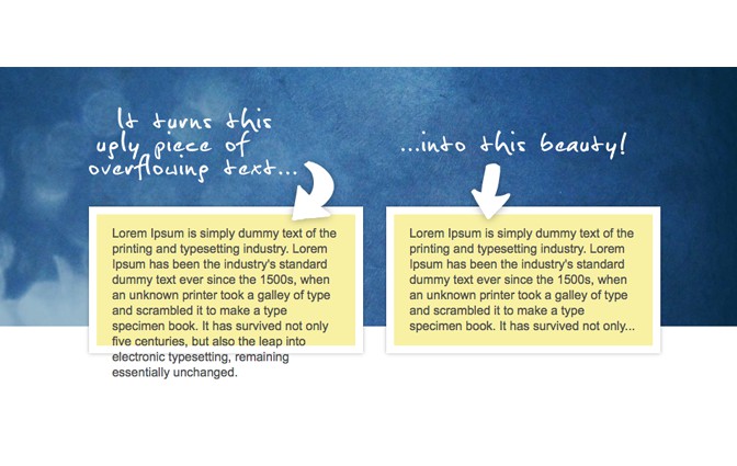
react-scroll-collapse
Component wrappers for auto-scrolling collapsible elements - with smooth animations powered by react-motion and react-collapse.
react-scroll-collapse provides a scrolling container (<Scroller>) and two higher order components (collapserController, collapserControllerItem) which provide props and callbacks to use when designing your react-collapse based components.
Scroller will auto-scroll your nested components to the top when they are wrapped with either the collapserController or collapserControllerItem HoCs.
collapserController provides controls to expand/collapse all child components wrapped with collapserControllerItem.
collapserControllerItem provides controls to expand/collapse a single element.
Installation
NPM
npm install --save react-scroll-collapse
Installing peer dependencies
If you use npm@3 you'll need to install the peer dependencies
npm install --save classnames react react-collapse react-dom react-height react-motion react-redux redux redux-saga reselect
redux Integration
react-scroll-collapse relies on Redux for state management.
Importing the reducers:
import {reactScrollCollapse} from 'react-scroll-collapse';
You will need to include the 'reactScrollCollapse' reducer in your top level reducer with the same state key (i.e. reactScrollCollapse). See example
redux-saga Integration
react-scroll-collapse also relies on redux-saga
Importing the sagas:
import {reactScrollCollapseSagas} from 'react-scroll-collapse';
You will need to include 'reactScrollCollapseSagas' in your root saga - See example - which in turn must be included in your redux middleware See example
Handy tip:
redux-sagas uses generators which aren't supported widely by browsers at the moment. If you are using webpack - install the transform runtime via npm:
npm install --save-dev babel-plugin-transform-runtime
...and add it to your .babelrc file in the root of your project. It should look something like:
{
  "presets": [
    "@babel/preset-env",
    "@babel/preset-react"
  ],
  "plugins": [
    "@babel/plugin-transform-runtime",
    "your-other-plugins"
  ]
}
Consult both the redux and redux-saga docs for more information about installing and using those libraries.
Component Wrappers
<Scroller>
Usage
For the auto-scroll functionality to work, components wrapped with collapserController should be nested within the scope of <Scroller>. collapserControllerItem wrapped components should be nested in the scope of a component wrapped with collapserController.
import Scroller from 'react-scroll-collapse';

//...

<Scroller>
  ...
  <YourComponent - wrapped by collapserController>  // nested under Scroller
    ...
    <AnotherComponent - wrapped by collapserControllerItem />  // nested under a collapserController
  </YourComponent>

  or...

  <YourComponent - wrapped by collapserController>  // nested under Scroller
    ...
    <AnotherComponent - wrapped by collapserControllerItem />  // nested under a collapserController
    <ThirdComponent wrapped by collapserController> // you can nest collapserControllers under each other
      <FourthComponent wrapped by collapserControllerItem />
    </ThirdComponent>
  </YourComponent>

</Scroller>
You can see this component implemented in the examples folder here.
<Scroller> - Props
onRest : PropTypes.function
Scroller makes use of the react-motion <Motion> component to perform the scrolling animation. The onRest prop is passed directly into the <Motion> component. It is a callback that is fired when the animation is finished. Consult the react-motion docs for more information.
scrollTo : PropTypes.number
Scroller will scroll to the offsetTop value of the nested collapserControllerItem that has its expandCollapse function called. You can over ride this completely by setting a value for this prop.
offsetScrollTo : PropTypes.number
Alternatively you can set an offset that will be added to the offsetTop value.
springConfig : PropTypes.object (default: {stiffness: 170, damping: 20})
You can change the style of animation using the springConfig prop. Consult the react-motion docs on using animation springs.
className, style
You can use the usual react className and style props to style the component. A default style is applied using css modules:
:local(.scroller) {
  overflow: auto;
  position: relative;
}
It is possible to overwrite this default - but will probably break things.
The scroll to top functionality relies on the <Scroller> DOM element being the first relatively positioned parent. Other then this limitation - wrapped child collapserController and collapserItemController elements can be as deeply nested in other components as you like.
collapserController()
collapserController provides controls to expand/collapse all child components wrapped with collapserControllerItem. Components wrapped with collapserController must be a child of a Scroller component (but do not have to be immediate children).
You can nest wrapped collapserController components within other collapserController components (again - they don't have to be immediate children). But - at the moment - you can't nest them within components wrapped with the collapserItemController wrapper.
collapserController will pass a 'collapserRef' prop. You must pass this as the 'ref' attribute on the DOM node you want the scroll to top animation to be applied.
Usage
import {collapserController} from 'react-scroll-collapse';

class YourComponent extends Component {

  ...

  render() {
    return (
      <div
        ref={this.props.collapserRef} // Don't forget to pass this ref!!!
      >
        ...
        <Component - wrapped by collapserItemController />
        <Component - wrapped by collapserItemController />
        ...
      </div>
    );
  }
}

export default collapserController(YourComponent);
You can see full implementations of the wrapper in the SimpleCollapser component example and the CommentThread component example
collapserController - Props
Because it's a HoC wrapper - collapserController passes props to your component.
areAllItemsExpanded : PropTypes.bool
A boolean telling your component if all the child collapserItems are expanded. Use this to display information to the user about whether it will expand its children or close them the next time expandCollapseAll is called.
If areAllItemsExpanded is true, then the next expandCollapseAll call will collapse all expand children - otherwise it will expand all children.
collapserRef : PropTypes.object
Is a ref object as created by React.createRef - you must pass this as the 'ref' attribute to a DOM node.
expandCollapseAll : PropTypes.func
Calling this function in your component will scroll your component to the top of the parent <Scroller> component and expand/collapse any components wrapped with the collapserItemController HoC nested within the scope of the collapserController.
If some children are expanded and some collapsed then it will expand them all.
collapserId, parentCollapserId, parentScrollerId : PropTypes.number
These are the ids used in redux to track components.
collapserControllerItem()
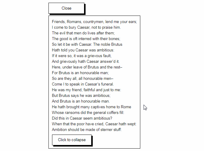
collapserControllerItem provides controls to expand/collapse a single component that uses the react-collapse <Collapse> component. The actual collapse/expand animation is handled by <Collapse> so consult its docs for usage information.
collapserControllerItem will pass a 'collapserItemRef' prop. You must pass this as the 'ref' attribute on the DOM node you want the scroll to top animation to be applied.
Usage
import Collapse from 'react-collapse';
import {collapserControllerItem} from 'react-scroll-collapse';

class YourComponent extends Component {

  ...

  render() {
    const {isOpened, onHeightReady, expandCollapse} = this.props;
    return (
      <div
        onClick={expandCollapse} // use expandCollapse as an event callback.
        ref={collapserItemRef} // pass the supplied ref or auto scroll won't work.
      >
        ...
        <Collapse isOpened={isOpened}> // make sure you pass the isOpened prop to <Collapse> !!
          ...nested components
        </Collapse>
        ...
      </div>
    );
  }
}

export default collapserItemController(YourComponent);
All components wrapped with collapserControllerItem need to be a child of a component wrapped with collapserController. However, if you don't need to have multiple children of a particular collapserController then you don't need to create an additional component just to serve as the input for collapserController.
You can just wrap your collapserControllerItem immediately upon export like so:
import {collapserController, collapserControllerItem} from 'react-scroll-collapse';

class YourComponent extends Component {

  ...(your inner component stuff)

}

export default collapserControler(ItemController(YourComponent));  // wrap the item immediately with collapserController!
You can see full implementations of the wrapper in the SimpleComment component example and the Comment component example
collapserControllerItem - Props
Because it's a HoC wrapper - collapserItemController passes props to your component.
collapserItemRef : PropTypes.object
Is a ref object as created by React.createRef - you must pass this as the 'ref' attribute to a DOM node.
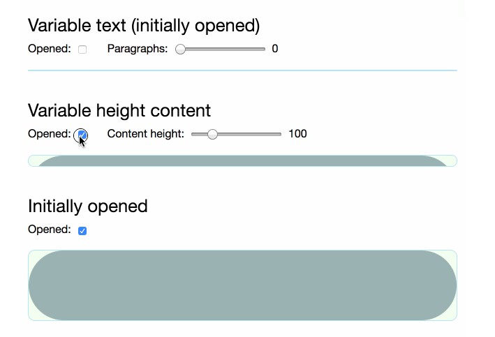
isOpened : PropTypes.bool
A boolean to pass into the <Collapse> component (also uses isOpened) which controls the expanded state.
expandCollapse : PropTypes.func
Flips the value of the isOpened boolean - and scrolls your component to the top of the <Scroller> component.
itemId, parentCollapserId, parentScrollerId : PropTypes.number
These are the ids used in redux to track components.
Development
Running the example demo
git clone https://github.com/danhaggard/react-scroll-collapse.git
cd react-scroll-collapse
npm install
npm start
Demo content will be served at http://localhost:8080
Testing
To run the tests:
npm test
Coverage is found in ./test/coverage/lcov-report
Acknowledgements
generator-react-webpack-redux
The original template for the project came from generator-react-webpack-redux