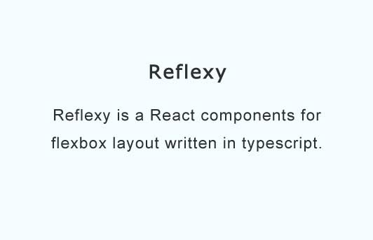
Reflexy
Flexbox layout react components.
Reflexy is a React components for flexbox layout written in typescript.
With Reflexy
- You don't need to worry about the prefixes of different browsers - Reflexy use an autoprefixer.
- You don't need to do a concatenation of a lot of css classes:
vs<div className={classNames(styles['flex'], styles['flex-column'], styles['flex-align-center'], ...)}> {children} </div><Flex column alignItems="center" className="custom-class">{children}</Flex> - You can replace default output
divtag:
output:<Flex tagName="header">{children}</Flex><header class="...">{children}</header> - You can tweak you own react component with flexbox layout (your component must accept className through props):
will be<Flex component={MyComponent} column alignSelf="center" myProp="myPropValue" className={styles['my-class']} > {children} </Flex><MyComponent myProp="myPropValue" className="[reflexy classes] my-class">{children}</MyComponent>
Installation
yarn add react reflexy
or
npm install --save react reflexy
Reflexy has own css files so you need provide loader for css files placed in node_modules folder. With webpack it's maybe css-loader:
{
  test: /\.css$/,
  include: path.join(__dirname, 'node_modules'),
  // or
  include: /reflexy/
  use: [
    { loader: 'style-loader' },
    {
      loader: 'css-loader',
      options: {
        modules: true,
        localIdentName: '[local]',
      },
    },
  ],
},
Usage
import { Flex } from 'reflexy';

...

<Flex row justifyContent="center">
  ...
</Flex>
Props
Flex
Default style is just display: flex;
inline?: boolean;- Setsdisplaytoinline-flex.alignContent?: 'center' | 'flex-start' | 'flex-end' | 'space-between' | 'space-around' | 'stretch' | 'initial' | 'inherit';- Setsalign-contentto corresponding value.alignItems?: 'center' | 'flex-start' | 'flex-end' | 'stretch' | 'baseline' | 'initial' | 'inherit';- Setsalign-itemsto corresponding value.alignSelf?: 'center' | 'flex-start' | 'flex-end' | 'stretch' | 'baseline' | 'auto' | 'initial' | 'inherit';- Setsalign-selfto corresponding value.justifyContent?: 'center' | 'flex-start' | 'flex-end' | 'space-between' | 'space-around' | 'initial' | 'inherit';- Setsjustify-contentto corresponding value.basis?: 'none' | 'auto' | 'fill' | 'content' |fit-content' | 'min-content' | 'max-content';- Setsflex-basisto corresponding value.grow?: 0..24;- Setsflex-growto corresponding value. Also accepts boolean value:trueis equals to1,falseis equals to0.shrink?: 0..24;- Setsflex-shrinkto corresponding value. Also accepts boolean value:trueis equals to1,falseis equals to0.row?: boolean;- Setsflow-directiontorow.column?: boolean;- Setsflow-directiontocolumn. Takes a precedence overrow.reverse?: boolean;- Used withroworcol. Setsflow-directiontocolumn-reverseorrow-reverse.wrap?: boolean | 'reverse';- Setsflex-wraptowraporwrap-reverse.order?: number;- Setsorderto corresponding value.hfill?: boolean;- Stretch by horizontal.vfill?: boolean;- Stretch by vertical.fill?: 'v' | 'h' | 'all';- Stretch by v - vertical or h - horizontal or all - both. Also accepts boolean value:trueis equals toall.component?: React.ComponentType<any>;- Sets React component as a container. Component must accept className through props.tagName?: string;- Html tag name for output container. Takes a precedence overcomponent.center?: boolean;- SetsjustifyContentandalignItemstocenter. Takes a precedence overjustifyContentandalignItems.className?: string;- CSS class name.style?: React.CSSProperties;- Inline styles.- and all other props of html element.
TODO
If you need more features or you find a bug, please, open an issue or make PR.