custom-react-cursor
A React Custom able cursor that can decorate your site also your hand is open to manipulate the cursor with css
Installing
npm i react-special-cursor
Running Demo
npm i
npm run serve
Build
npm run build
Test
it’s on watch mode you can change it through package.json
npm run test
Usage
import Cursor from "react-special-cursor";

function App() {
  return (
    <Cursor color="orange">
      <App>...</App>
    </Cursor>
  );
}
if you want to put something beside App component you should put them inside a Fragment like this
import Cursor from "react-special-cursor";

function App() {
  return (
    <Cursor color="orange">
      <React.Fragment>
        <App>...</App>
        <AnotherComponent></AnotherComponent>
        ...
      </React.Fragment>
    </Cursor>
  );
}

// or

function App() {
  return (
    <Cursor color="orange">
      <>
        <App>...</App>
        <AnotherComponent>...</AnotherComponent>
        ...
      </>
    </Cursor>
  );
}

// also you can do this

function App() {
  return <Cursor color="orange" children={<App>...</App>} />;
}
Example file
import React from "react";
import ReactDOM from "react-dom";
import Cursor from "./Cursor/Cursor";
import "./demo.scss";
export default function App() {
return (
<Cursor
color="orange"
hoverClasses={[
{ classNameOfTargetElement: "link", classNameOfStyle: "hover" },
{ classNameOfTargetElement: "react", classNameOfStyle: "react-hover" },
{
classNameOfTargetElement: "author",
classNameOfStyle: "author-on-hover",
},
]}>
<div className="wrapper">
<h1>
<a
className="react"
href="https://github.com/amirho1/react-cursors.git"
target="_blank">
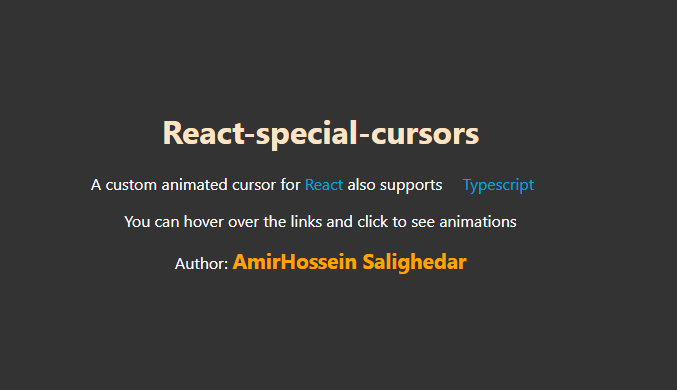
React-cursors
</a>
</h1>
<p>
A custom animated cursor for{" "}
<a className="react" target="_blank" href="https://reactjs.org/">
React
</a>{" "}
also supports{" "}
<a
className="link"
target="_blank"
href="https://www.typescriptlang.org/download">
{" "}
Typescript
</a>
</p>
<p>You can hover over the links and click to see animations</p>
Author: <a
href="https://github.com/amirho1"
target="_blank"
className="author">
{" "}
AmirHossein Salighedar
</a>
</div>
</Cursor>
);
}
css example
cursor-dot is default the className for dot and for border is cursor-border
body {
  background-color: #333;
  color: white;
  margin: 0;
  padding: 0;
  height: 1000px;
}

a {
  color: rgb(0, 166, 216);
  text-decoration: none;
}

.wrapper {
  margin: auto;
  width: 60%;
  text-align: center;
}

.hover .cursor-dot {
  width: 100px;
  height: 100px;
  z-index: -1;
  background-color: lightblue;
}

.hover .cursor-border {
  z-index: -1;
}

.link {
  padding: 1em;
}

.react-hover .cursor-border {
  background-color: white;
  width: 50px;
  height: 50px;
  border-radius: 0;
  z-index: -1;
}

.react-hover .cursor-dot {
  z-index: -3;
}

.author {
  color: orange;
  font-weight: 800;
  font-size: 1.3em;
}

.author-on-hover .cursor-dot {
  width: 100px;
  height: 100px;
  background-color: gray;
  z-index: -1;
}

.author-on-hover .cursor-border {
  z-index: -1;
}

.head {
  color: bisque;
}

.head-hover .cursor-border {
  border: 5px dotted darkorange;
}

.head-hover .cursor-dot {
  background-color: purple;
  width: 20px;
  height: 20px;
}
Properties
| Name | Type | Description |
|---|---|---|
| children | JSX.Element | the rest of your application i should be App component |
| borderClassName | string | className of cursor border |
| dotClassName | string | className of cursor inner dot |
| hoverClasses | object | an array of objects that each object accepts 2 string one with name of classNameOfTargetElement that accepts the className of the elements that you want to have some styles on hover second is classNameOfStyle the className that will passed to the cursor-wrapper element from that you have access to modify cursor-dot and cursor-border on each hover |
hoverClasses Object Type
[
  {
    classNameOfTargetElement: string;
    classNameOfStyle: string;
  }
]