Check-Online-Offline: React Network Status Hook with Callback Functionality
Elevate your React applications with the useCheckOnlineOffline hook, streamlining network status monitoring. Seamlessly adapt to changing connectivity through intuitive integration and advanced callback functions.
Features:
-
Real-time Monitoring: Keep your finger on the pulse of network status changes in real time. React promptly to online and offline transitions for a seamless user experience.
-
Callback Flexibility: Harness the power of callbacks to execute customized actions during network status shifts. Whether it’s data synchronization, UI updates, or specialized behaviors, tailor your app’s response effortlessly.
-
Simplicity of Integration: Integration is a breeze with our developer-centric approach. Import the hook, attach your desired callbacks, and let it handle the intricacies of network status management.
-
Minimal Resource Impact: Prioritizing efficiency, the hook ensures minimal resource consumption. Enjoy robust network monitoring without sacrificing application performance.
-
Comprehensive Documentation: Empower your development journey with in-depth documentation and illustrative examples. Seamlessly incorporate network status tracking into your projects with ease.
Installation
Open your terminal and navigate to your project directory. Use npm to install the package:
npm install check-online-offline
Usage
The useOnline hook enables you to respond to changes in network connectivity by providing callback functions for both online and offline states. It takes an object with two properties: online and offline.
Online State
When the application transitions from an offline state to an online state, the callback functions within the online array will be executed. Multiple functions can be included to perform various actions when the app goes online.
Offline State
Conversely, when the application transitions from an online state to an offline state, the callback functions within the offline array will be executed. Similar to the online array, you can include multiple functions for different offline state actions.
Usecase
Import the Hook:
In the React component where you intend to use the network status monitoring, import the hook:
import useOnline from 'check-online-offline';
Utilize the Hook:
Within your component, employ the hook by invoking it. The useOnline() hook produces an output of either true or false. When the network is connected, it yields true otherwise, it returns false.
status = useOnline();
// return true or false
Using Callbacks with the Hook
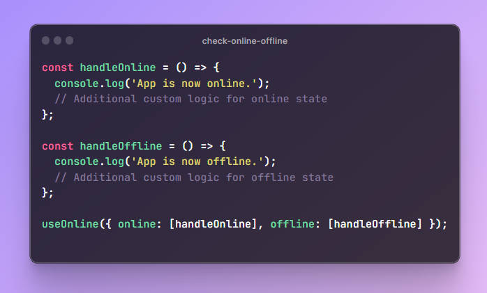
const handleOnline = () => {
  console.log('App is now online.');
  // Additional custom logic for online state
};

const handleOffline = () => {
  console.log('App is now offline.');
  // Additional custom logic for offline state
};

useOnline({ online: [handleOnline], offline: [handleOffline] });
-
Callback Functions Setup:
-
handleOnline: This is a callback function that gets executed when the application transitions from an offline state to an online state. In this example, it logs a message to the console indicating that the app is now online. You can customize this function to include any specific actions that should be performed when the app becomes online. -
handleOffline: This is a callback function that gets executed when the application transitions from an online state to an offline state. It logs a message to the console indicating that the app is now offline. Similar tohandleOnline, you can tailor this function to include any necessary actions for when the app goes offline.
-
-
Invoking the
useOnlineHook:useOnline({ online: [handleOnline], offline: [handleOffline] });: Here, theuseOnlinehook is invoked with an object containing two properties:online: An array containing thehandleOnlinefunction. This means that when the app goes online, the code insidehandleOnlinewill execute.offline: An array containing thehandleOfflinefunction. This indicates that when the app goes offline, the code withinhandleOfflinewill be executed.
-
Passing multiple functions :
 useOnline({
 online: [handleOnline1, handleOnline2],
 offline: [handleOffline1, handleOffline2]
 });
Use of hook in component:
The StatusComponent is a reusable React component designed to handle the display of a modal when the user is offline. It uses the useOnline hook from the check-online-offline library to determine the online/offline status. The component accepts various props like headingText, descriptionText, buttonText, buttonLink, and styling options to customize its appearance. When the user is offline, the modal becomes visible, showing the provided heading and description, along with a button to refresh the page. This component simplifies the process of notifying users when they lose internet connectivity and encourages them to refresh the page once the connection is reestablished.
// Import the useOnline hook from the 'check-online-offline' library
import useOnline from 'check-online-offline';
// Import the CSS file for the component
import './StatusComponent.css';

// Define the StatusComponent functional component
const StatusComponent = (props) => {
    // Destructure props to extract values for customization
    const {
        headingText,
        descriptionText,
        buttonText,
        buttonLink,
        headingCss,
        descriptionCss,
        buttonCss,
        modalCss,
        modalCssName
    } = props;

    // Use the useOnline hook to determine online/offline status
    const isOnline = useOnline();

    // Return JSX for the component
    return (
        <div style={{ display: isOnline ? 'none' : 'block' }}>
            {/* Container for the dark background */}
            <div className="darkBackgroundDiv">
                {/* Modal container with custom styles */}
                <div className={modalCssName} style={modalCss}>
                    {/* Heading section */}
                    <div className="heading" style={headingCss}>
                        {headingText}
                    </div>
                    {/* Description section */}
                    <p className='description' style={descriptionCss}>
                        {descriptionText}
                    </p>
                    {/* Button section */}
                    <a href={buttonLink} className="modalBtn">
                        <button className="reloadButton mt-3" style={buttonCss}>{buttonText}</button>
                    </a>
                </div>
            </div>
        </div>
    );
}

// Default props for the component
StatusComponent.defaultProps = {
    modalCssName: "modalDiv",
    headingText: "Oops, Looks Like You're Offline!?",
    descriptionText: "Well, well, well... someone pulled the plug, didn't they? ? No worries, even our pixels need a coffee break sometimes! ☕",
    buttonLink: "/",
    buttonText: "Refresh"
}

// Export the StatusComponent for use in other files
export default StatusComponent;
Default CSS for StatusComponent :
File name – StatusComponent.css
@import url('https://fonts.googleapis.com/css2?family=Poppins&display=swap');

.darkBackgroundDiv {
    background-color: rgb(0, 0, 0, 0.3);
    transform: translate(-50%, -50%);
    display: flex;
    justify-content: center;
    align-items: center;
    position: fixed;
    top: 50%;
    left: 50%;
    width: 100%;
    height: 100%;
    font-family: 'Poppins', sans-serif;
}

.darkBackgroundDiv .modalDiv {
    box-shadow: rgba(17, 17, 26, 0.1) 0px 4px 16px, rgba(17, 17, 26, 0.05) 0px 8px 32px;
    width: 50%;
    background-color: white;
    padding: 2rem;
    border-radius: 10px;
    text-align: center;
}

.modalDiv .heading {
    font-size: 2rem;
    font-weight: bold;
}

.modalDiv .description {
    margin-top: 2rem;
}

.modalDiv .reloadButton {
    background-color: rgb(41, 43, 40);
    color: white;
    font-size: 1rem;
    padding: .3rem .8rem;
    border: 2px solid #242322;
    border-radius: 5px;
    height: 3rem;
    box-shadow: rgba(56, 56, 56, 0.2) 0px 2px 8px 0px;
    width: 8rem;
    cursor: pointer;
    transition: all .3s ease-in-out;
    margin-top: 2rem;
}

.modalDiv .reloadButton:hover {
    opacity: .95;
    text-decoration: none;

}

@media only screen and (max-width:1200px) {
    .darkBackgroundDiv .modalDiv {
        width: 70%;
    }
}

@media only screen and (max-width:550px) {
    .darkBackgroundDiv .modalDiv {
        width: 90%;
        padding: 2rem 1rem;
    }
}
Contribution
Contributions to the check-online-offline package are welcomed and encouraged! If you’d like to contribute, follow these steps:
-
Fork the Repository: Start by forking the official repository on GitHub.
-
Clone the Fork: Clone your forked repository to your local development environment.
git clone https://github.com/rajatrawal/check-online-offline.git
-
Create a Branch: Create a new branch for your changes.
git checkout -b feature/new-feature
-
Make Changes: Make your desired changes to the codebase.
-
Test: Ensure that your changes don’t break existing functionality and add appropriate test cases if necessary.
-
Commit and Push: Commit your changes and push them to your forked repository.
git commit -m "Add: Your contribution description" git push origin feature/new-feature -
Create a Pull Request: Open a pull request from your forked repository’s branch to the main repository’s branch. Provide a clear description of your changes and their purpose.
Author
The check-online-offline package is developed by Rajat Rawal. Connect with the author on Linkedin: Rajat Rawal.
For any questions or inquiries, you can also reach out via email.


