React Flow
React Flow is a library for building node-based graphs. You can easily implement custom node types and it comes with components like a mini-map and graph controls.
Key Features
- Easy to use: Seamless zooming & panning behaviour and single and multi-selections of elements
- Customizable: Different node and edge types and support for custom nodes with multiple handles and custom edges
- Fast rendering: Only nodes that have changed are re-rendered and only those that are in the viewport are displayed
- Utils: Snap-to-grid and graph helper functions
- Components: Background, Minimap and Controls
- Reliable: Written in Typescript and tested with cypress
In order to make this library as flexible as possible we don’t do any state updates besides the positions. This means that you need to pass the functions to remove an element or connect nodes by yourself. You can implement your own ones or use the helper functions that come with the library.
Installation
npm install react-flow-renderer
Usage
This is a very basic example of how to use React Flow. There are more advanced examples in the example folder.
import React from 'react';
import ReactFlow from 'react-flow-renderer';

const elements = [
  { id: '1', data: { label: 'Node 1' }, position: { x: 250, y: 5 } },
  // you can also pass a React component as a label
  { id: '2', data: { label: <div>Node 2</div> }, position: { x: 100, y: 100 } },
  { id: 'e1-2', source: '1', target: '2', animated: true },
];

const BasicFlow = () => <ReactFlow elements={elements} />;
React Flow Component Prop Types
Basic Props
elements: array of nodes and edges (required)style: css propertiesclassName: additional class name
Flow View
minZoom: default:0.5maxZoom: default:2defaultZoom: default:1defaultPosition: default:[0, 0]snapToGrid: default:falsesnapGrid: [x, y] array - default:[16, 16]onlyRenderVisibleNodes: default:truetranslateExtent: default[[-∞, -∞], [+∞, +∞]]
Event Handlers
onElementClick(event: MouseEvent, element: Node | Edge): called when user clicks node or edgeonElementsRemove(elements: Elements): called when user removes node or edgeonNodeDragStart(event: MouseEvent, node: Node): node drag startonNodeDragStop(event: MouseEvent, node: Node): node drag stoponNodeMouseEnter(event: MouseEvent, node: Node): node mouse enteronNodeMouseMove(event: MouseEvent, node: Node): node mouse moveonNodeMouseLeave(event: MouseEvent, node: Node): node mouse leaveonNodeContextMenu(event: MouseEvent, node: Node): node context menuonConnect({ source, target }): called when user connects two nodesonConnectStart(event: MouseEvent, { nodeId, handleType }): called when user starts to drag connection lineonConnectStop(event: MouseEvent): called when user stops to drag connection lineonConnectEnd(event: MouseEvent): called after user stops or connects nodesonLoad(reactFlowInstance): called after flow is initializedonMove(flowTransform: FlowTransform): called when user is panning or zoomingonMoveStart(flowTransform: FlowTransform): called when user starts panning or zoomingonMoveEnd(flowTransform: FlowTransform): called when user ends panning or zoomingonSelectionChange(elements: Elements): called when user selects one or multiple elementsonSelectionDragStart(evt: MouseEvent, nodes: Node[]): called when user starts to drag a selectiononSelectionDrag(evt: MouseEvent, nodes: Node[]): called when user drags a selectiononSelectionDragStop(evt: MouseEvent, nodes: Node[]): called when user stops to drag a selectiononSelectionContextMenu(event: MouseEvent, nodes: Node[]): called when user does a right-click on a selectiononPaneClick(event: MouseEvent): called when user clicks directly on the canvasonPaneContextMenu(event: MouseEvent): called when user does a right-click on the canvasonPaneScroll(event: WheelEvent): called when user scrolls pane (only works whenzoomOnScrollis set to `false)
Interaction
nodesDraggable: default:true. This applies to all nodes. You can also change the behavior of a specific node with thedraggablenode optionnodesConnectable: default:true. This applies to all nodes. You can also change the behavior of a specific node with theconnectablenode optionelementsSelectable: default:true. This applies to all elements. You can also change the behavior of a specific node with theselectablenode optionzoomOnScroll: default:truezoomOnDoubleClick: default:trueselectNodesOnDrag: default:truepaneMoveable: default:true- If set tofalse, panning and zooming is disabled
Element Customization
nodeTypes: object with node typesedgeTypes: object with edge typesarrowHeadColor: default:#bbb
Connection Line Options
connectionLineType: connection line type =default(bezier),straight,step,smoothstepconnectionLineStyle: connection style as svg attributesconnectionLineComponent: custom connection line component
Keys
deleteKeyCode: default:8(delete)selectionKeyCode: default:16(shift)
React Flow Instance
You can receive a reactFlowInstance by using the onLoad callback:
import React from 'react';
import ReactFlow from 'react-flow-renderer';

const onLoad = (reactFlowInstance) => {
  reactFlowInstance.fitView();
}

const BasicFlow = () => <ReactFlow onLoad={onLoad} elements={[]} />;
reactFlowInstance has the following functions:
project
Transforms pixel coordinates to the internal ReactFlow coordinate system.
This can be used when you drag nodes (from a side bar for example) and need the position on the pane.
project = (position: XYPosition): XYPosition
fitView
Fits view port so that all nodes are inside the view port.
fitView = ({ padding }): void
zoomIn
zoomIn = (): void
zoomOut
zoomOut = (): void
zoomTo
zoomTo = (zoomLevel: number): void
getElements
getElements = (): Elements
setTransform
Sets position and zoom of the pane.
setTransform = (transform: FlowTransform): void
Nodes
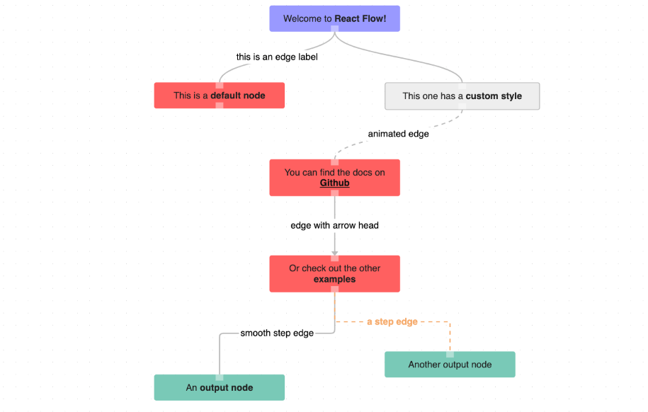
There are three different node types (default, input, output) you can use. The node types differ in the number and types of handles. An input node has only a source handle, a default node has a source and a target and an output node has only a target handle. You create nodes by adding them to the elements array of the ReactFlow component.
Node example: { id: '1', type: 'input', data: { label: 'Node 1' }, position: { x: 250, y: 5 } }
Options
id: string (required)position: { x: number, y: number } (required)data: {} (required if you are using a standard type, otherwise depends on your implementation)type: 'input' | 'output' | 'default' or a custom one you implementedstyle: css propertiesclassName: additional class nametargetPosition: 'left' | 'right' | 'top' | 'bottom' handle position - default: 'top'sourcePosition: 'left' | 'right' | 'top' | 'bottom' handle position - default: 'bottom'isHidden: iftrue, the node will not be rendereddraggable: boolean - if option is not set, the node is draggable (overwrites generalnodesDraggableoption)connectable: boolean - if option is not set, the node is connectable (overwrites generalnodesConnectableoption)selectable: boolean - if option is not set, the node is selectable (overwrites generalelementsSelectableoption)
Node Types & Custom Nodes
The standard node types are input, default and output. The default node types object looks like this:
{
  input: InputNode,
  default: DefaultNode,
  output: OutputNode
}
The keys represent the type names and the values are the components that get rendered.
If you want to introduce a new type you can pass a nodeTypes object to the ReactFlow component:
nodeTypes={{
  special: MyCustomNode
}}
You can now use the type special for a node.
The default, input and output types would be still available except you overwrote one of them.
There is an example of a custom node implementation in the custom node example.
Custom Node Props
Your custom nodes are wrapped so that the basic functions like dragging or selecting work. Custom nodes receive the following props:
id: stringdata: objecttype: stringselected: booleansourcePosition: stringtargetPosition: string
Prevent dragging
If you have controls or other elements inside your custom node that should not drag the node you can add the class name nodrag.
Handle Component
We export a Handle component as a helper for your custom nodes:
import { Handle } from 'react-flow-renderer';

const targetHandleWithValidation = (
  <Handle
    type="target"
    position="left"
    isValidConnection={(connection) => connection.source === 'some-id'}
    onConnect={params => console.log('handle onConnect', params)}
    style={{ background: '#fff' }}
  />
);
Prop Types
type: 'source' or 'target'id: string - you only need this when you have multiple source or target handles (otherwise the node id is used)position: 'left', 'right', 'top' or 'bottom' handle position - default: 'top' for type target, 'bottom' for type sourceonConnect: function that gets triggered on connectisValidConnection: function receives a connection{ target: 'some-id', source: 'another-id' }as param, returns a boolean - default:truestyle: css propertiesclassName: additional class name
Validation
The handle receives the additional class names connecting when the connection line is above the handle and valid if the connection is valid. You can find an example which uses these classes here.
Multiple Handles
If you need multiple source or target handles you can achieve this by creating a custom node. Normally you just use the id of a node for the source or target of an edge. If you have multiple source or target handles you need to pass an id to these handles. These ids get then added to the node id, so that you can connect a specific handle. If you have a node with an id = 1 and a handle with an id = a you can connect this handle by using the id = 1__a.
You can find an example of how to implement a custom node with multiple handles in the custom node example.
Edges
React Flow comes with four edge types (default, straight, step, smoothstep). As the names indicate, the edges differ in the representation. The default type is a bezier edge. You create edges by adding them to your elements array of the ReactFlow component.
Edge example: { id: 'e1-2', type: 'straight', source: '1', target: '2', animated: true, label: 'edge label' }
If you wanted to display this edge, you would need a node with id = 1 (source node) and another one with id = 2 (target node).
Options
id: string (required)source: string (an id of a node) (required)target: string (an id of a node) (required)type: 'default' (bezier), 'straight', 'step' and 'smoothedge' or a custom one depending on your implementationanimated: booleanstyle: css properties for the edge line pathclassName: additional class namelabel: stringlabelStyle: css properties for the textlabelShowBg: boolean - default:truelabelBgStyle: css properties for the text backgroundlabelBgPadding: [number, number] background rectangle padding - default:[2, 4]labelBgBorderRadius: number - default 2arrowHeadType: 'arrow' or 'arrowclosed' - defines the arrowhead of the edgemarkerEndId: custom marker end url - if this is usedarrowHeadTypegets ignoredisHidden: iftrue, the edge will not be rendereddata: {} you can use this to pass data to your custom edges.
You can find an example with different edges in the edges example.
Edge Types & Custom Edges
The basic edge types are default (bezier), straight, step and smoothstep. The default edgeTypes object looks like this:
{
  default: BezierEdge,
  straight: StraightEdge,
  step: StepEdge,
  smoothstep: SmoothStepEdge
}
The keys represent the type names and the values are the edge components.
If you want to introduce a new edge type you can pass an edgeTypes object to the ReactFlow component:
edgeTypes={{
  special: MyCustomEdge
}}
Now you could use the new type special for an edge.
The straight, default and step types would still be available unless you overwrote one of them.
There is an implementation of a custom edge in the edges example.
Edge Utils
There are several utils that help you to create a custom edge. They are used in the custom edge example.
getBezierPath
Returns the path of a bezier edge.
getBezierPath({ sourceX, sourceY, sourcePosition = Position.Bottom, targetX, targetY, targetPosition = Position.Top, }: GetBezierPathParams): string
getSmoothStepPath
Returns the path of a smooth step edge. You can set borderRadius = 0 to get a step edge path.
getSmoothStepPath({ sourceX, sourceY, sourcePosition = Position.Bottom, targetX, targetY, targetPosition = Position.Top, borderRadius = 5, }: GetSmoothStepPathParams): string
getEdgeCenter
Returns the center poostion [centerX, centerY] of the edge.
getEdgeCenter({ sourceX, sourceY, targetX, targetY }: GetCenterParams): [number, number, number, number]
getMarkerEnd
Returns the marker end url for displaying the arrow head.
getMarkerEnd(arrowHeadType?: ArrowHeadType, markerEndId?: string): string
Components
Background
React Flow comes with two background variants: dots and lines. You can use it by passing it as a children to the ReactFlow component:
import ReactFlow, { Background } from 'react-flow-renderer';

const FlowWithBackground = () => (
  <ReactFlow elements={elements}>
    <Background
      variant="dots"
      gap={12}
      size={4}
    />
  </ReactFlow>
);
Prop Types
variant: string - has to be 'dots' or 'lines' - default:dotsgap: number - the gap between the dots or lines - default:16size: number - the radius of the dots or the stroke width of the lines - default:0.5color: string - the color of the dots or lines - default:#999for dots,#eeefor linesstyle: css propertiesclassName: additional class name
MiniMap
You can use the mini map plugin by passing it as a children to the ReactFlow component:
import ReactFlow, { MiniMap } from 'react-flow-renderer';

const FlowWithMiniMap = () => (
  <ReactFlow elements={elements}>
    <MiniMap
      nodeColor={(node) => {
        switch (node.type) {
          case 'input': return 'red';
          case 'default': return '#00ff00';
          case 'output': return 'rgb(0,0,255)';
          default: return '#eee';
        }
      }}
    />
  </ReactFlow>
);
Prop Types
nodeColor: string or function - If you pass a color as a string all nodes will get that color. If you pass a function you can return a color depending on the passed node.nodeBorderRadius: numbernodeClassName: string or function for adding an additional class to the nodes inside the mini mapmaskColor: stringstyle: css propertiesclassName: additional class name
Controls
The control panel contains a zoom-in, zoom-out, fit-view and a lock/unlock button. You can use it by passing it as a children to the ReactFlow component:
import ReactFlow, { Controls } from 'react-flow-renderer';

const FlowWithControls = () => (
  <ReactFlow elements={elements}>
    <Controls />
  </ReactFlow>
);
Prop Types
showZoom: boolean - default: trueshowFitView: boolean - default: trueshowInteractive: boolean - default: truestyle: css propertiesclassName: additional class name
ReactFlowProvider
If you need access to the internal state and action of React Flow outside of the ReactFlow component you can wrap it with the ReactFlowProvider component:
import ReactFlow, { ReactFlowProvider } from 'react-flow-renderer';

const FlowWithOwnProvider = () => (
  <ReactFlowProvider>
    <ReactFlow
      elements={elements}
      onElementClick={onElementClick}
      onConnect={onConnect}
    />
  </ReactFlowProvider>
);
It is used in the provider example.
Styling
There are two ways how you can style the graph pane and the elements.
You can create your own CSS rules or pass style properties to the components.
Using Class Names
Since we are rendering DOM nodes you can simply overwrite the styles with your own CSS rules.
The React Flow wrapper has the className react-flow. If you want to change the graph background for example you can do:
.react-flow {
  background: red;
}
Used Class Names
.react-flow- Outer container.react-flow__renderer- Inner container.react-flow__zoompane- Zoom & pan pane.react-flow__selectionpane- Selection pane.react-flow__selection- User selection.react-flow__edges- Edges wrapper.react-flow__edge- Edge element.selectedis added when edge is selected.animatedis added when edge is animated
.react-flow__edge-path- Edge element path.react-flow__edge-text- Edge text.react-flow__edge-textbg- Edge text background.react-flow__connection- Connection line.react-flow__connection-path- Connection line path.react-flow__nodes- Nodes wrapper.react-flow__node- Node element.selectedis added when edge is selected-${type}is added (.react-flow__node-default,.react-flow__node-input,.react-flow__node-output)
.react-flow__nodesselection- Nodes selection.react-flow__nodesselection-rect- Nodes selection rect.react-flow__handle- Handle component.react-flow__handle-bottomis added when position = 'bottom'.react-flow__handle-topis added when position = 'top'.react-flow__handle-leftis added when position = 'left'.react-flow__handle-rightis added when position = 'right'.react-flow__handle-connectingis added when connection line is above a handle.react-flow__handle-validis added when connection line is above a handle and the connection is valid
.react-flow__background- Background component.react-flow__minimap- Mini map component.react-flow__controls- Controls component
Using Properties
You could achieve the same effect by passing a style prop to the ReactFlow component:
const style = { background: 'red', width: '100%' height: '300px' };

const FlowWithRedBg = (
  <ReactFlow
    elements={elements}
    style={style}
  />
);
Helper Functions
If you want to remove a node or connect two nodes with each other you need to pass a function to onElementsRemove and onConnect. In order to simplify this process there are some helper functions you can use:
import ReactFlow, { isNode, isEdge, removeElements, addEdge } from 'react-flow-renderer';
isEdge
Returns true if the passed element is an edge.
isEdge = (element: Node | Edge): element is Edge
isNode
Returns true if the passed element is a node.
isNode = (element: Node | Edge): element is Node
removeElements
Returns an array of elements without the ones from elementsToRemove. It also removes all incoming/outgoing edges if you just pass one or multiple nodes.
removeElements = (elementsToRemove: Elements, elements: Elements): Elements
addEdge
Returns an array with elements with the added edge.
addEdge = (edgeParams: Edge, elements: Elements): Elements
getOutgoers
Returns all direct child nodes of the passed node.
getOutgoers = (node: Node, elements: Elements): Node[]
getIncomers
Returns all direct incoming nodes of the passed node.
getIncomers = (node: Node, elements: Elements): Node[]
getConnectedEdges
Returns all edges that are connected to the passed nodes.
getConnectedEdges = (nodes: Node[], edges: Edge[]): Edge[]
You can use these function as seen in this example or use your own ones.
Access Internal State and Actions
Under the hood React Flow uses Easy Peasy for state handling.
If you need to access the internal state you can use the useStoreState hook inside a child component of the ReactFlow component:
import ReactFlow, { useStoreState } from 'react-flow-renderer';

const NodesDebugger = () => {
  const nodes = useStoreState(state => state.nodes);

  console.log(nodes);

  return null;
}

const Flow = () => (
  <ReactFlow elements={elements}>
    <NodesDebugger />
  </ReactFlow>
);
You will not need this in most cases but you can also use the internal actions that are defined in the store:
import React, { useEffect } from 'react';
import { useStoreActions } from 'react-flow-renderer'

const TransformUpdater = ({ x, y, zoom }) => {
  const setTransform = useStoreActions(actions => actions.setInitTransform);

  useEffect(() => {
    setTransform({ x, y, k: zoom })
  }, [x, y, zoom])
});
If you need more control you can wrap the ReactFlow component with the ReactFlowProvider component in order to be able to call useStoreState and useStoreActions outside of the ReactFlow component.